Nº0
- Client :
- Nº0
- Term :
- 2022
- Works :
- Package/Products
 Package/Products
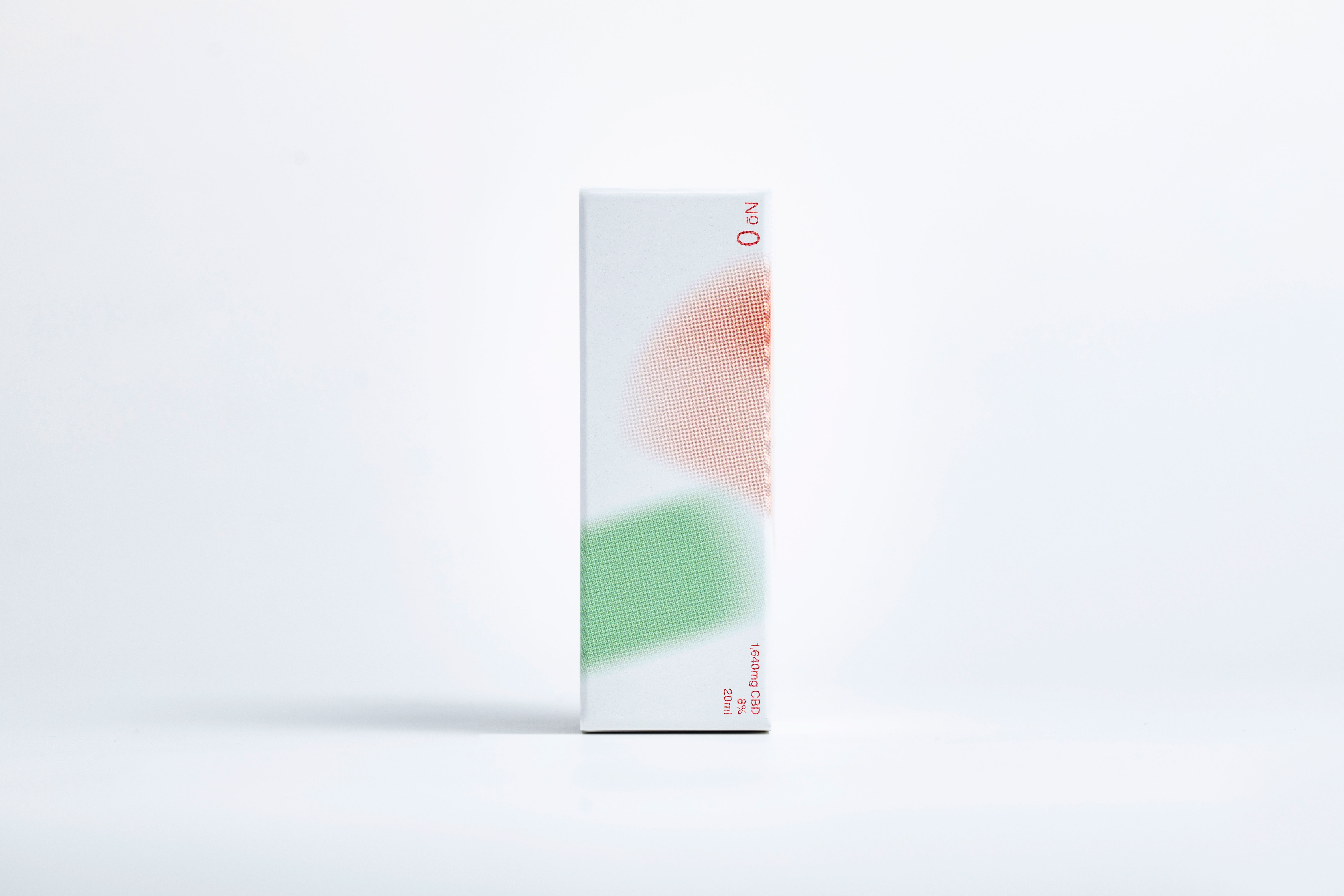 Package
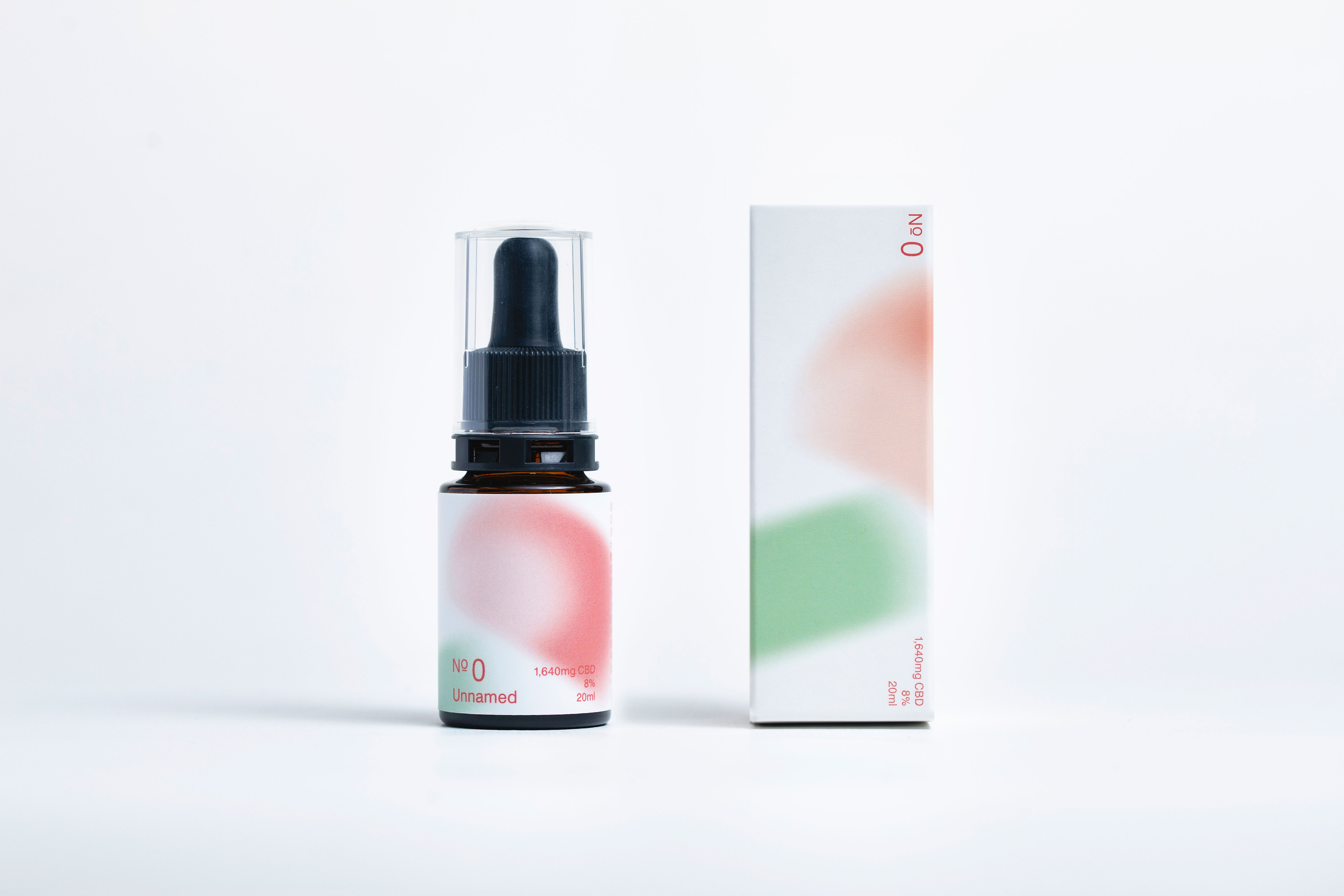 Package
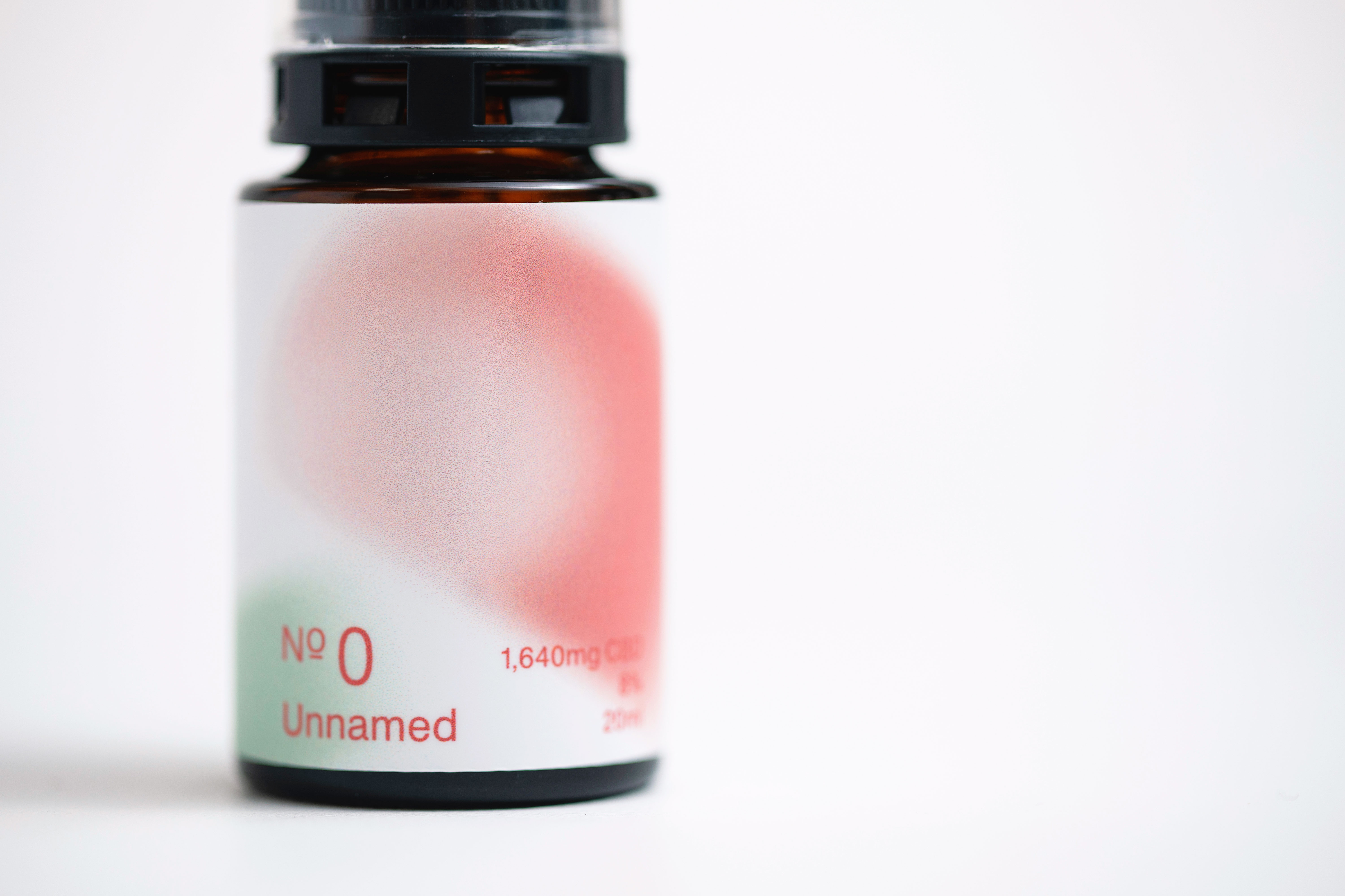 Package
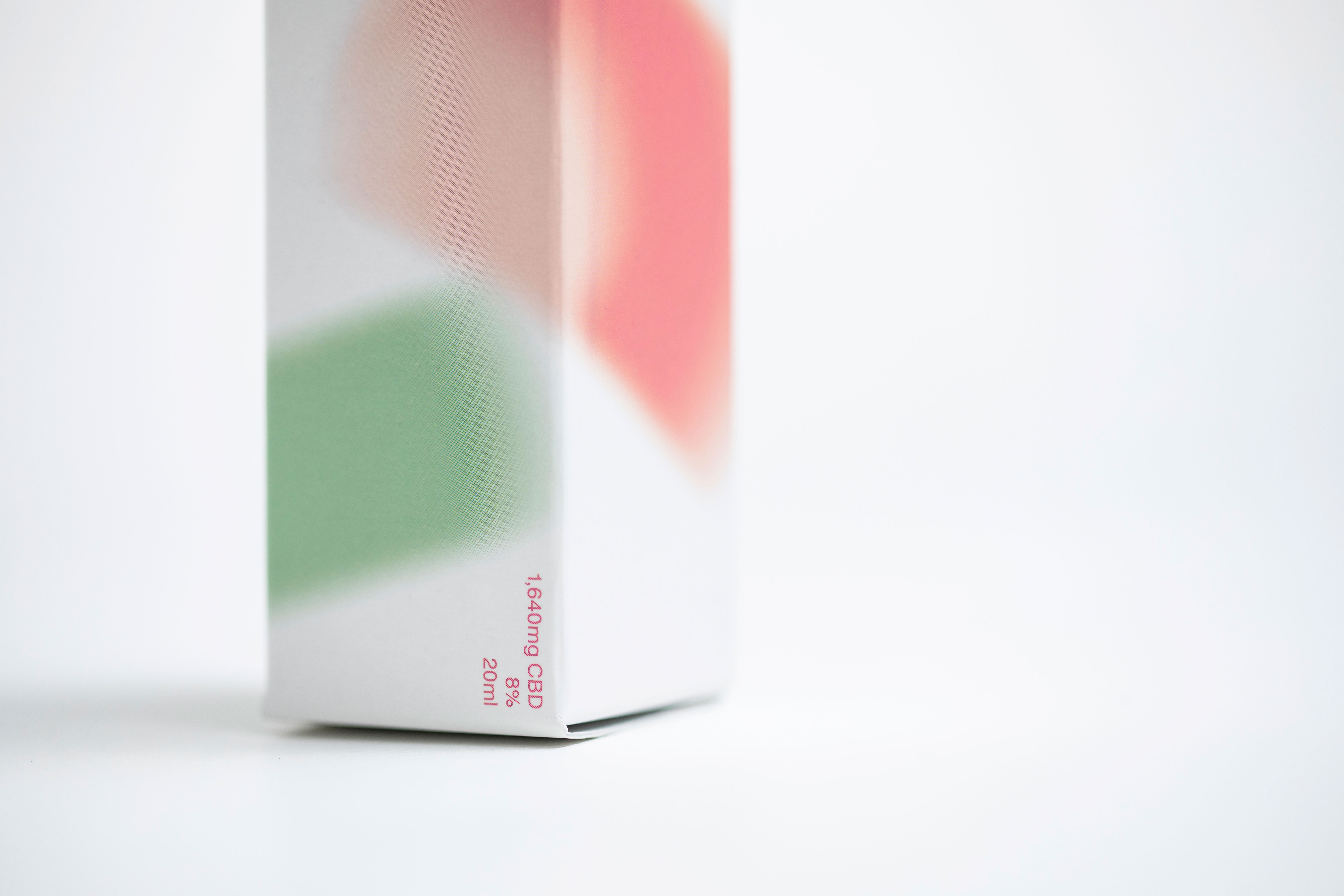 Package
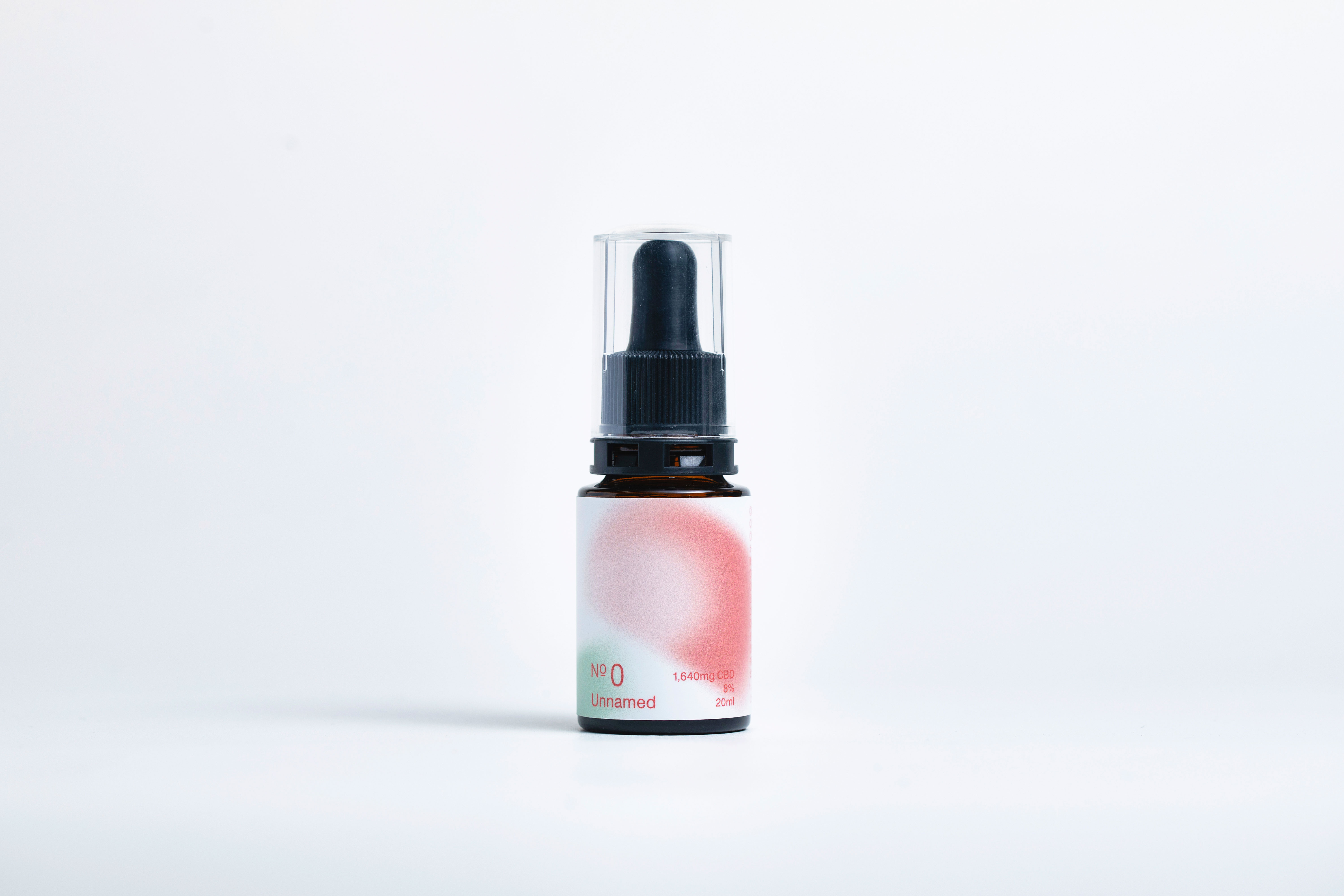
女性をメインターゲットに設定し、国内を拠点に各種酵素・サプリメントの開発・販売を行う企業の、オリジナルブランドにおけるパッケージデザインに携わった。
各サプリメントに共有する概念を抽出し、花びらや光を連想させるモチーフを中心に、有機的で淑やか、柔らかさやぬくもりを体現したパッケージデザインに仕上げた。その佇まいから、内面から静かに活力が湧き上がるトーンを狙っている。加え、ブランドカラーとして「Scarlet(スカーレット)」を新たに設定し、商品個別の識別カラーと併用し、各パッケージに用いることで変化の中にブランドとし ての統一感を持たせた。また、有機的なパッケージデザインとは対照的に、数字のラベリングを基本とした商品名とすることで、シリーズとしての一体感を目指すとともに、甘くなりすぎない専門的なトーンを残した。
サプリメントと暮らしの新たな関係性を考え、体現したパッケージデザインに仕上がった。
This package design project is for Nº0, an original brand who develops and sells various enzyme products and supplements, which are targeted female consumers.
We extracted the ideas underling all the supplements and created a series of package designs that embody something organic, grace, gentleness and warmth using motifs which remind us of petals or lights. It was our aim to create an appearance from which energy seems to spring out quietly. In addition, scarlet was chosen as the brand colour. Used with identification colours for individual products, it gives the standardised image to the whole series. Also, simple numbering system, which makes a good contrast with the organic look on the package, is used as the product names so it can give the feeling of unity and sense of professionalism to the entire series.
The package design encapsulate a new relationship between supplement and our life.