FUTABA SHOKAI DENTAL TECHNOLOGIST
- Client :
FUTABA SHOKAI DENTAL TECHNOLOGIST
- Term :
- 2020
- Works :
- Ci/Vi/BiGraphics
 Ci/Vi/Bi
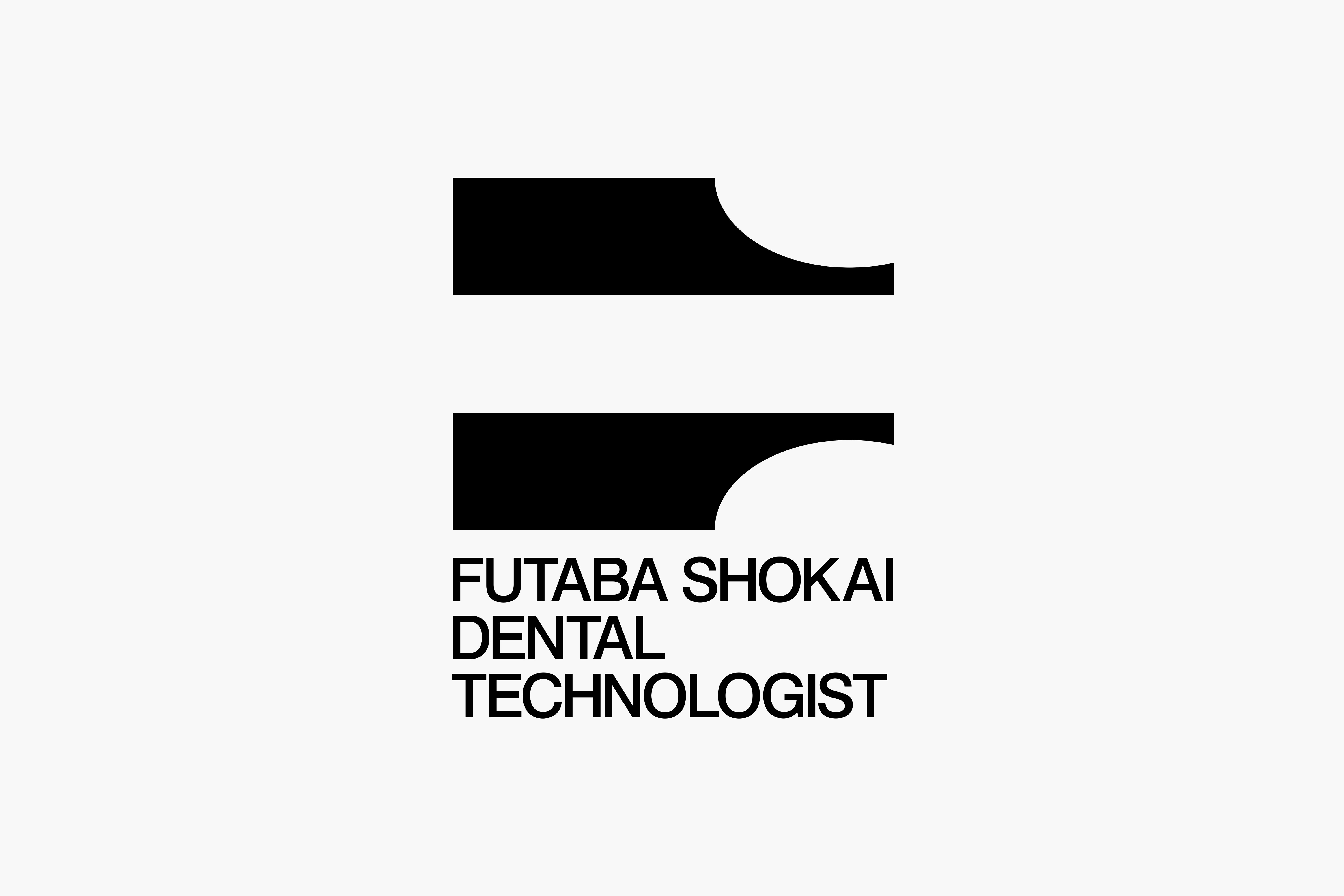 Ci/Vi/Bi
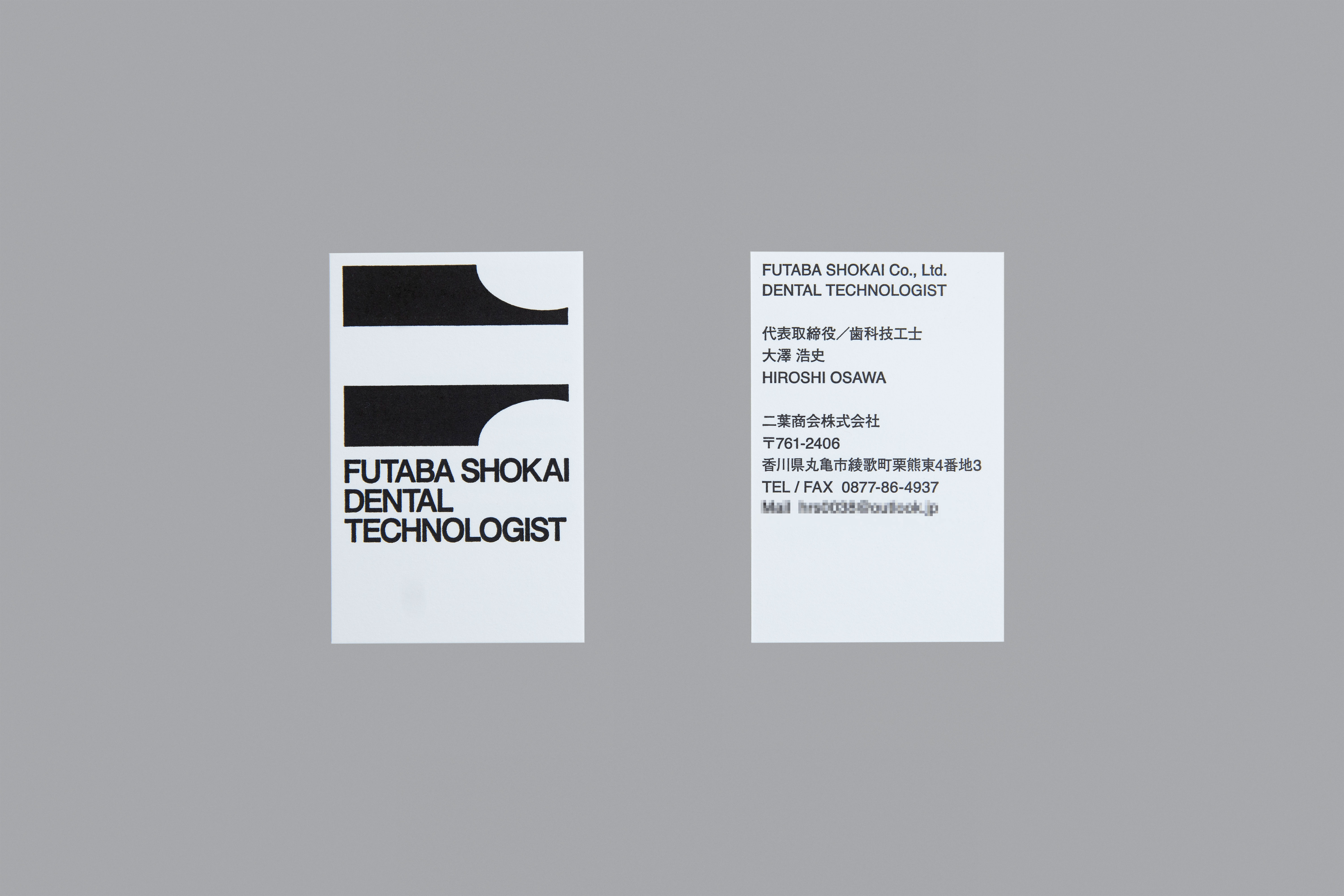 Business Card
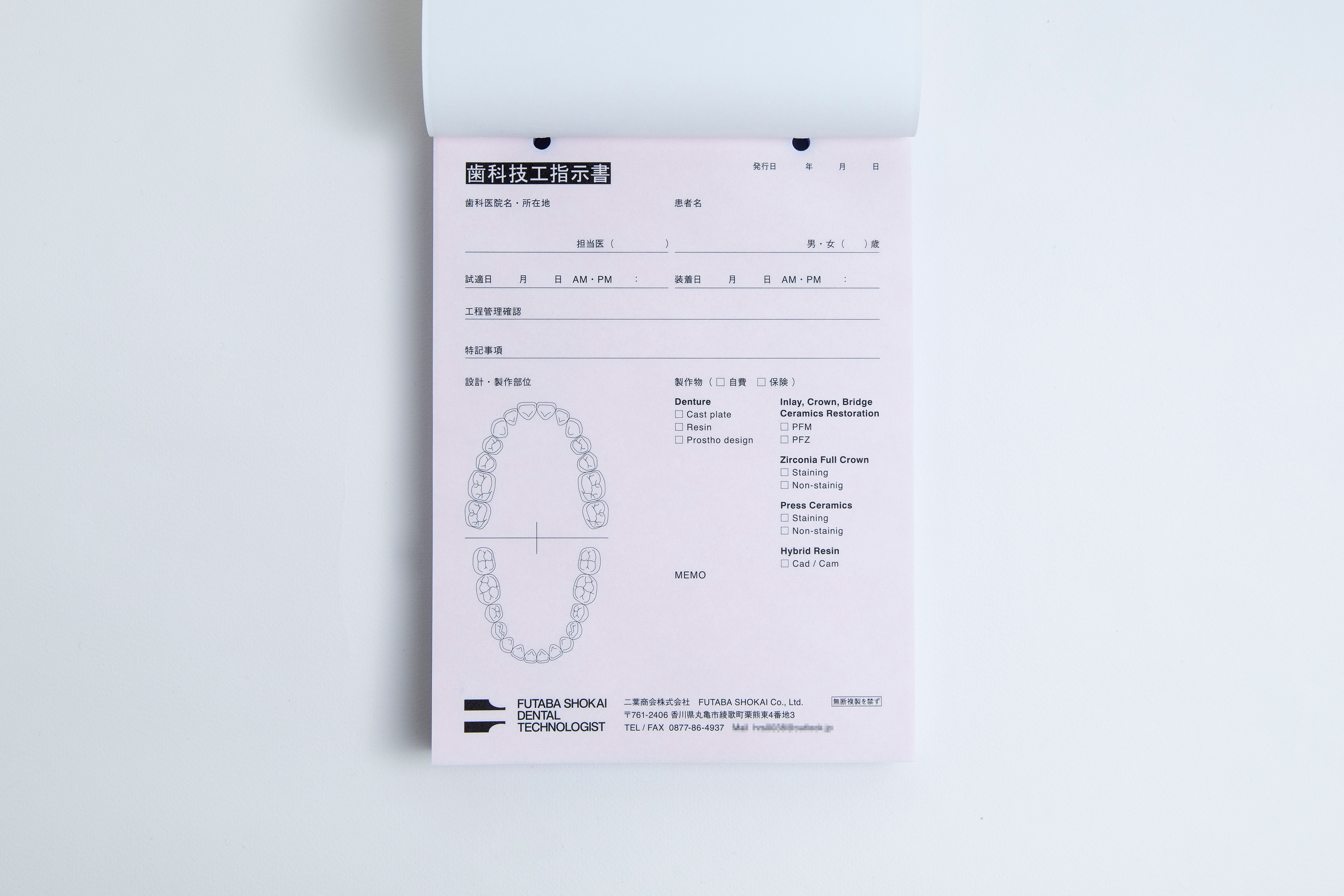 Business Tool
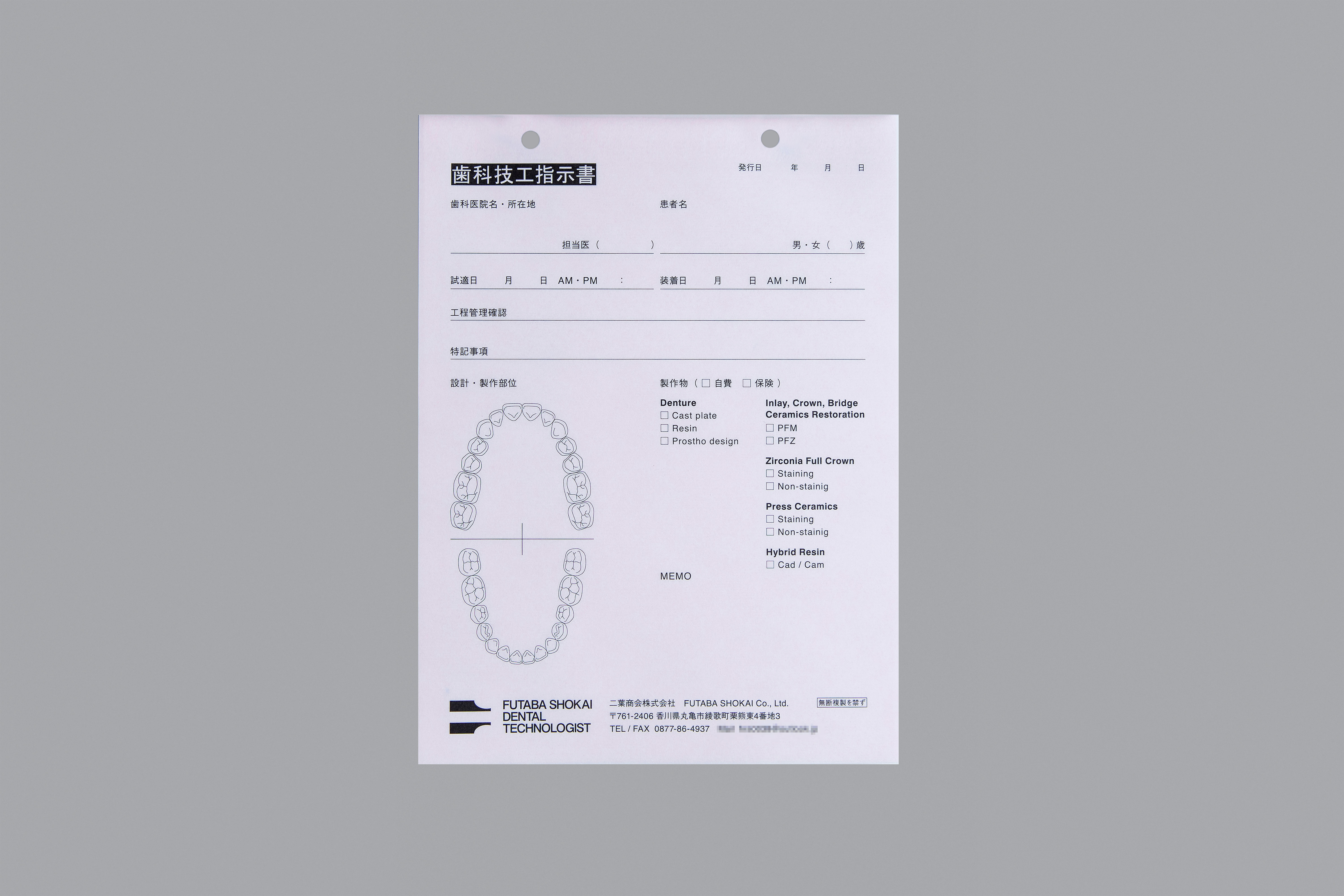 Business Tool
香川・丸亀で歯科技工士として、歯科治療における矯正器具などの製作を行う歯科技工 二葉商会。法人化に伴い、ロゴマークと各種ツール類の制作に携わった。
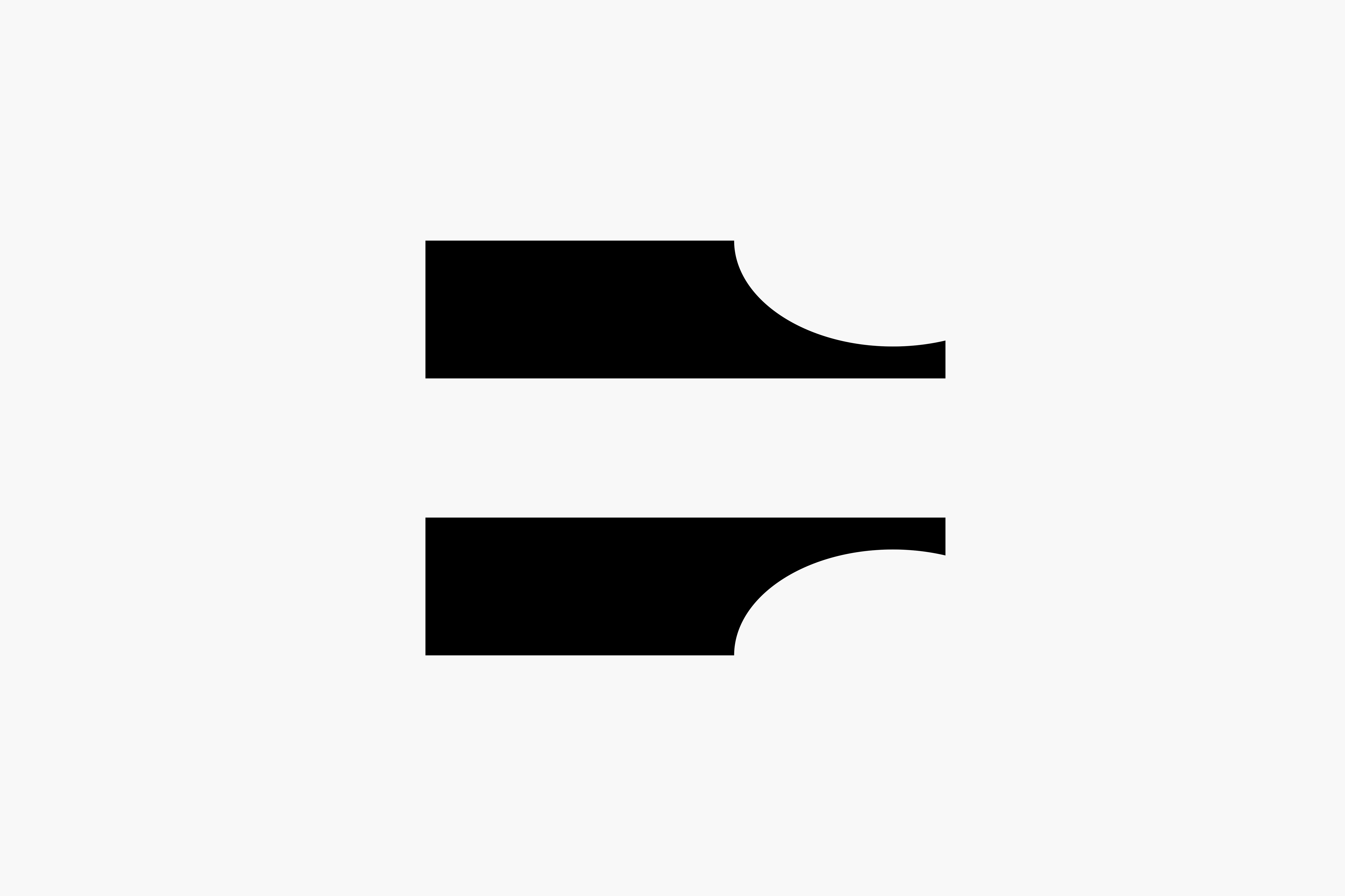
対応分野の広さや精度、技術力をベースに、歯科医師からの信頼も厚い企業であることを、抑制の効いたデザインで表現した。ロゴマークは、企業名の頭文字である「二」と専門具である技工ノギスをモチーフにシンボル化している。正確で技術力の高さを感じさせるよう、甘くなりすぎない緊張感を残したトーンに仕上げた。メインカラーであるブラックは、技工士としての姿勢を表すと同時に、普遍的なイメージを付加している。また、付随するツールである名刺や歯科技工指示書についても、同様の香りが漂うデザインに仕上げたニ葉商会印刷方法や仕様含め、簡素で機能を重視した業務的な顔つきとすることで、当社の姿勢や温度を感じられるデザインとした。
This is a design project to create the logo and promotion tools for Futaba Shokai, a dental technician firm based in Marugame, Kagawa. This project was a part of their incorporation process.
The logo with a disciplined design conveys the fact that the firm has been relied upon by many dentists because of the width of areas they can deal with, accuracy, and technical skills. In the logo, two motives; the first Japanese character ‘二’ of the name of the company ‘ニ葉商会’ and the shape of the specialist tool venire calipers, are symbolized. In order for it to embody the precision and sophistication of their techniques, we tried to maintain a hint of tension in it. The theme colour is black which demonstrates their attitudes as dental technicians and adds a universal image to the design. Also, the promotional tools like business cards and the dental lab order form are finished with the similar taste. While maintaining a practical visual with a focus on the simplicity and functionality which was created by specific printing method and specifications, the design expresses the stand point and amount of dedication.