yae shokudo
- Client :
- yae shokudo
- Term :
- 2021
- Works :
- BrandingCi/Vi/BiPackage/ProductsGraphics
 Ci/Vi/Bi
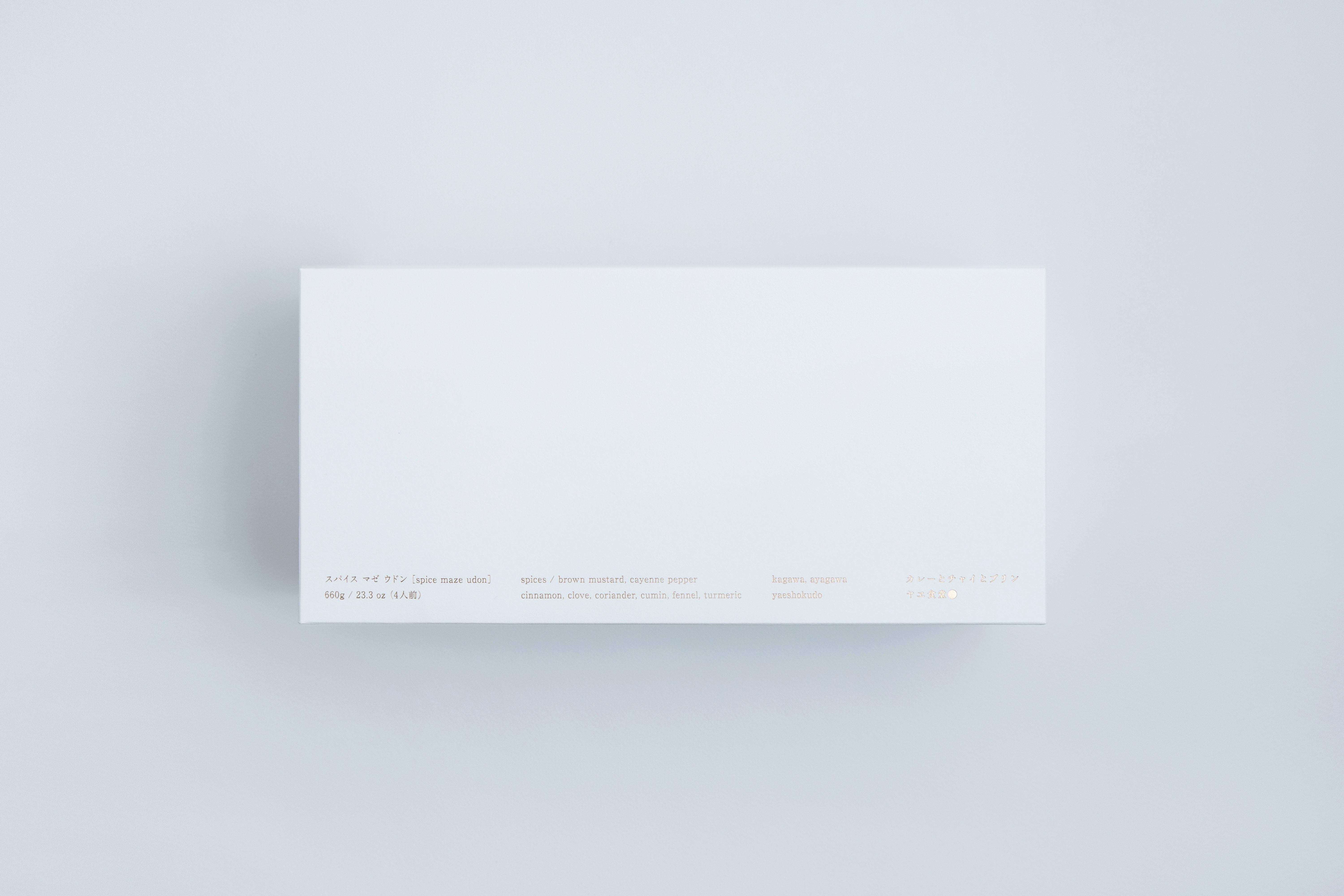 Package
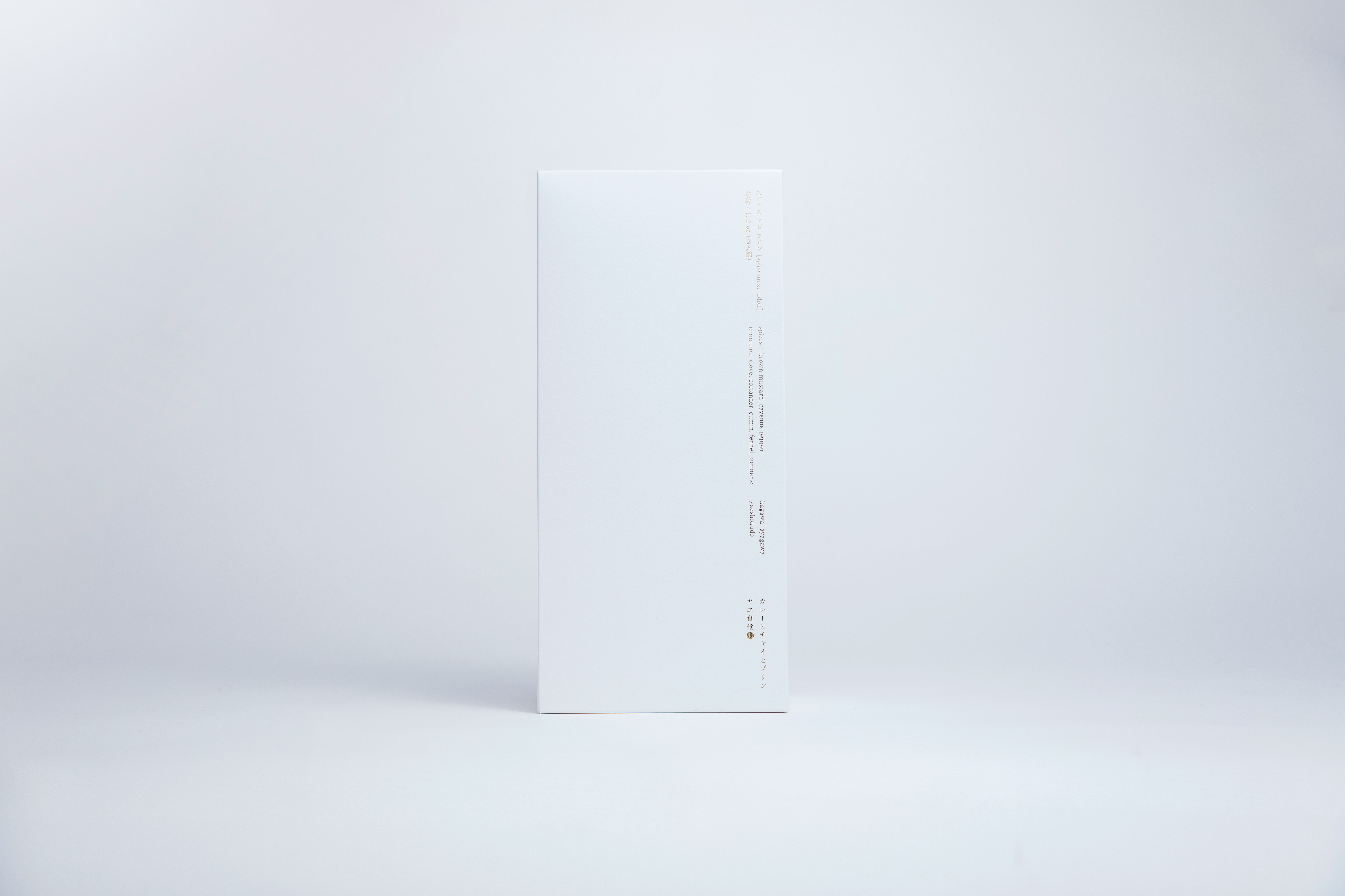 Package
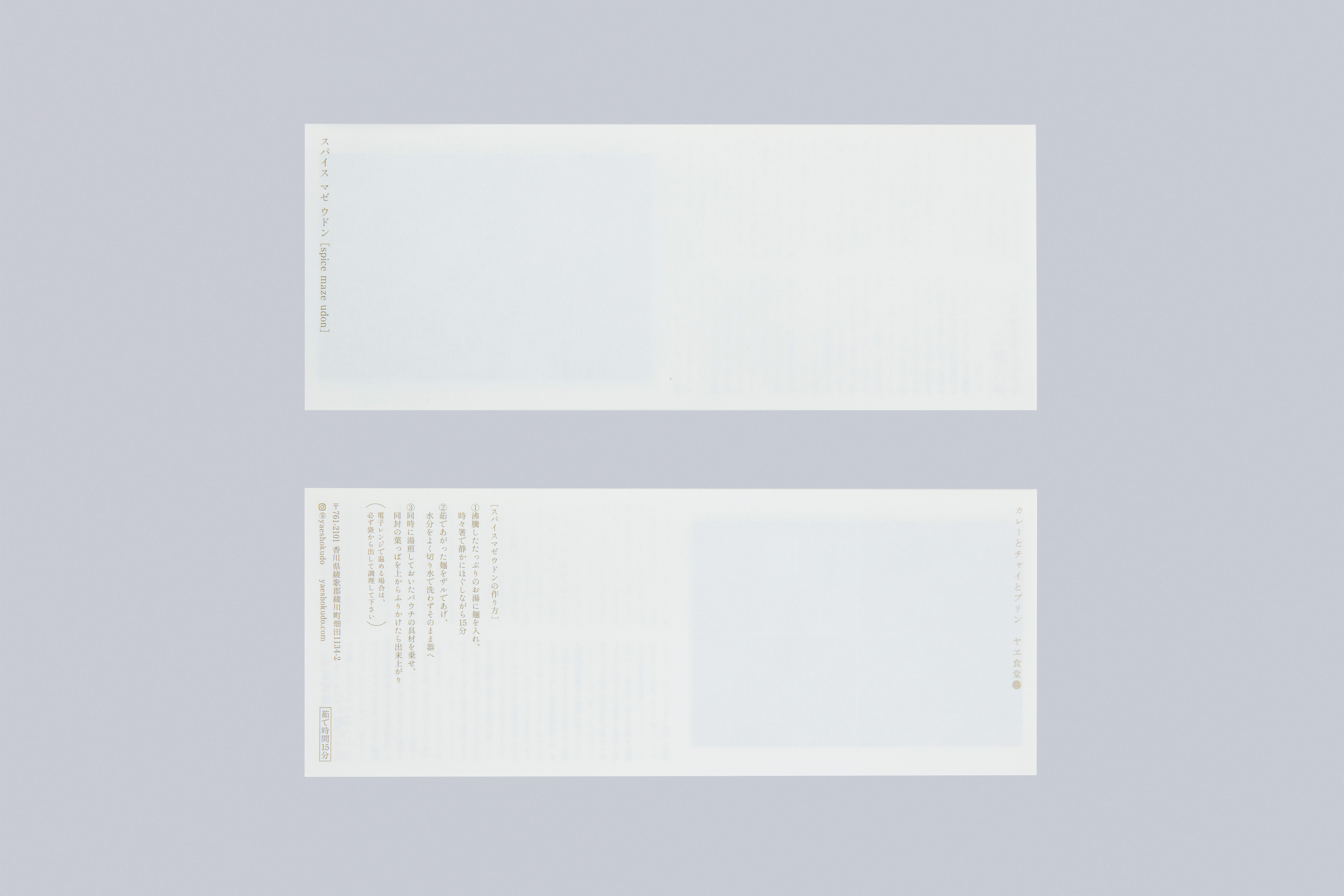 Leaflet
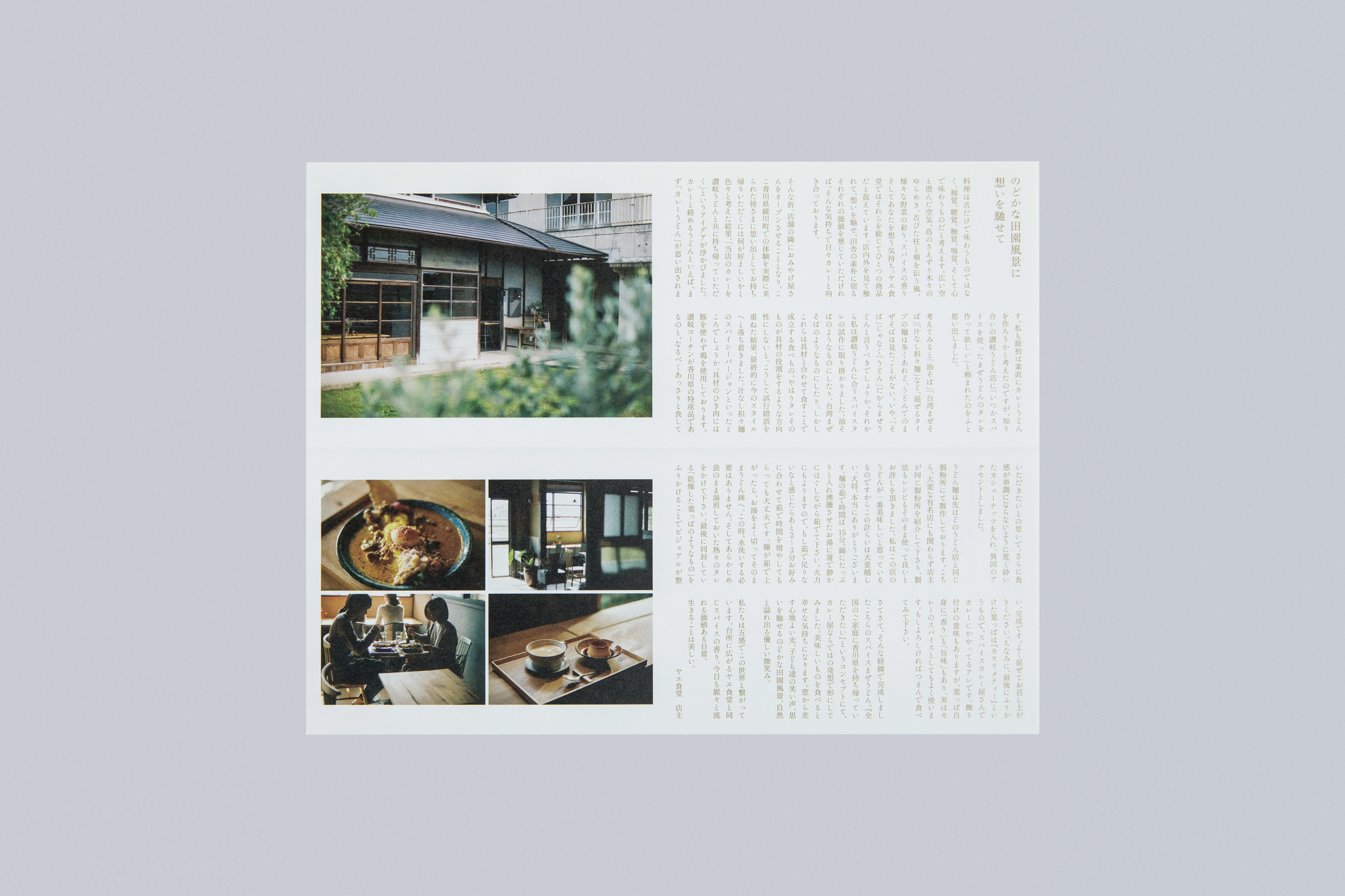 Leaflet
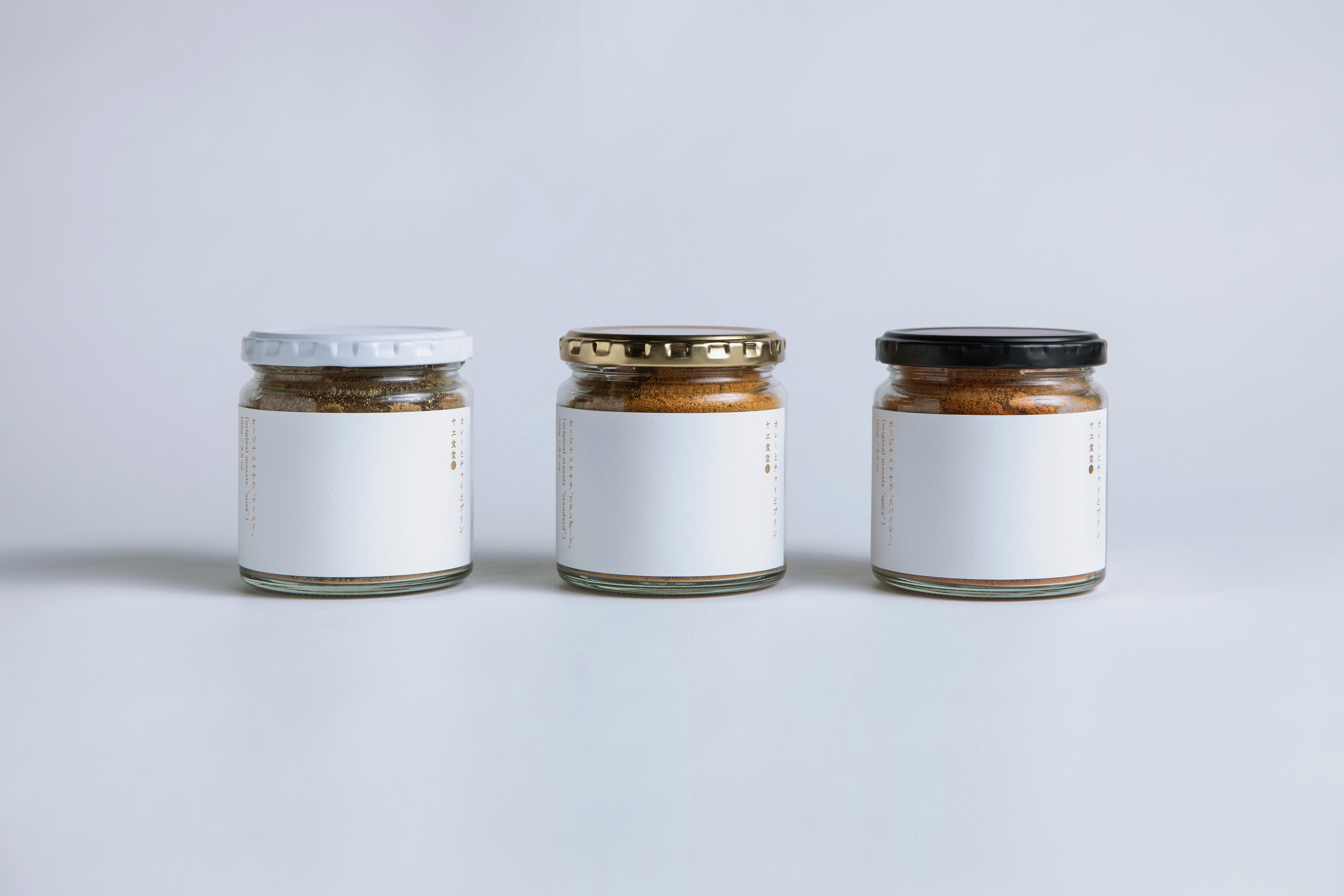 Package
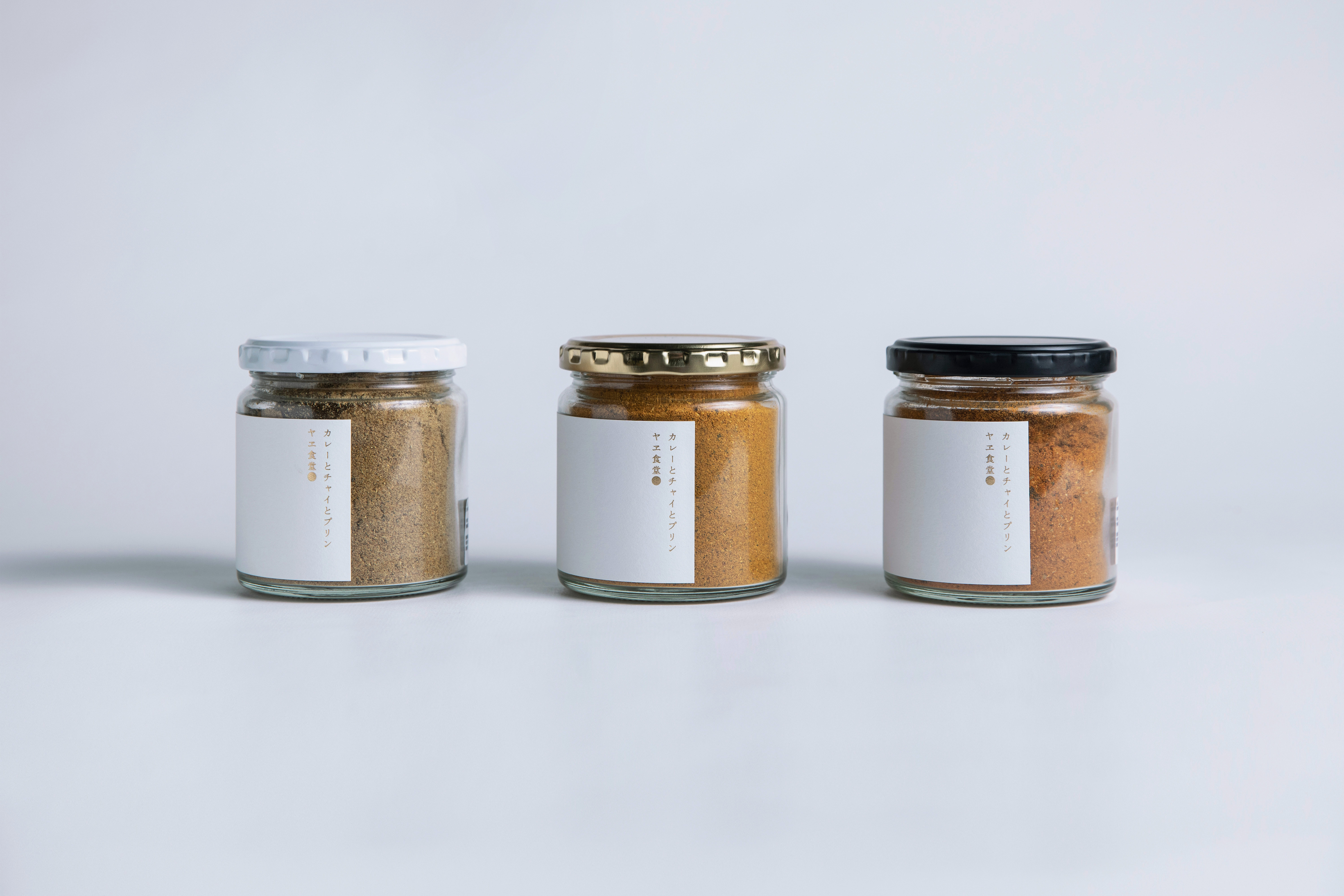 Package
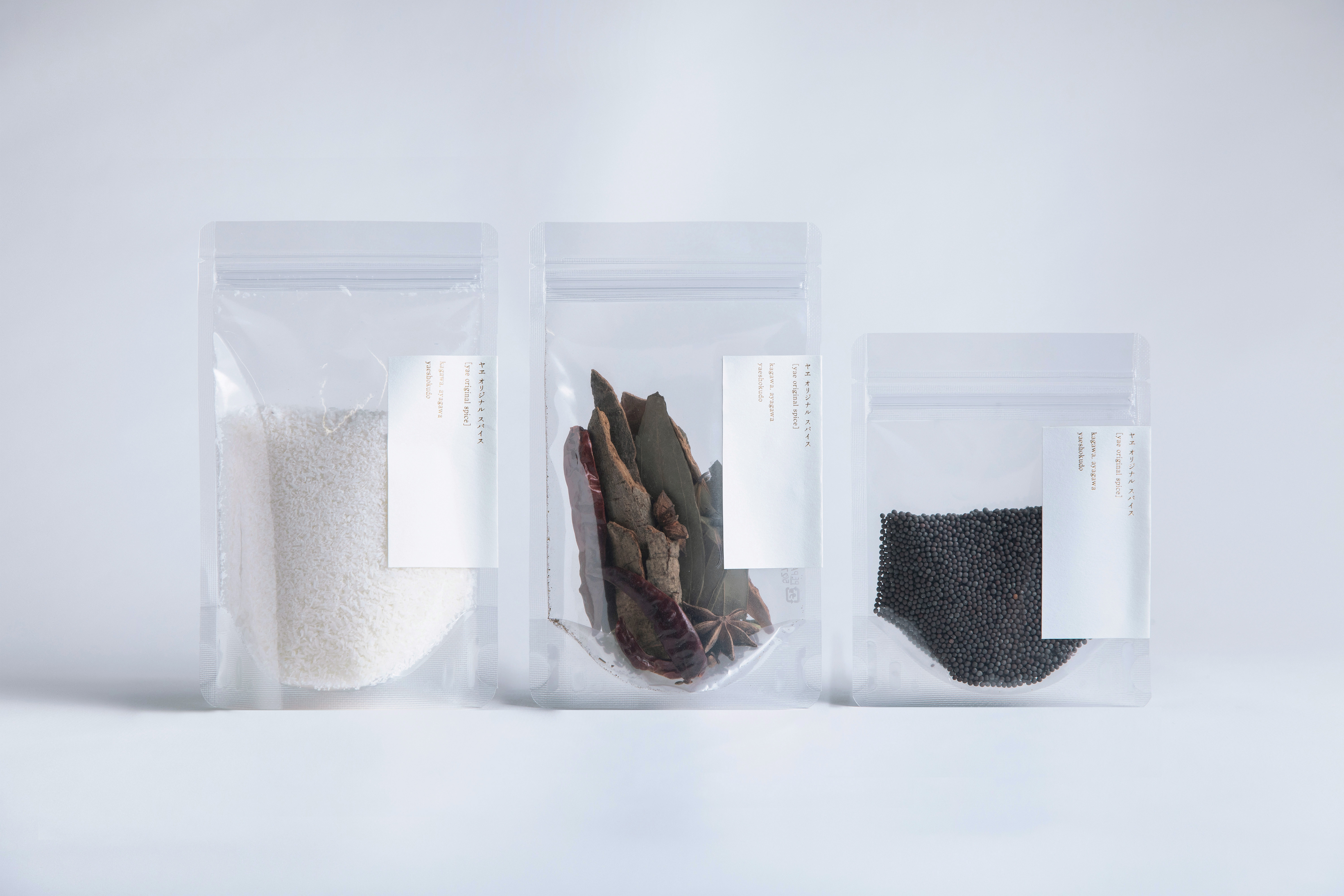 Package
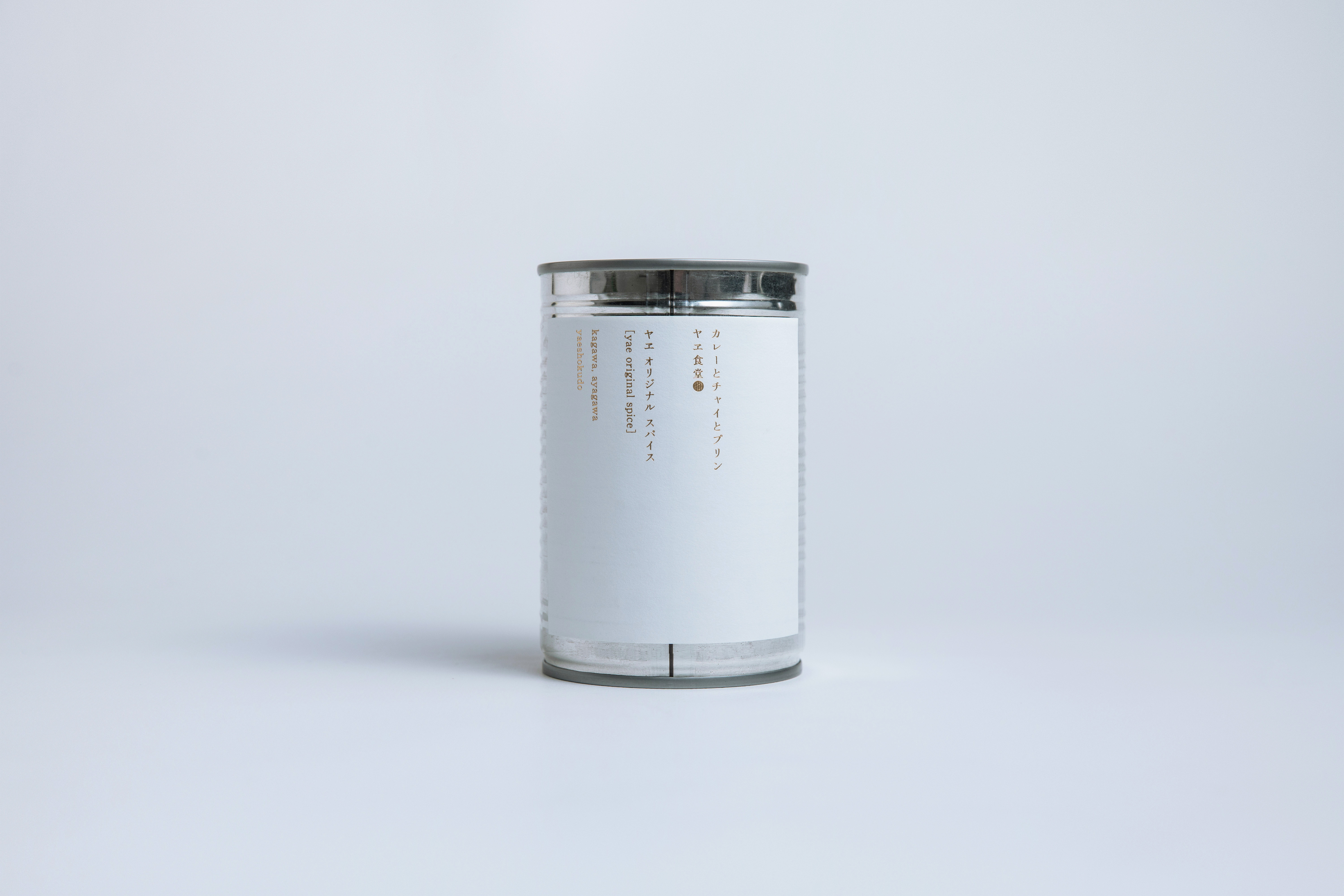 Package
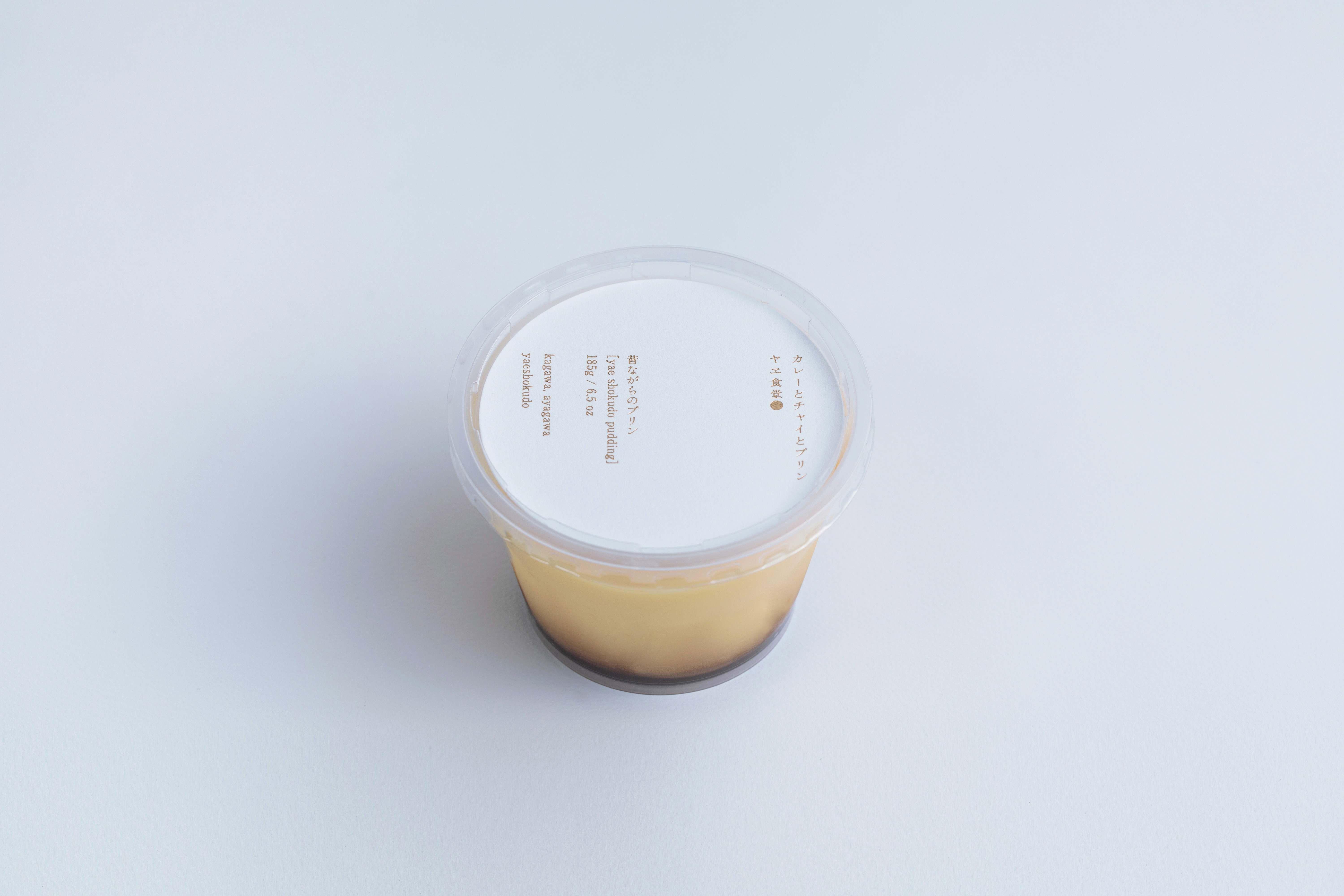 Package
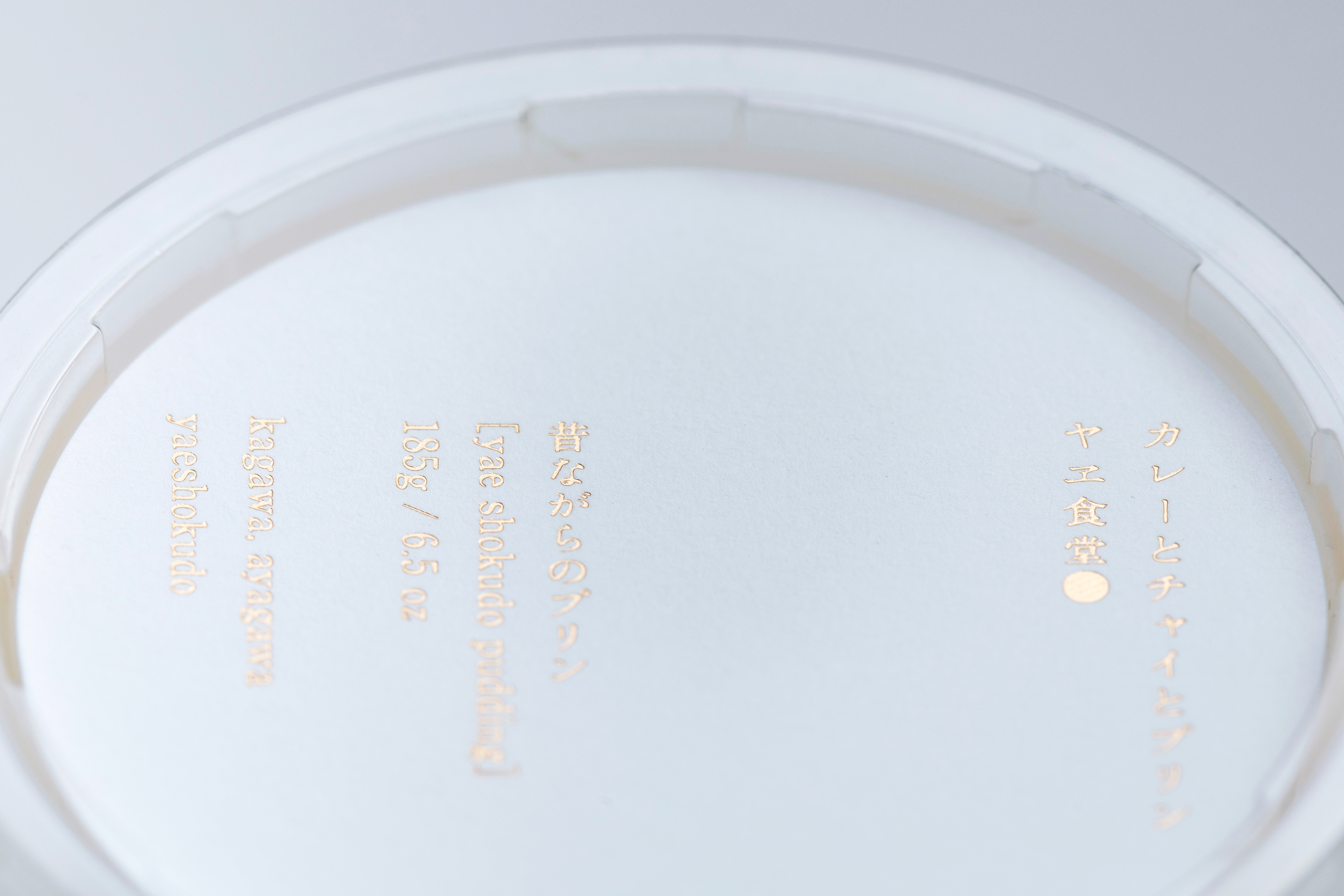 Package
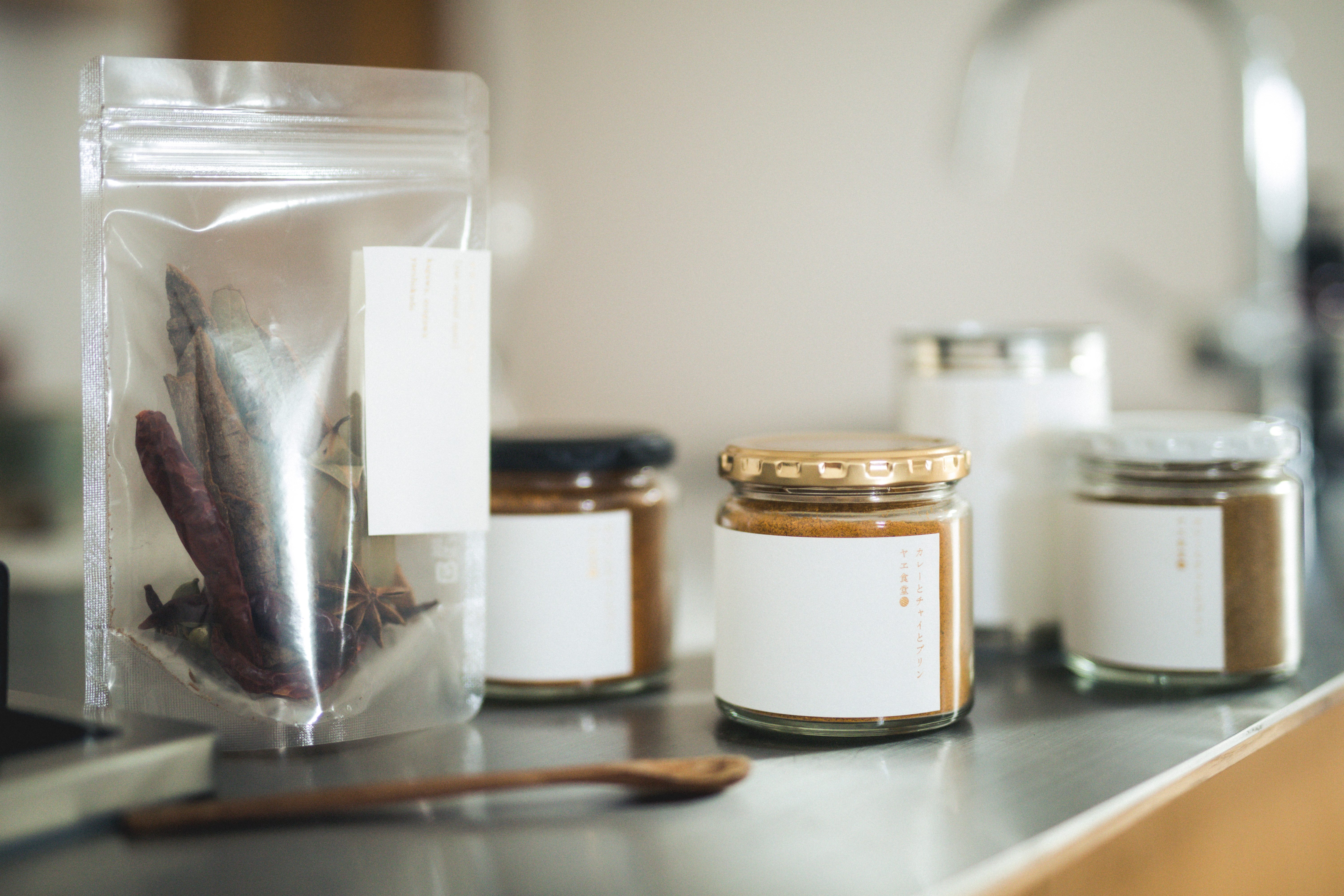 Package
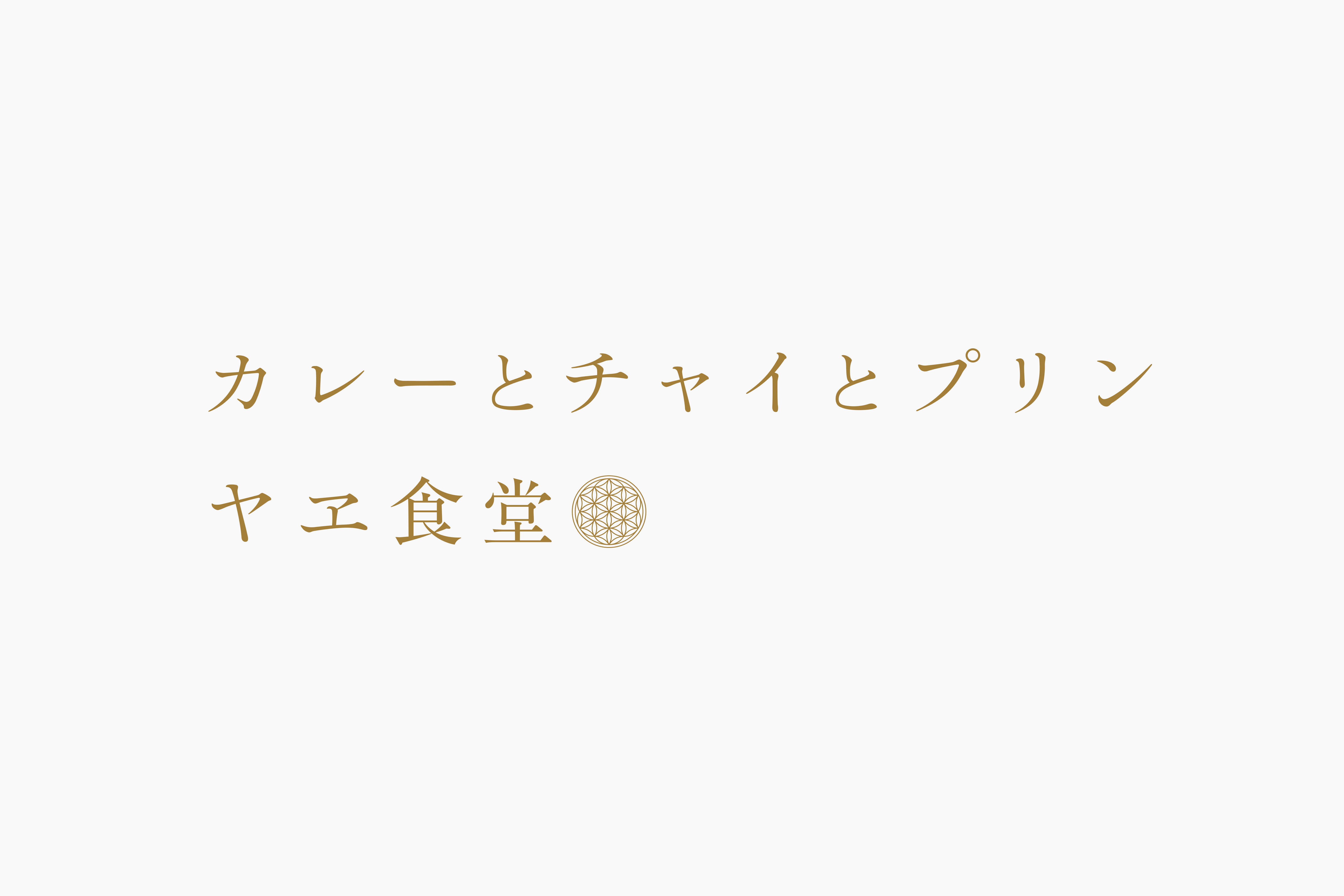
築100年の古民家を改築した、香川県綾川町にあるカレーとチャイとプリンのお店「ヤエ食堂」。営業再開に際し、統一されていなかったロゴタイプの整備と各種オリジナル商品のパッケージデザインに携わった。
神聖幾何学模様である“フラワー・オブ・ライフ“をベースとした既存ロゴマーク。まずはそれに対応するロゴタイプの開発から始めた。普遍性のあるニュートラルな書体を基本としながらも、活字書体や旧字体を用いるなど、無機質な中にぬくもりを感じる表現を目指した。また各種パッケージでは、抑揚を抑えた余白あるデザインとし、現代に即した日本的な佇まいを目指した。丁寧に料理・選定された商品の魅力を代弁するかのように、風合いのある用紙に金箔押しとし、品のある顔つきに仕上げた。
店主がこの地に感じる「何もないがここにある」という想いに沿うように、五感で感じるデザインが仕上がった。
A 100-years old kominka house in Ayagawa-cho, Kagawa, has been renovated into a restaurant, Yae shokudo which specialises in curry, chai and crème caramel.
At the time of its reopening, we embarked on the renewal of the logotype which would accompany the existing logo based on the Flower of Life, the sacred geometry pattern. We began with the development of neutral and universal typeface correspondent with it. In order to achieve an expression with a sense of warmth in the simplicity, moveable type or old character form were used.
Controlled design with abundant blank space and minimum inflection for the packages resulted in a typically Japanese atmosphere with a touch of modern feel. The elegant look created by gold foil stamping on textured paper speaks for the appeal of the carefully selected and cooked food products.
We are glad that we arrived at designs that can be appreciated fully with your five senses and are in line with the owner’s view of the location, ‘the nothing doesn’t mean nothing’