Tensaitou
- Client :
- Tensaitou
- Term :
- 2018
- Works :
- BrandingCi/Vi/BiGraphicsWebSpace
 Ci/Vi/Bi
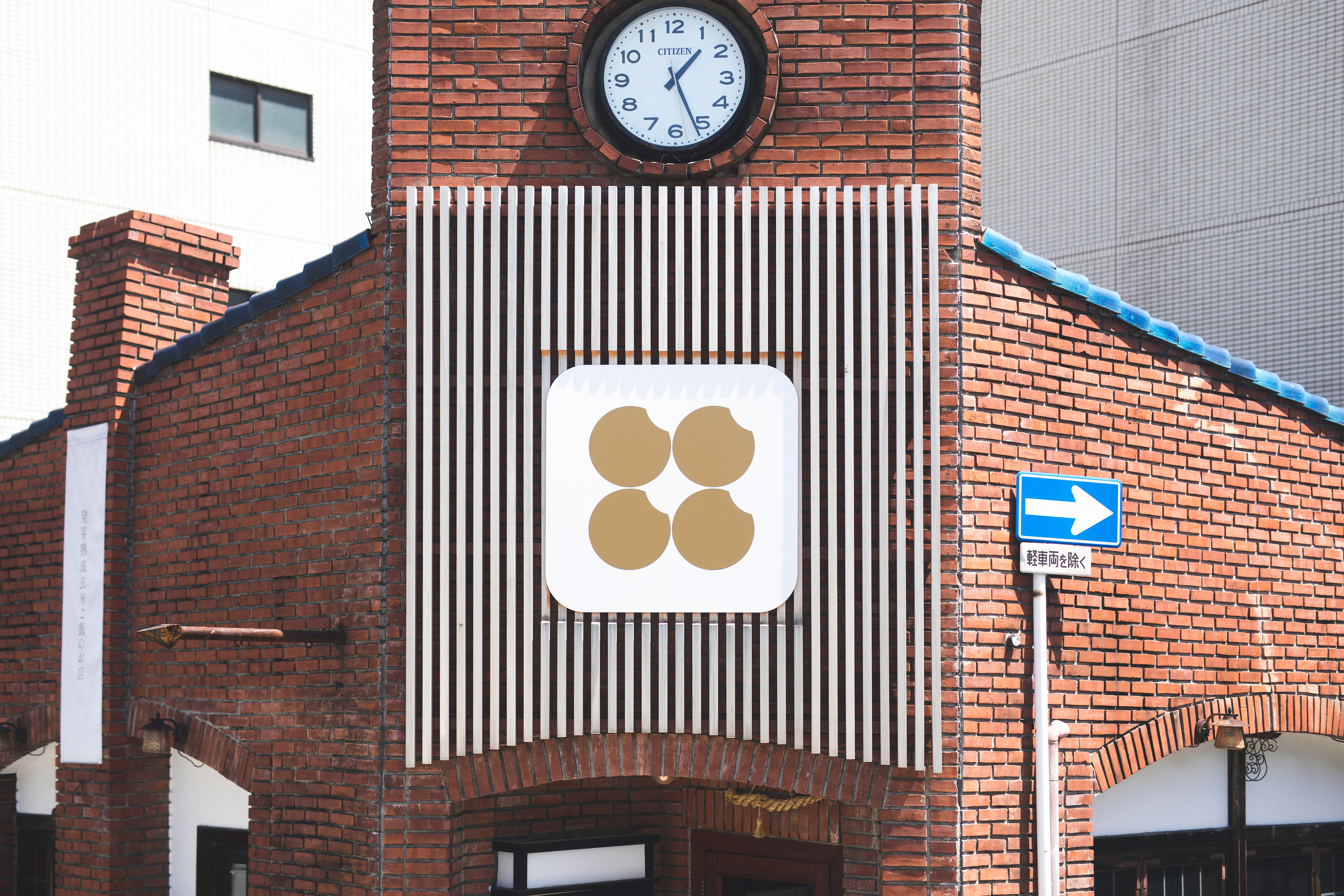 Sign
Sign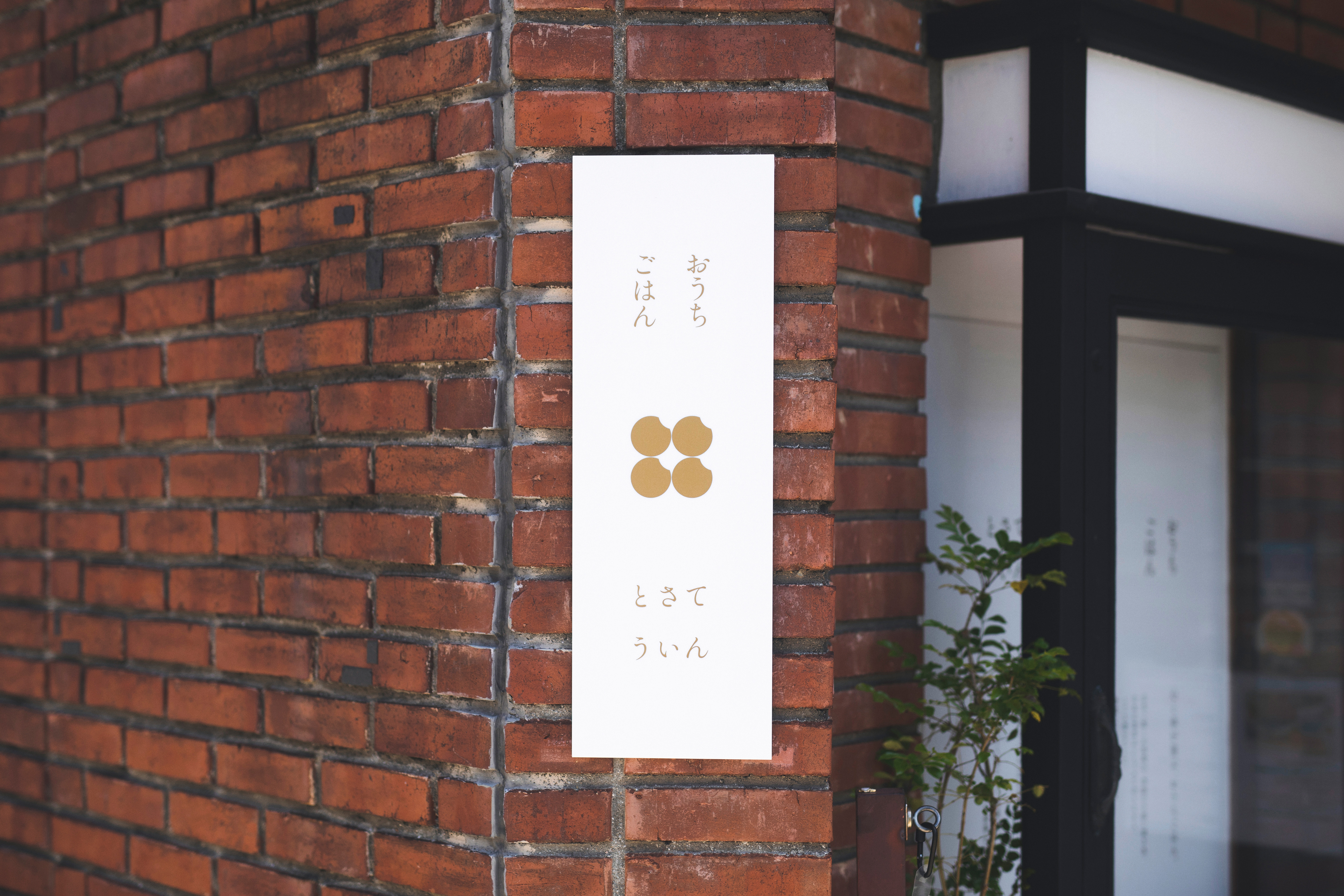 Sign
Sign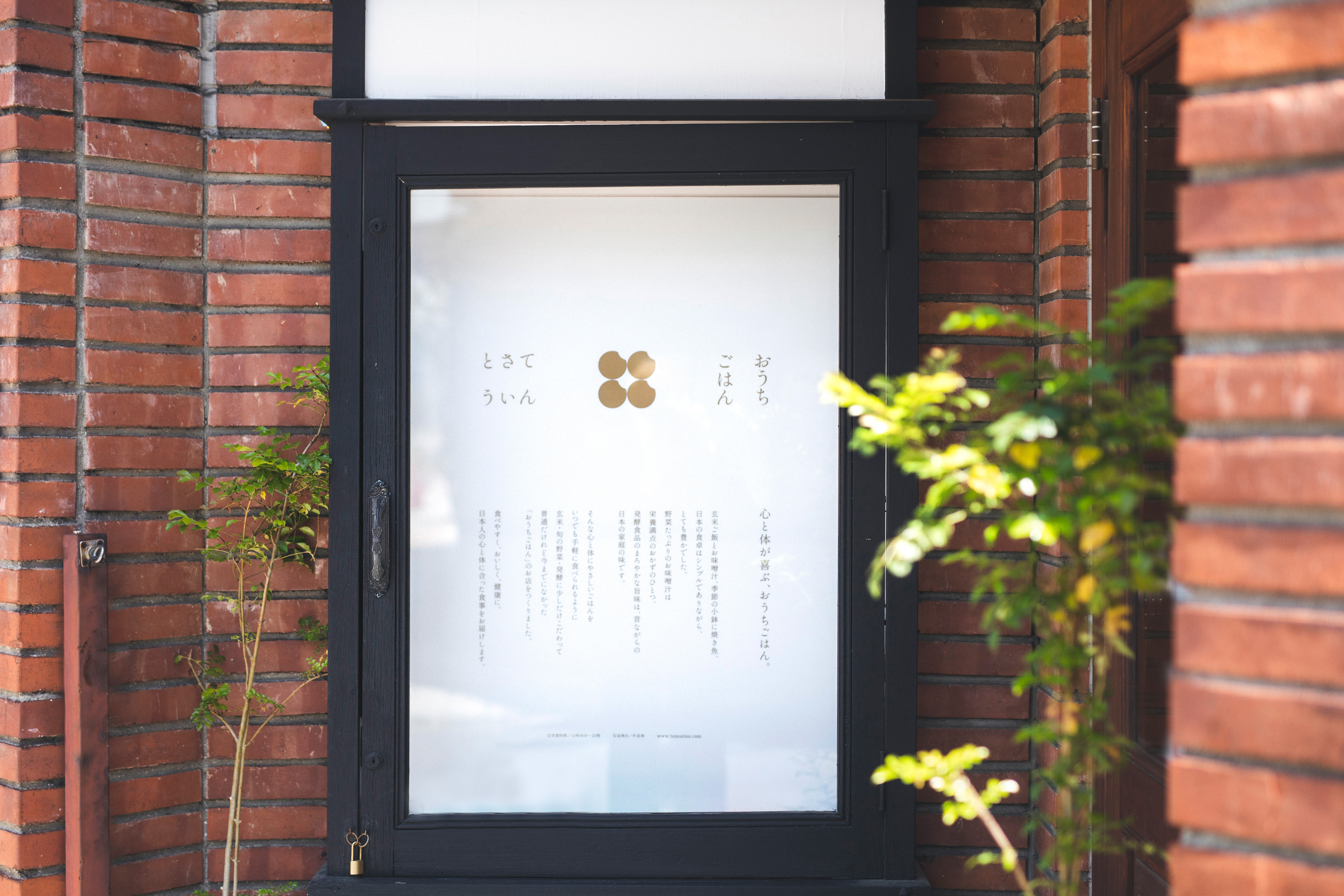 Sign
Sign-
 Web
Web
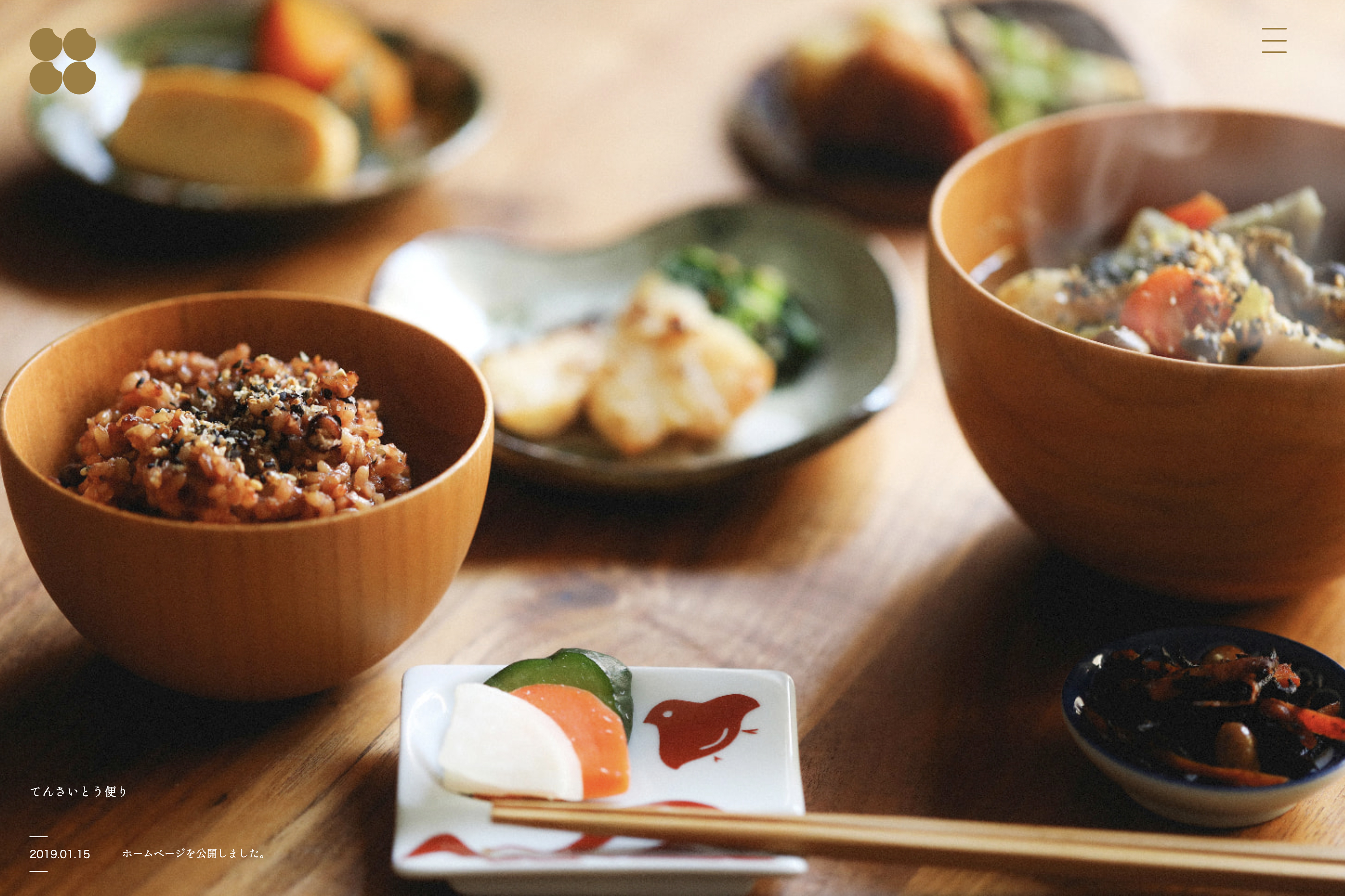
食べやすく、おいしく、健康に。日本人の心と体に合った食事を届ける「おうちごはん てんさいとう」。日本的でありがらも、伝統的な格式の高い食事ではなく、誰からも愛されるおうちごはん。シンプルでありながら豊かな「日本の食卓」がコンセプトの軸となった。
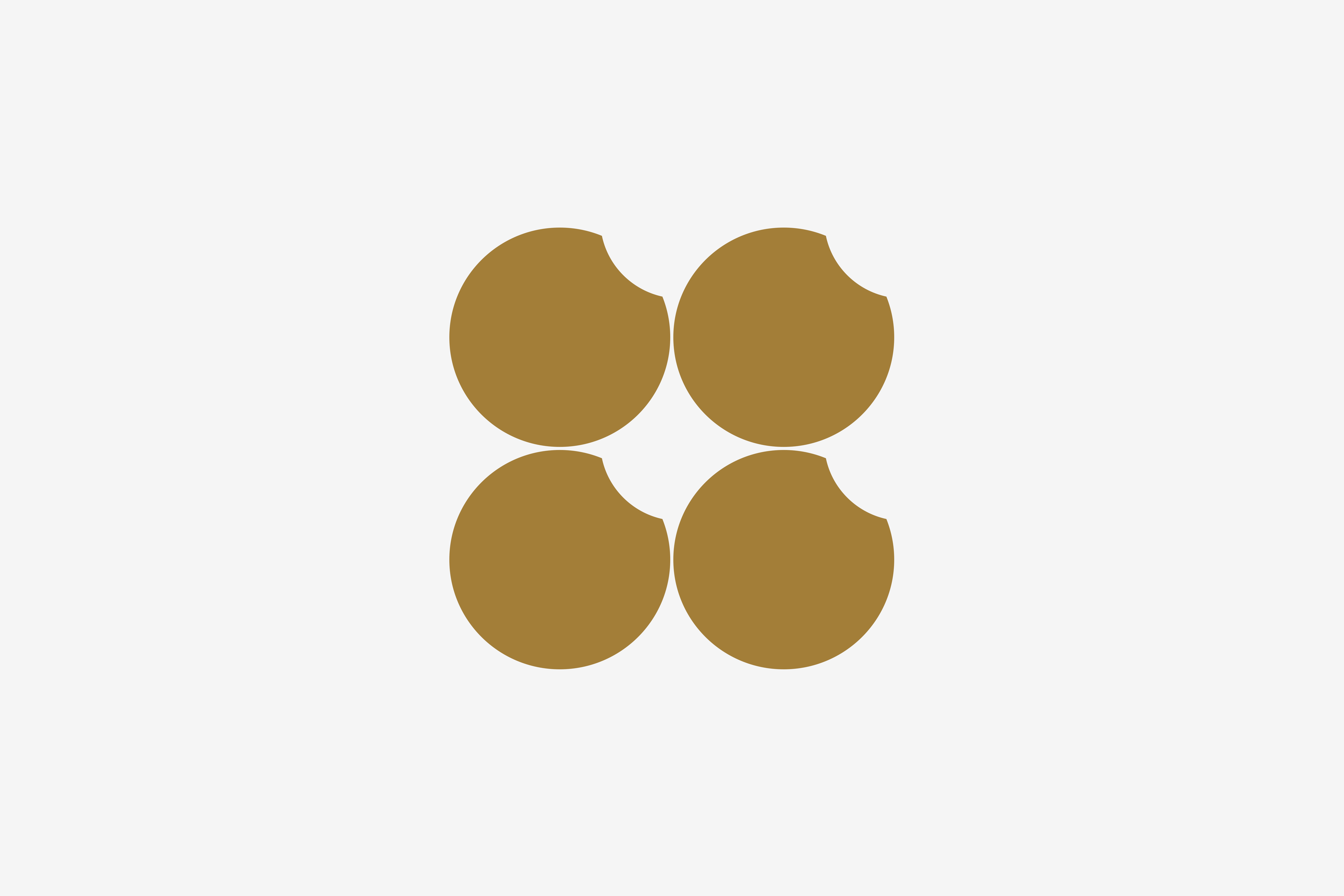
そこで当店の強みである発芽熟成玄米をストレートにロゴマークに落とし込んだ。4つの米粒で構成されたシンボルは、てんさいとうの「てん(十)」をも内包している。また、豊穣や米俵、玄米をイメージさせる金色をメインカラーに設定した。各種ツールに対しても大きめのサイズ感で配置することにより、店舗と訪れる人との適度な距離感を意識したデザインとした。日本の食卓にある団欒風景を残しながら、どこか新しさを感じさせる、幅広い年齢層に愛される店舗となった。
Home cooking Tensaitou is a food delivery service, who delivers tasty and healthy meals suitable for body and mind of Japanese people. The company offers Japanese home cooking everyone loves, not traditional or too prestigious meals. The concept of simple yet plentiful Japanese dining is the core to the designs.
Shape of sprouted mature brown rice is directly apppied to the logo design. The symbol consists of four grains of rice also implies the shape of ten (十). Gold that reminds us of good harvest, straw rice bag and brown rice, is designated as the main colour. We laid out largeish elements for various promotional tools in a hope for the design to keep an appropriate distance between the shop and the shoppers. Maintaining the feeling of family sitting in a circle and enjoying conversation, the design also has a subtle modern feeling as well. The shop has already been loved by people of various ages.