Hatsuyukihai -Mon-
- Client :
- Kyouwa Syuzou
- Term :
- 2019
- Works :
- Ci/Vi/BiPackage/ProductsGraphics
- Award :
- Graphic Design in Japan 2020 入選(JAGDA)
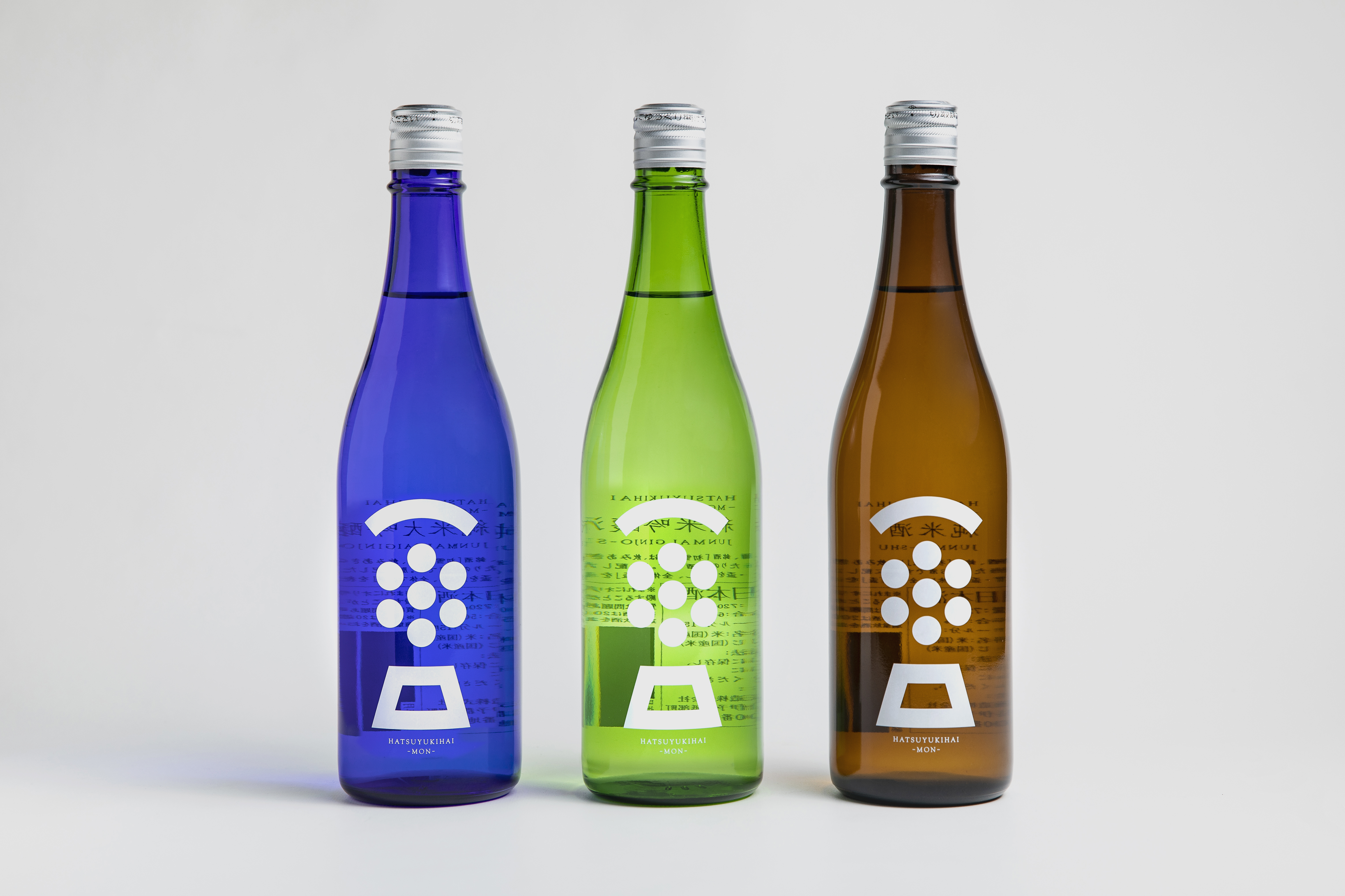 Bottle
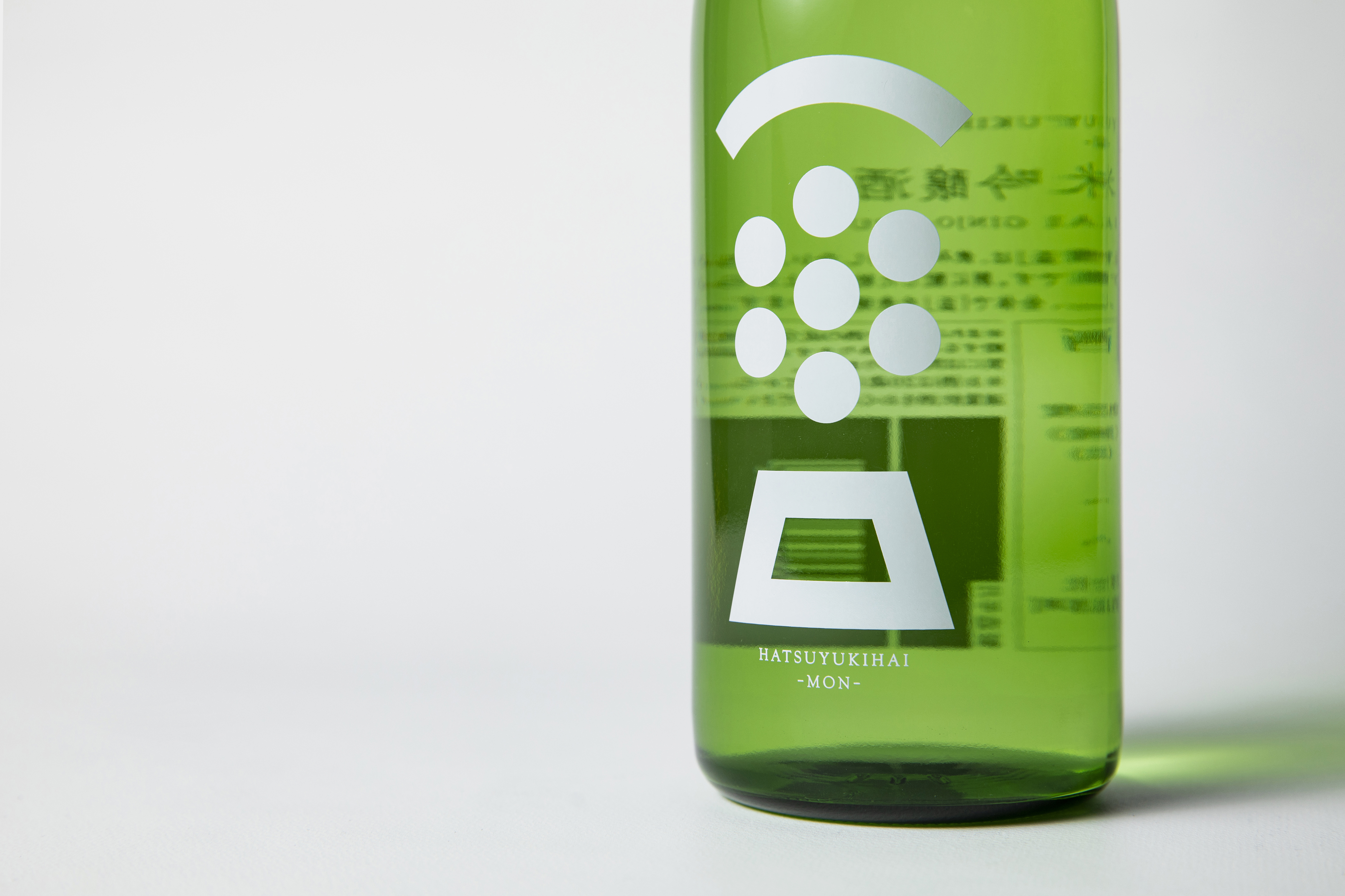 Bottle
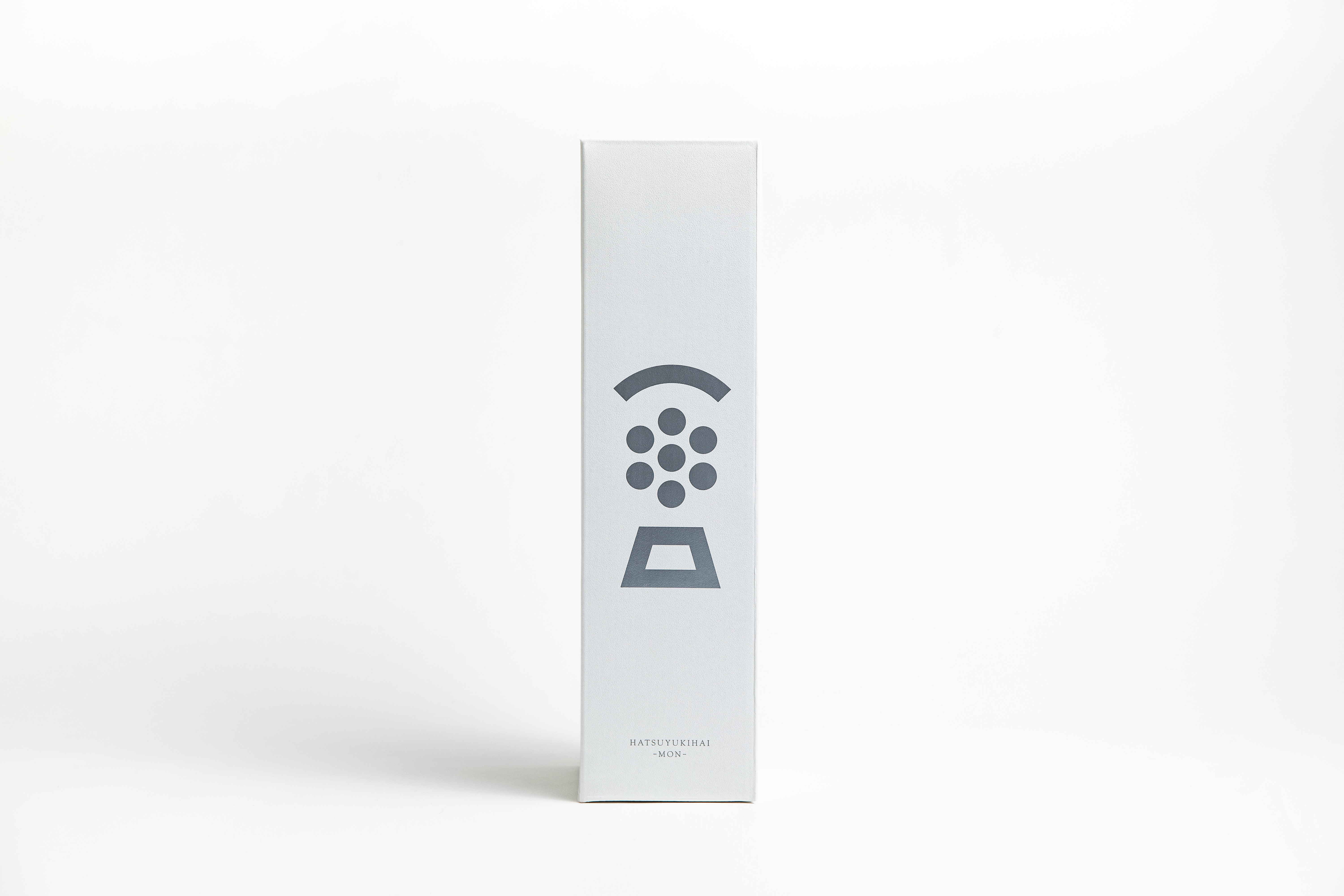 Box
Box
愛媛県の中予地方に位置する砥部町で、創業130年を迎える、水・米にこだわった実直な酒造りを続ける酒蔵「協和酒造」。県内酒造組合主催の事業を通じて、海外向け商品としてボトルデザインの刷新を行なった。
まずは杜氏交えながら、銘柄名の再考から始めた。これまでの伝統や紡いできたものを丁寧に紐解きながら、銘柄名を「HATSUYUKIHAI‐ MON‐ 」とし、新たな装いの制作がスタートした。ボトルデザインでは、当酒蔵が築き上げてきた歴史や“らしさ”を引き継ぎながらも新しい顔つきとなる表現を模索。検証を重ねながら、主要銘柄である初雪盃(はつゆきはい)の「初」「雪」「盃」を模したオリジナルの紋を制作した。またそれは同時に「盃(さかずき)」の一文字をも表現している。
海外に向けた出荷に端を発し、若年層や女性へ日本酒の魅力を知ってもらうきっかけとなる商品となった。
In Tobe Town located in the middle of Ehime, Kyowa Syuzou, a sake brewery who faithfully keeps producing sake using the best water and rice available, celebrates its 130th anniversary. As part of a project organised by Ehime Japanese Sake Association, we were involved in the renewal of the bottle design for overseas exports. We started with re-thinking the name of the product with Toji the chief brewer. Carefully tracing their tradition and what they have been weaving over the years, we gave the product a new name HATSUYUKIHAI‐MON‐. for the design of the bottles, we searched the way to give a new face inheriting the history and identity of the brewery. Eventually, original crests symbolised ‘hatsu (初)’ ‘yuki (雪)’ ‘hai (盃)’ respectively. The three combined the symbol forms the shape of the character ‘hai (盃)’. Initially targeted the overseas sales, this renewal also led to the recognition among young or female Japanese customers.