STROLL
- Client :
- STROLL
- Term :
- 2017-
- Works :
- BrandingCi/Vi/BiGraphicsWeb
 Ci/Vi/Bi
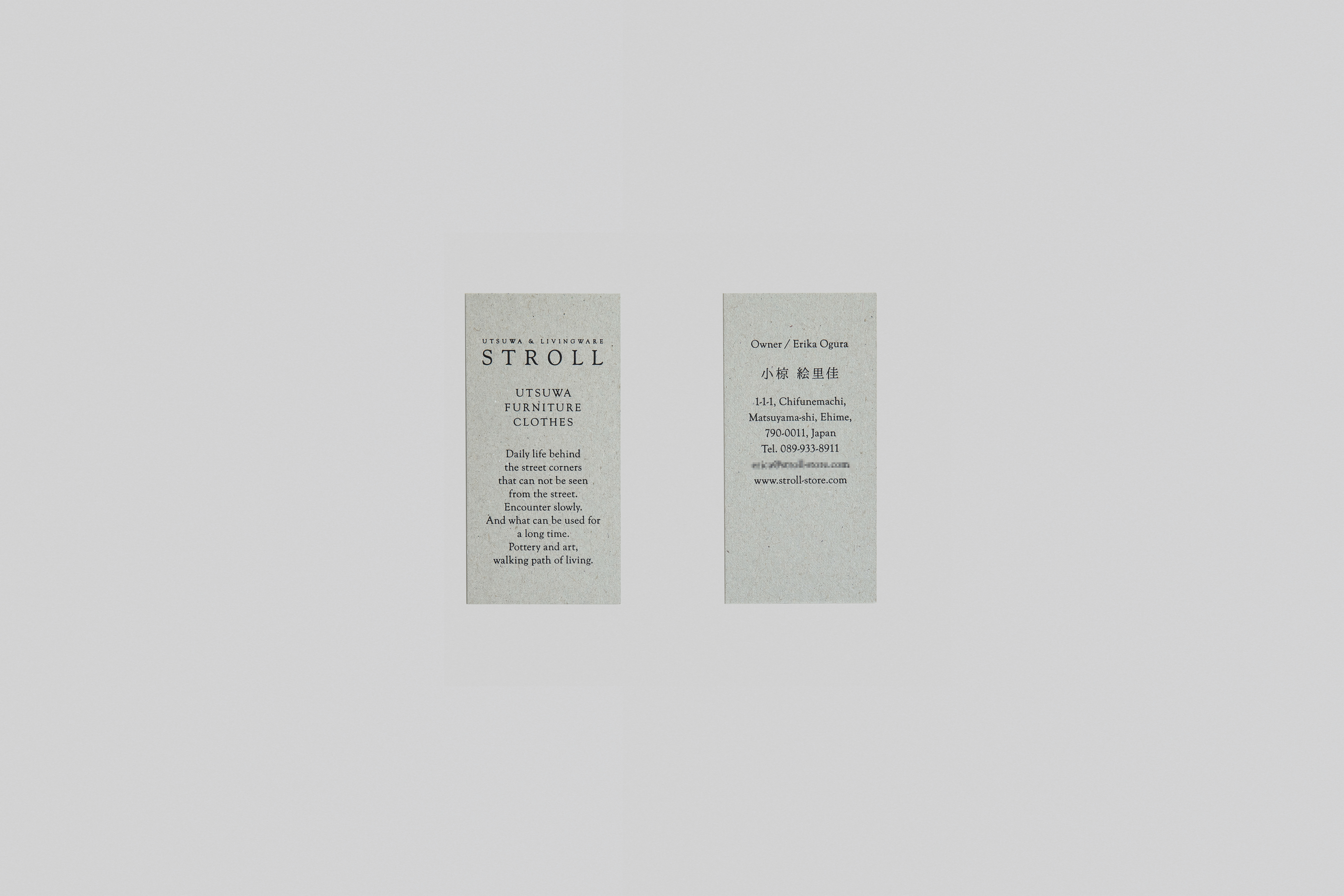 Businesscard
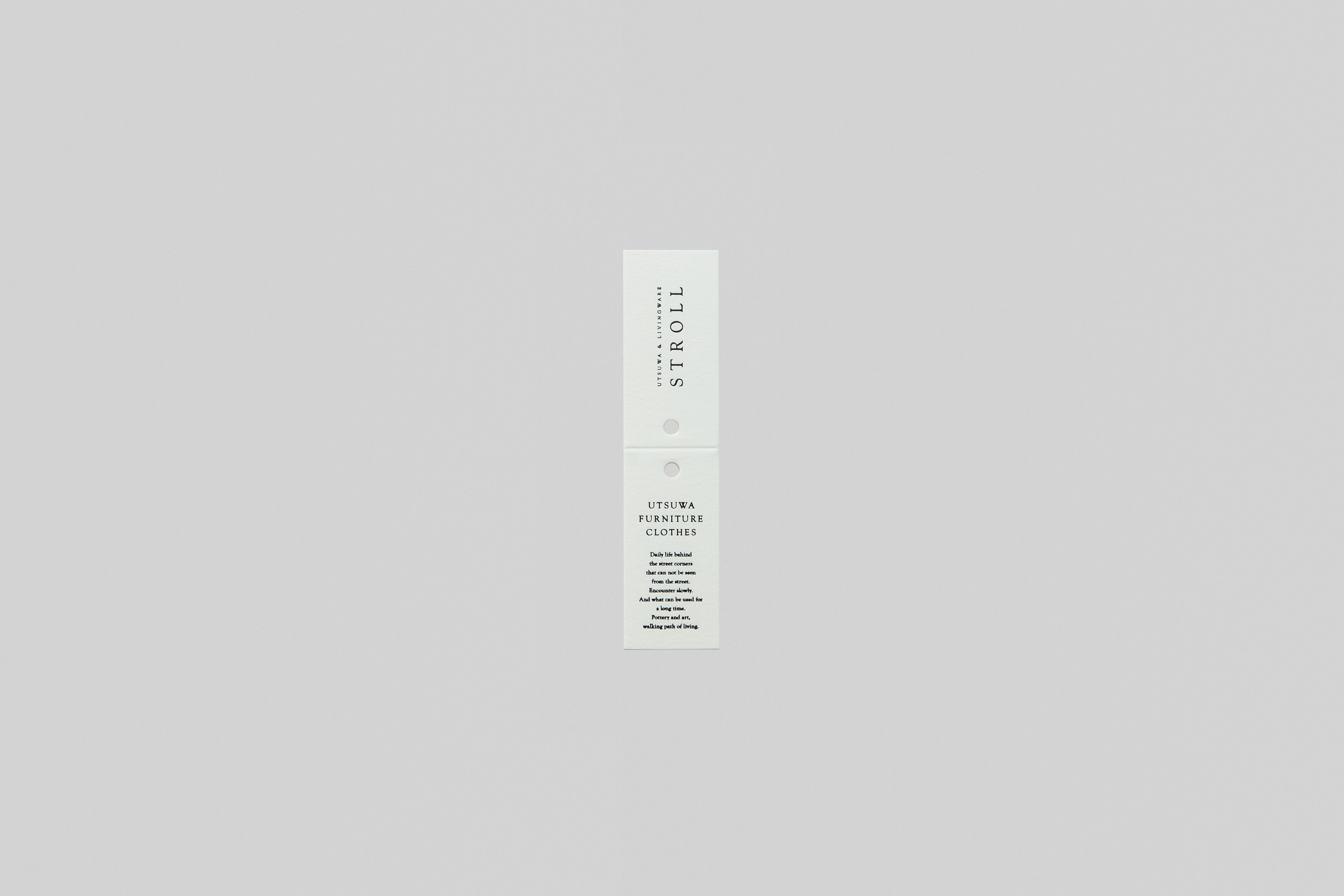 Tag
Tag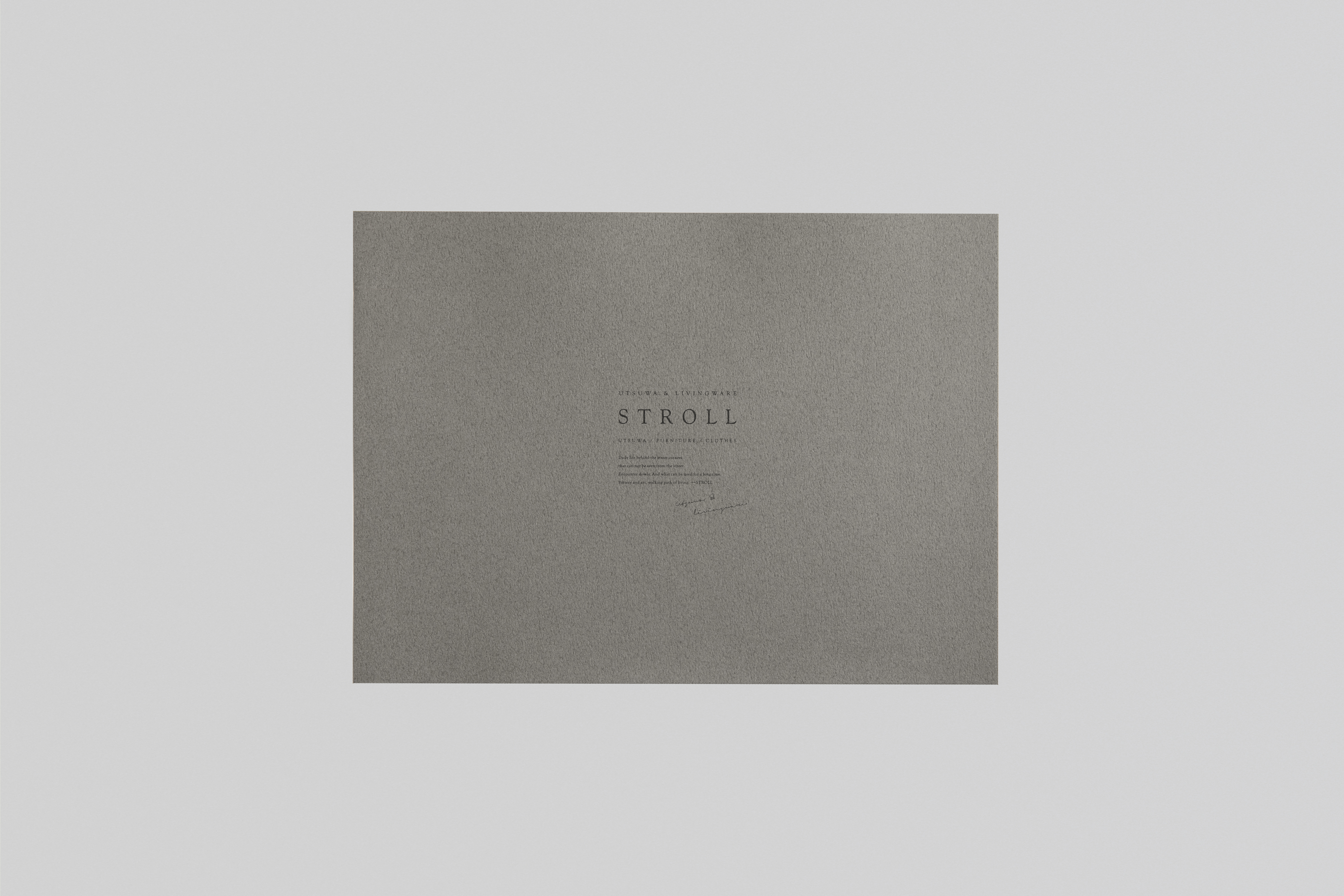 Wrappingpaper
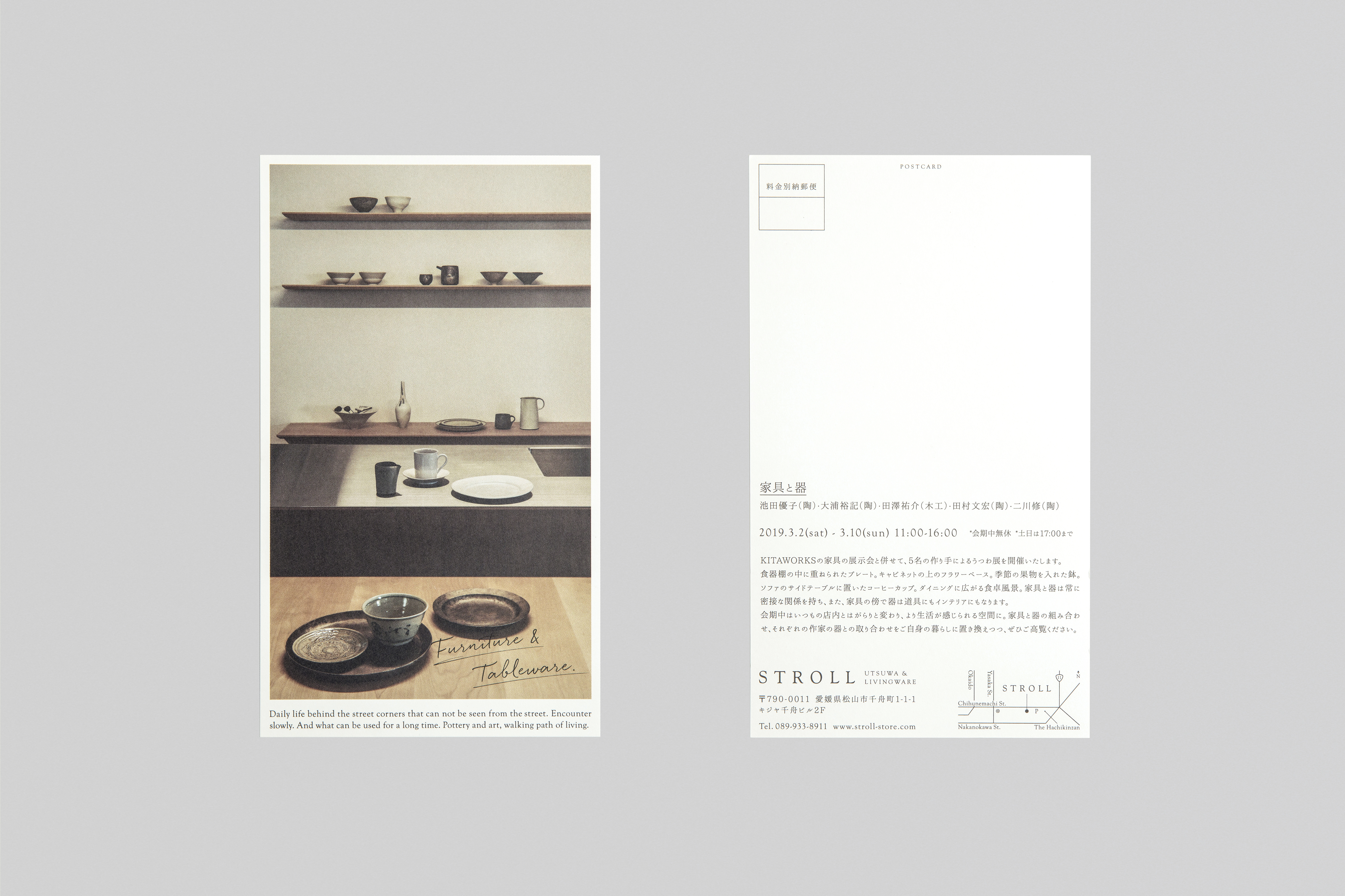 DM
DM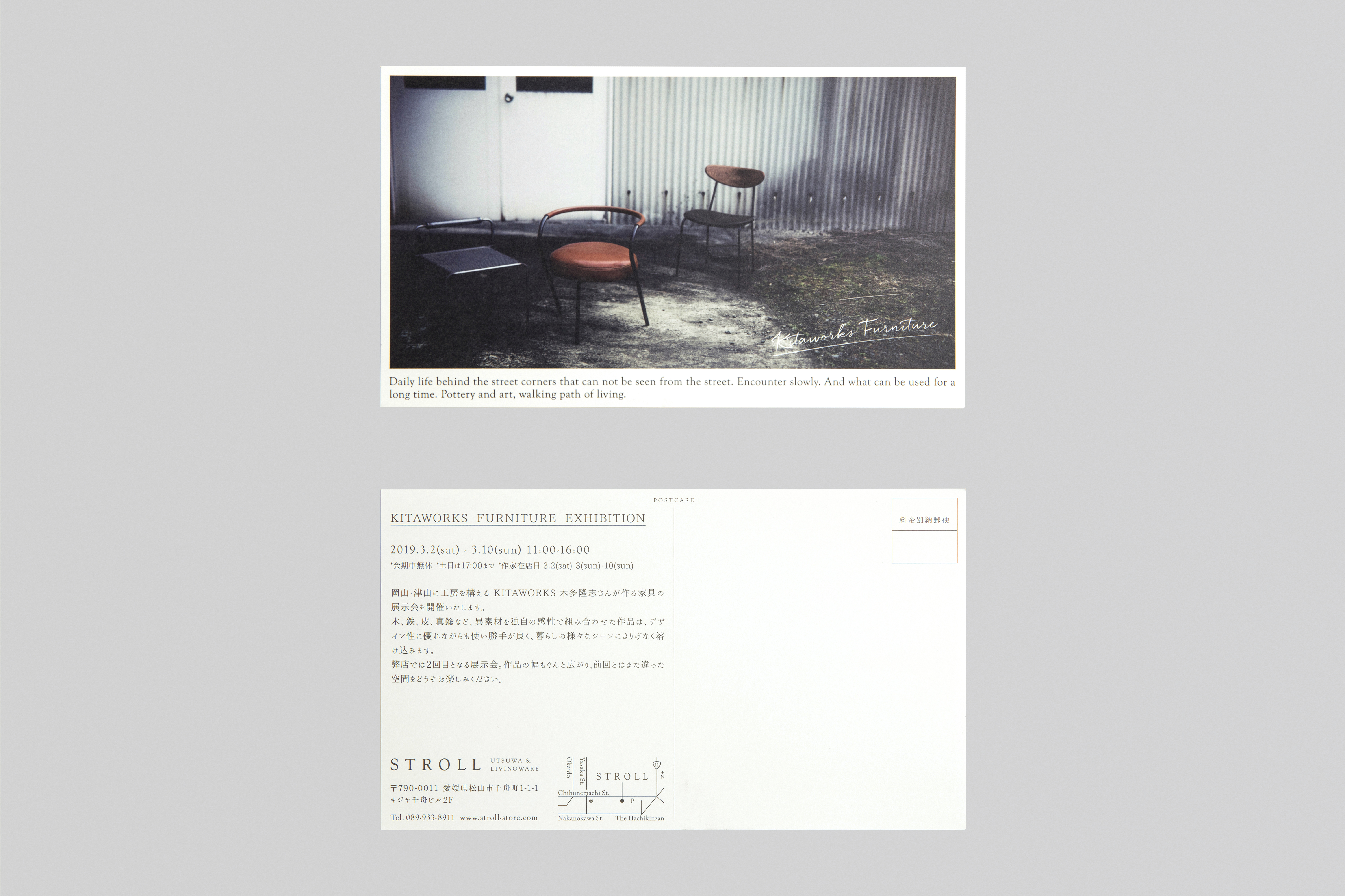 DM
DM-
 Web
Web -
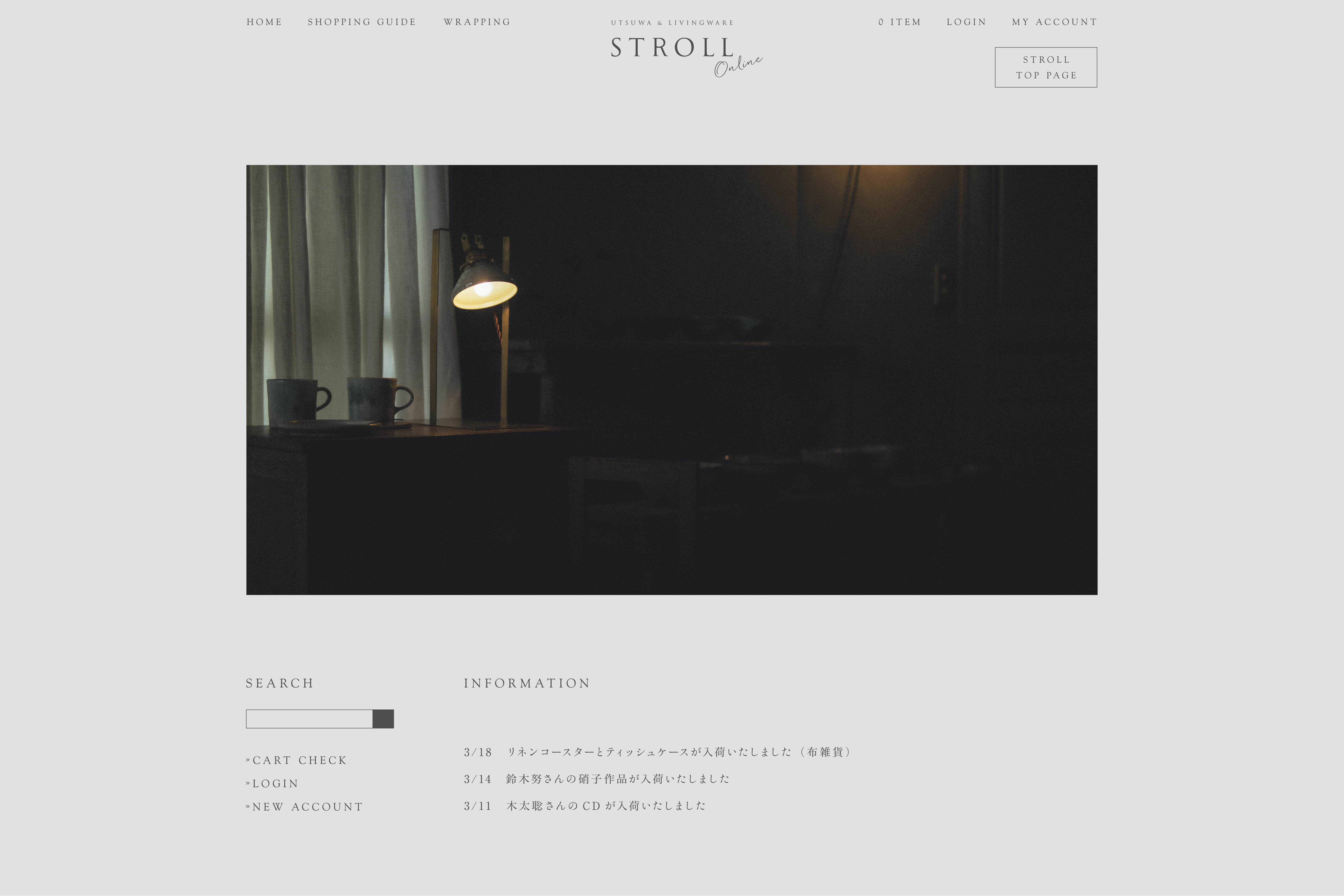 Onile Store
 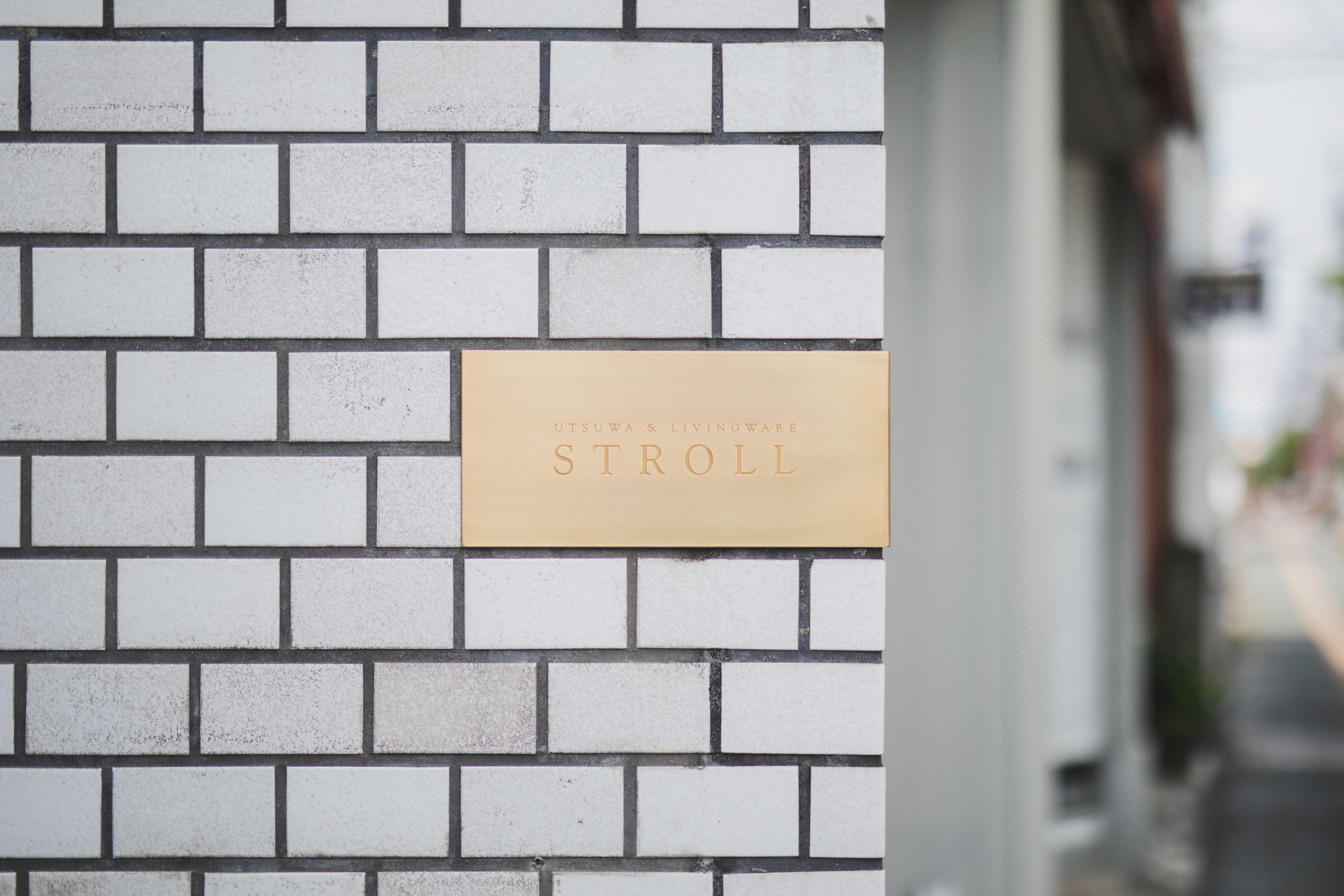 Sign
Sign Sign
Sign
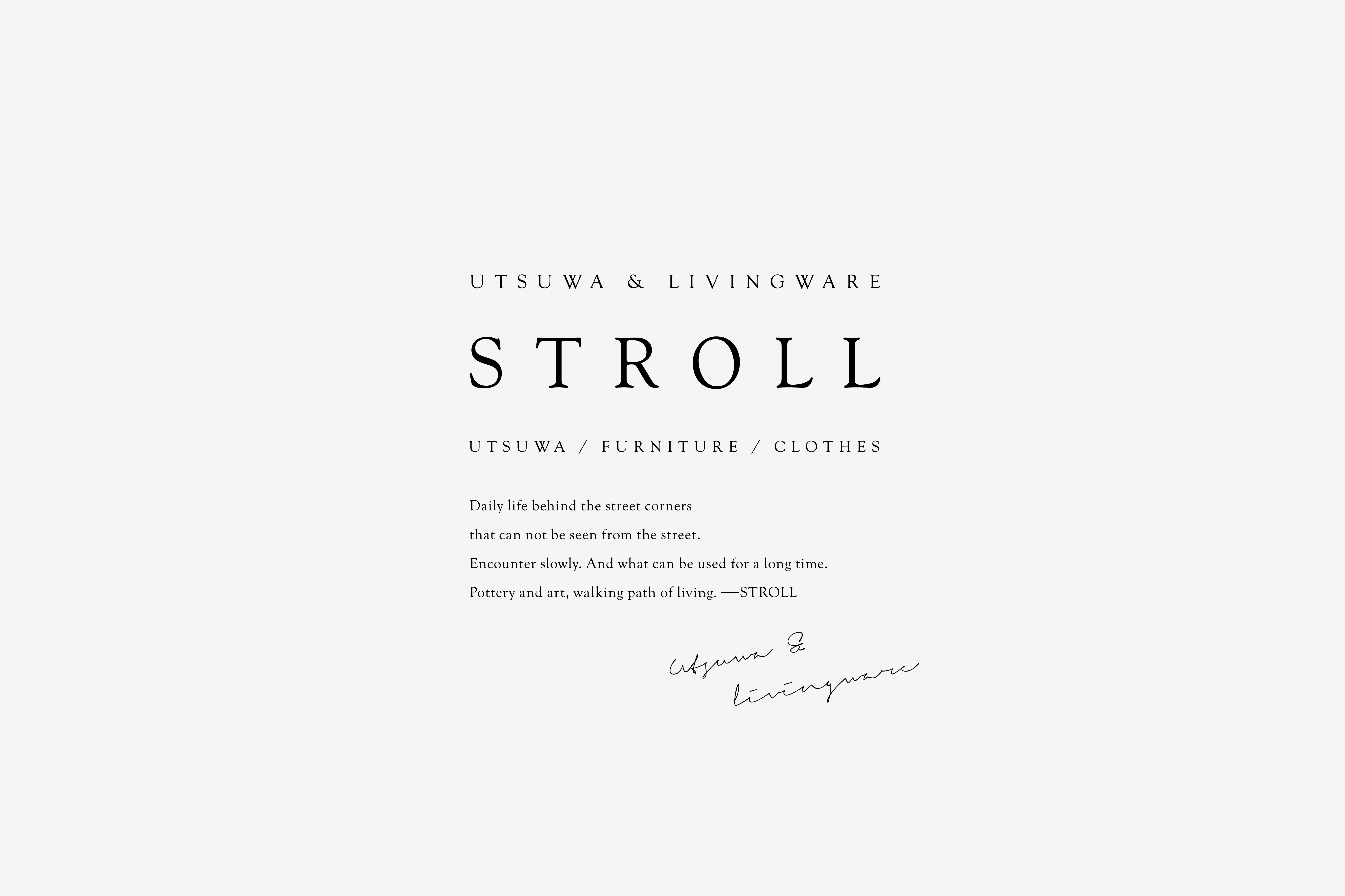
「器とアート、暮らしの散歩道」をテーマにしたうつわと生活道具のお店「STROLL(ストロール)」。既存ホームページのリニューアルから携わり、ロゴマーク、各種ショップツールに至るまで一貫して担当した。
“暮らし“を基軸としながら、上質さと暮らしの距離感を大事に、洗練さとクラフト感が両立するデザインに仕上げた。各種ツールでは、ツールそのものが当ショップの感度の高さを物語るよう配慮しながら各種設計を進めた。用紙が持つ風合い、活字から漂う歴史と知性、箔押しによる繊細さや上質さ———こうした素材そのものが備えている個性や魅力を最大限引き立たせることで、当ショップの洗練さとクラフト感という相反する要素の両立を図った。
STROLL is a shop of tools for living with a concept ‘pottery and art, walking path of living’. Beginning with the renewal of the existing website, we were involved with the shop with the total design for logotype, various sales promotional tools. Living is the key idea
Putting importance on the sense of distance between quality and everyday life, we created designs in which sophistication coexists with hand-made feel. For the promotional tools, on the other hand, the designs are considered so that they deliver the sensitivity of the shop. The texture of the paper we use, history and intelligence felt through the typography, subtlety and quality expressed with the foil stamping – by allowing the characteristics of all these elements to be fully expressed, we tried to balance between sophistication and hand-made feel which are seemingly conflicting.