KIITOS
- Client :
- KIITOS
- Term :
- 2017
- Works :
- BrandingCi/Vi/BiPackage/ProductsGraphicsSpace
 Ci/Vi/Bi
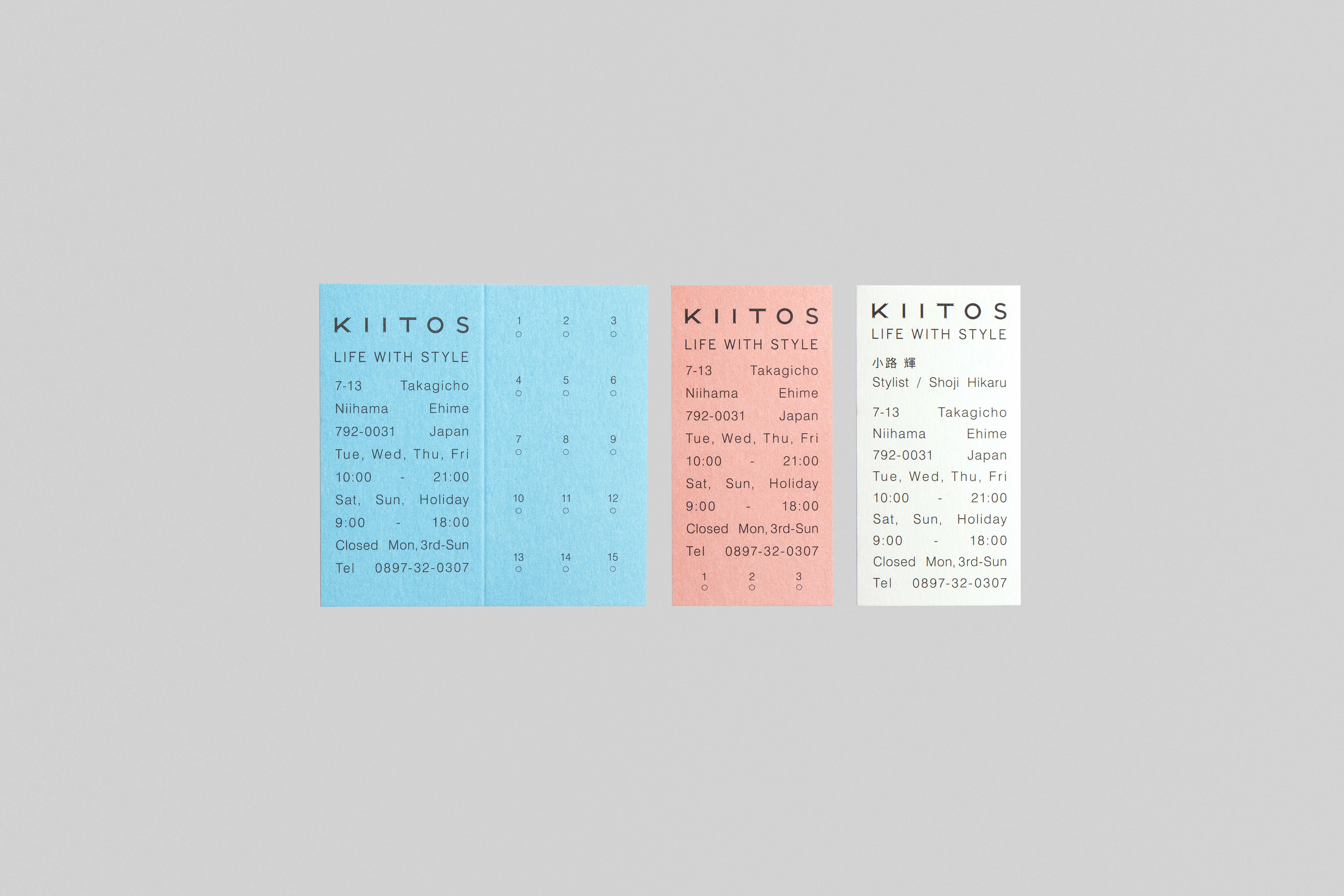 Card
Card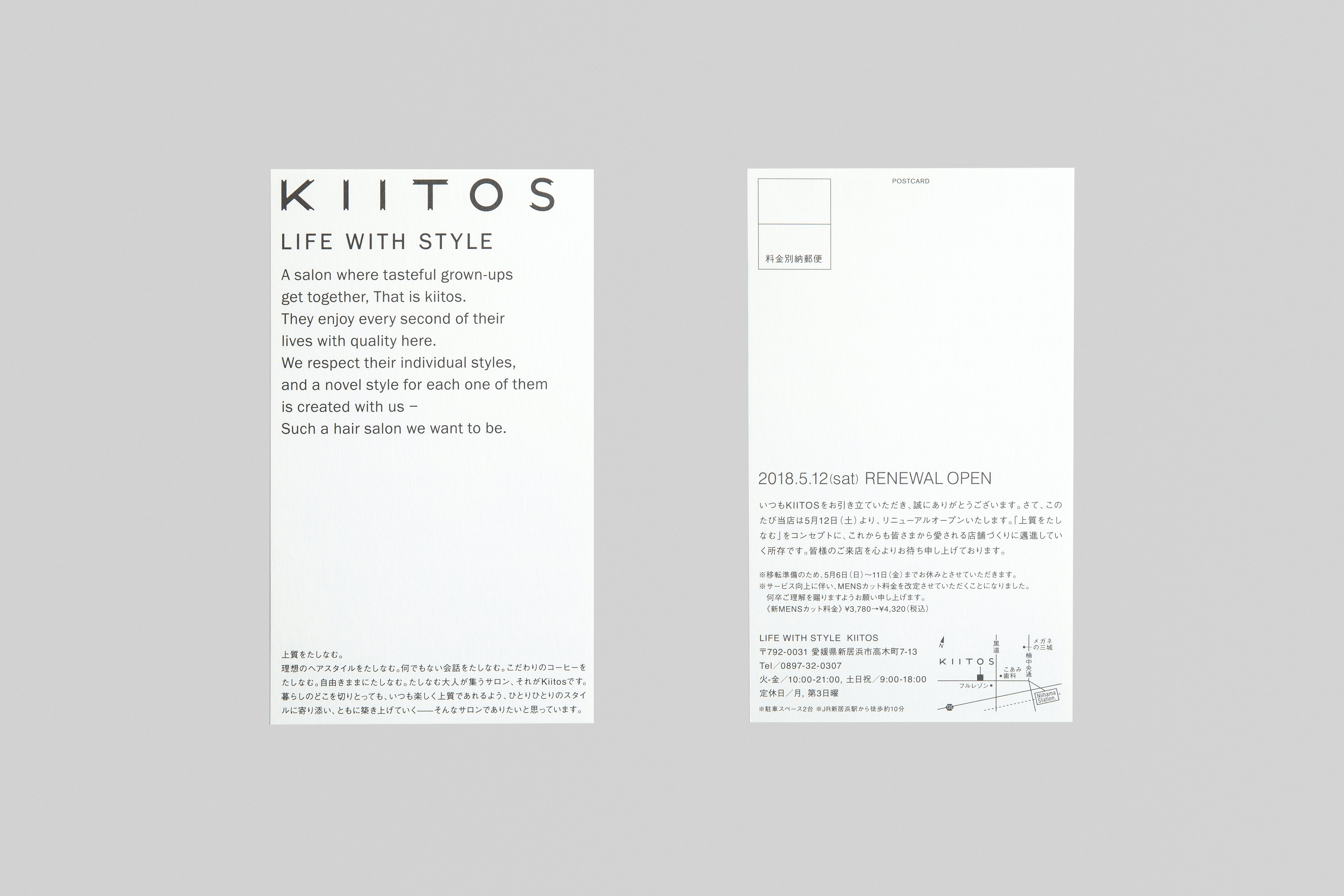 Postcard
 Guestcard
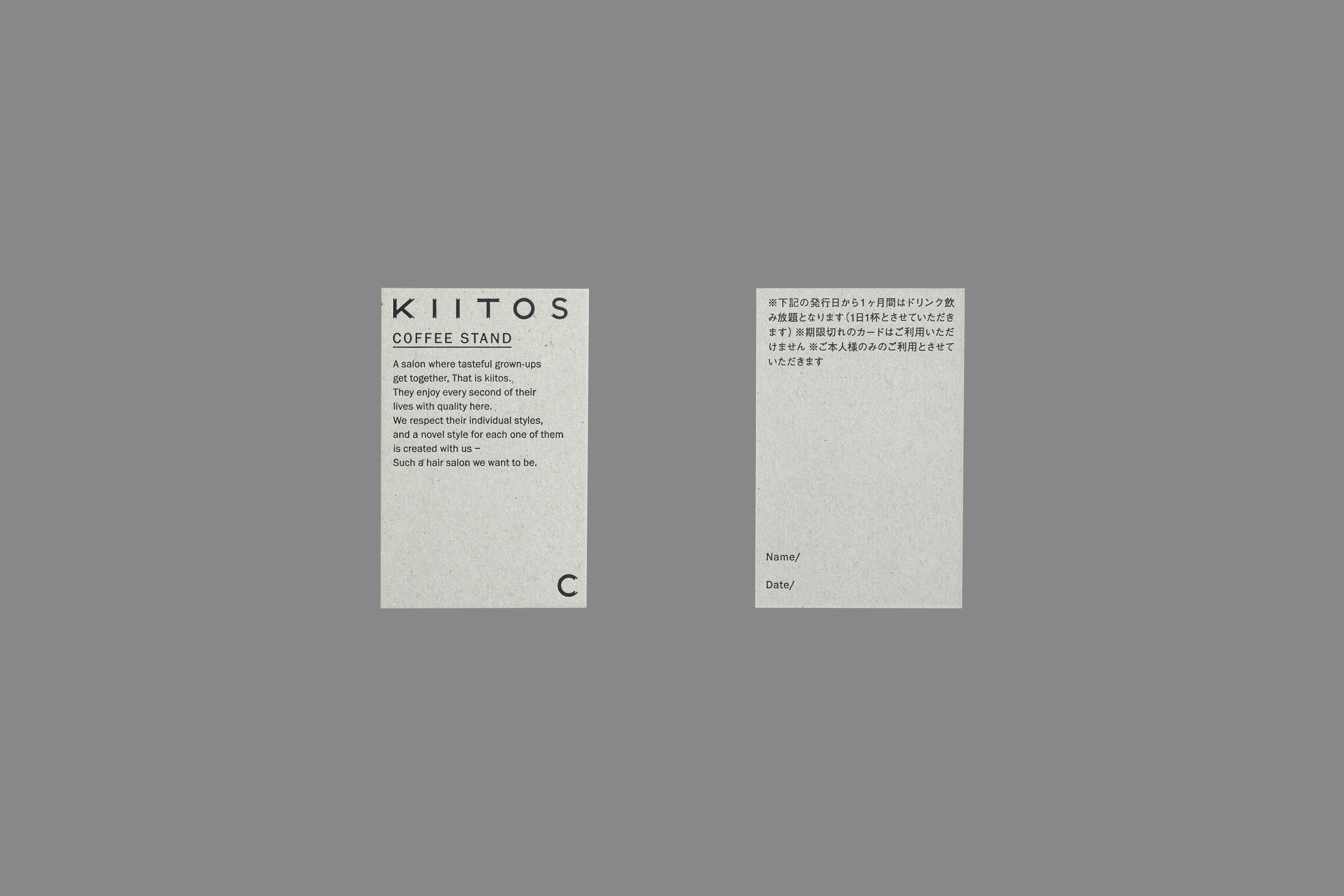 Coffeecard
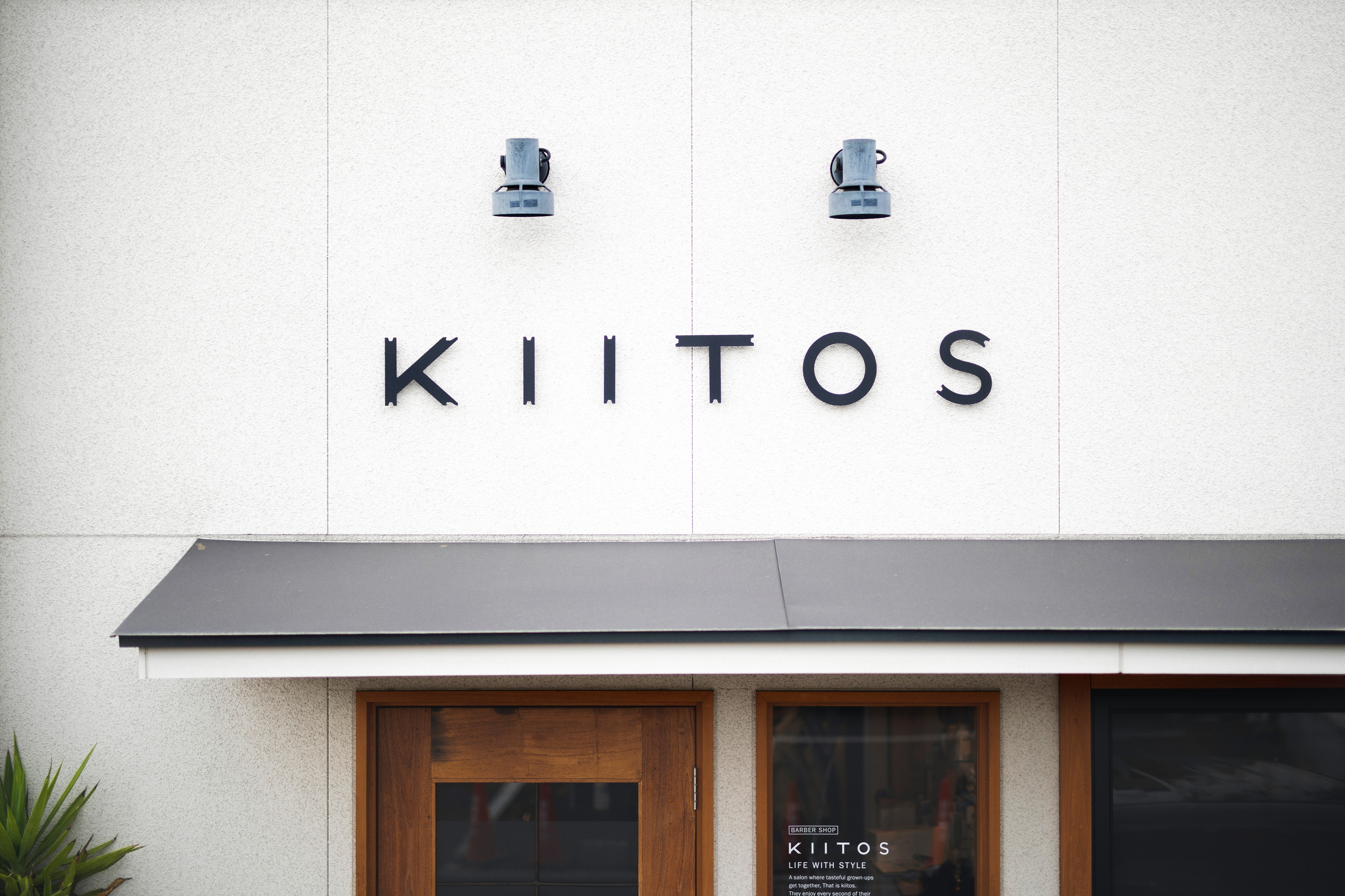 Sign
Sign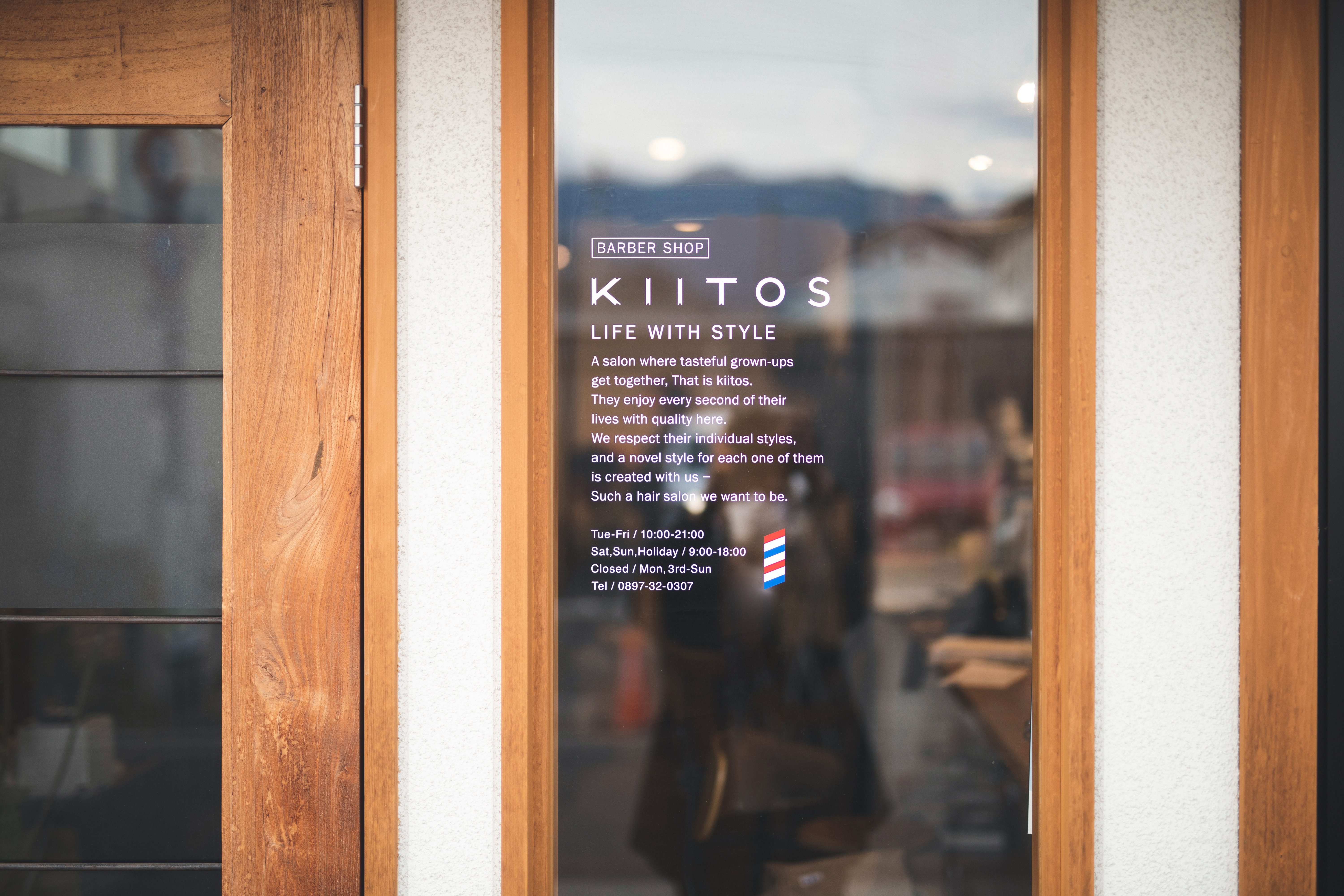 Sign
Sign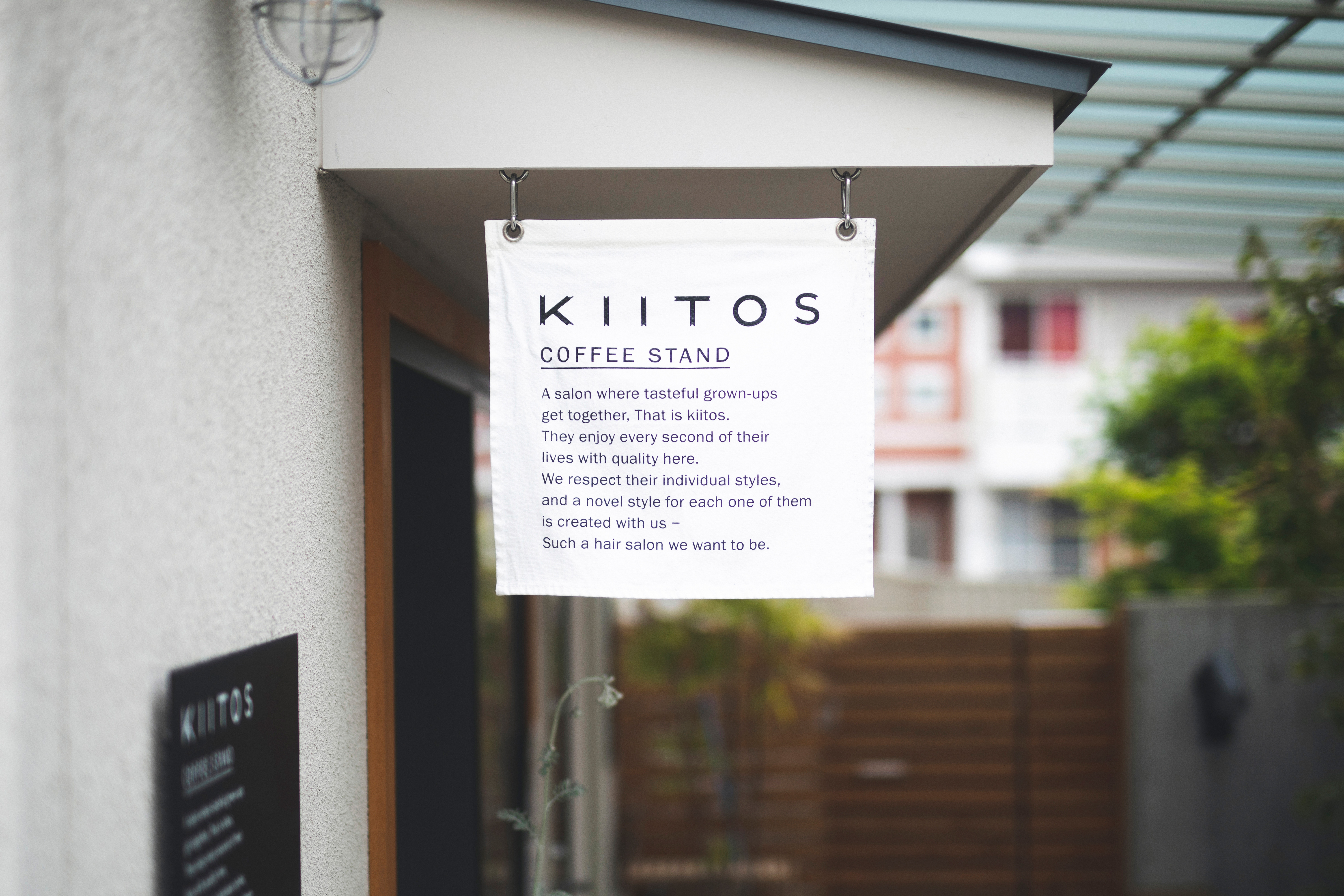 Sign
Sign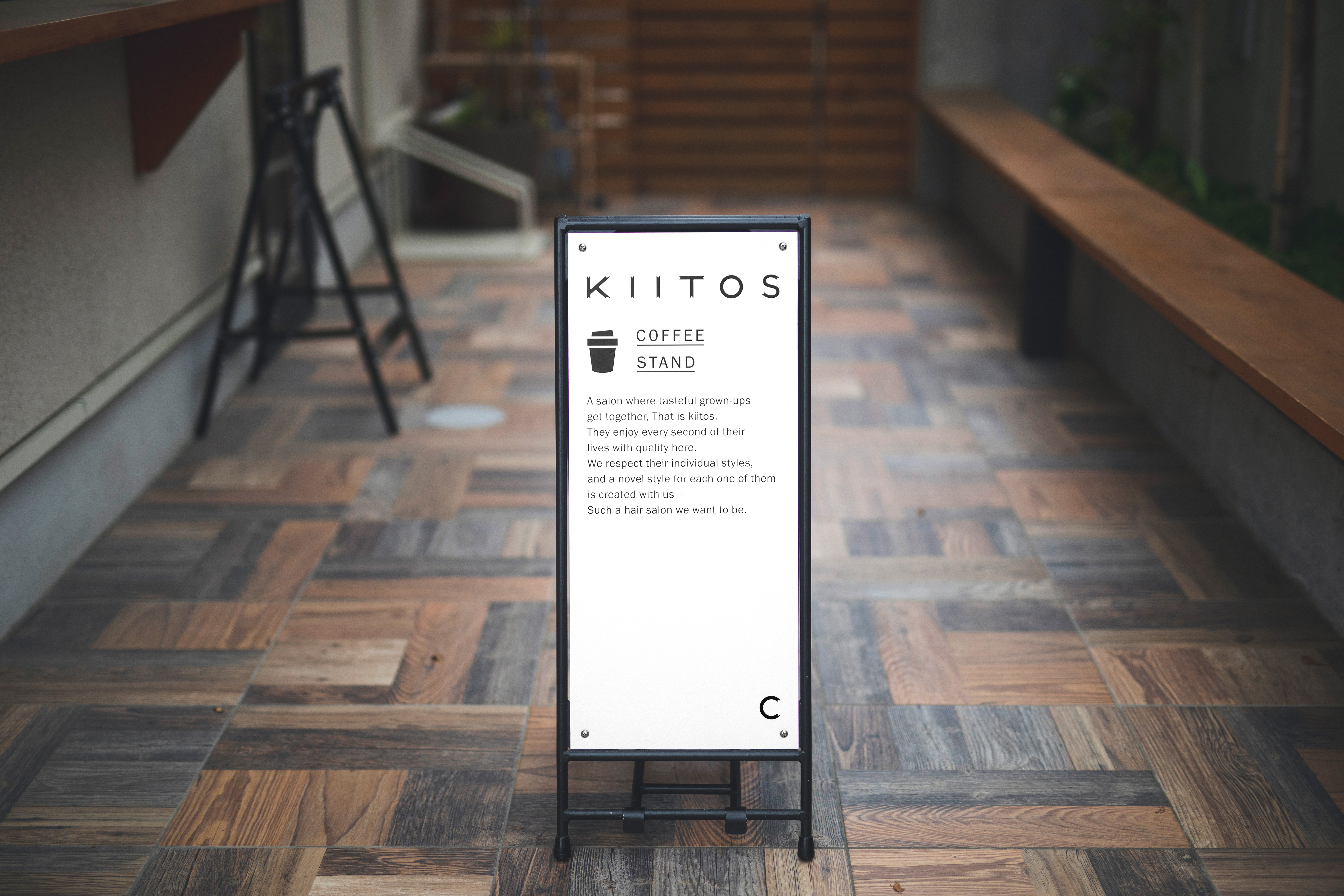 Sign
Sign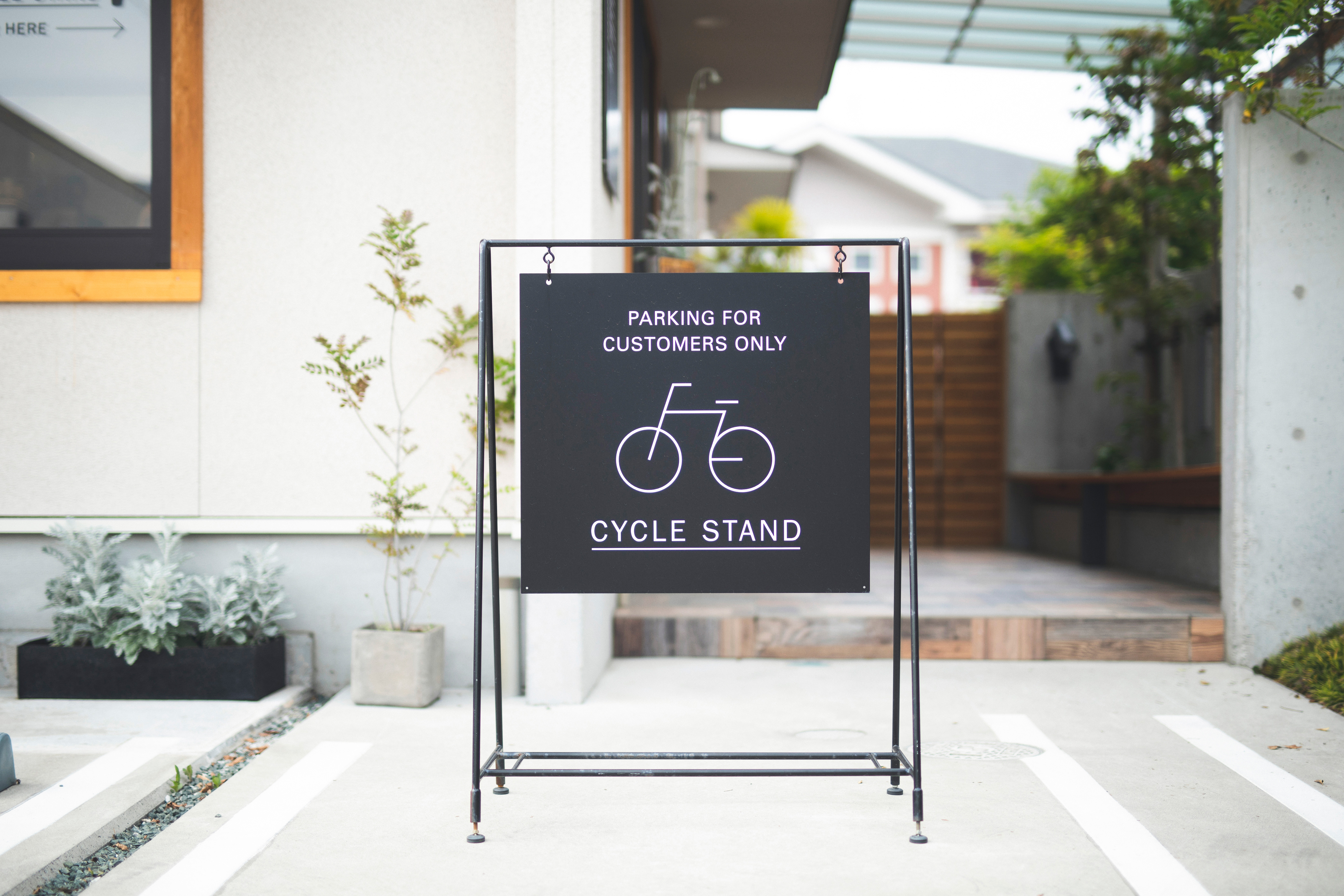 Sign
Sign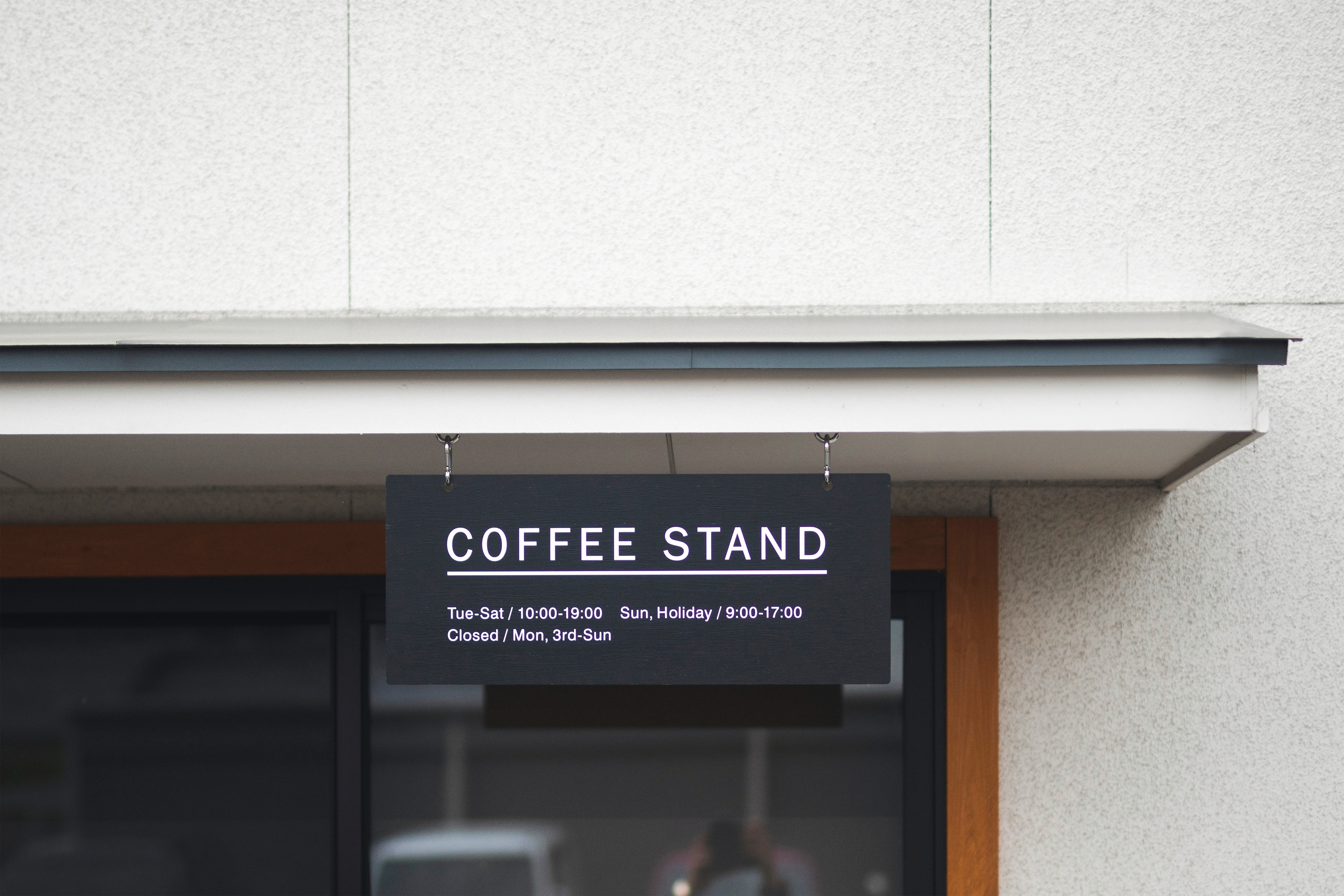 Sign
Sign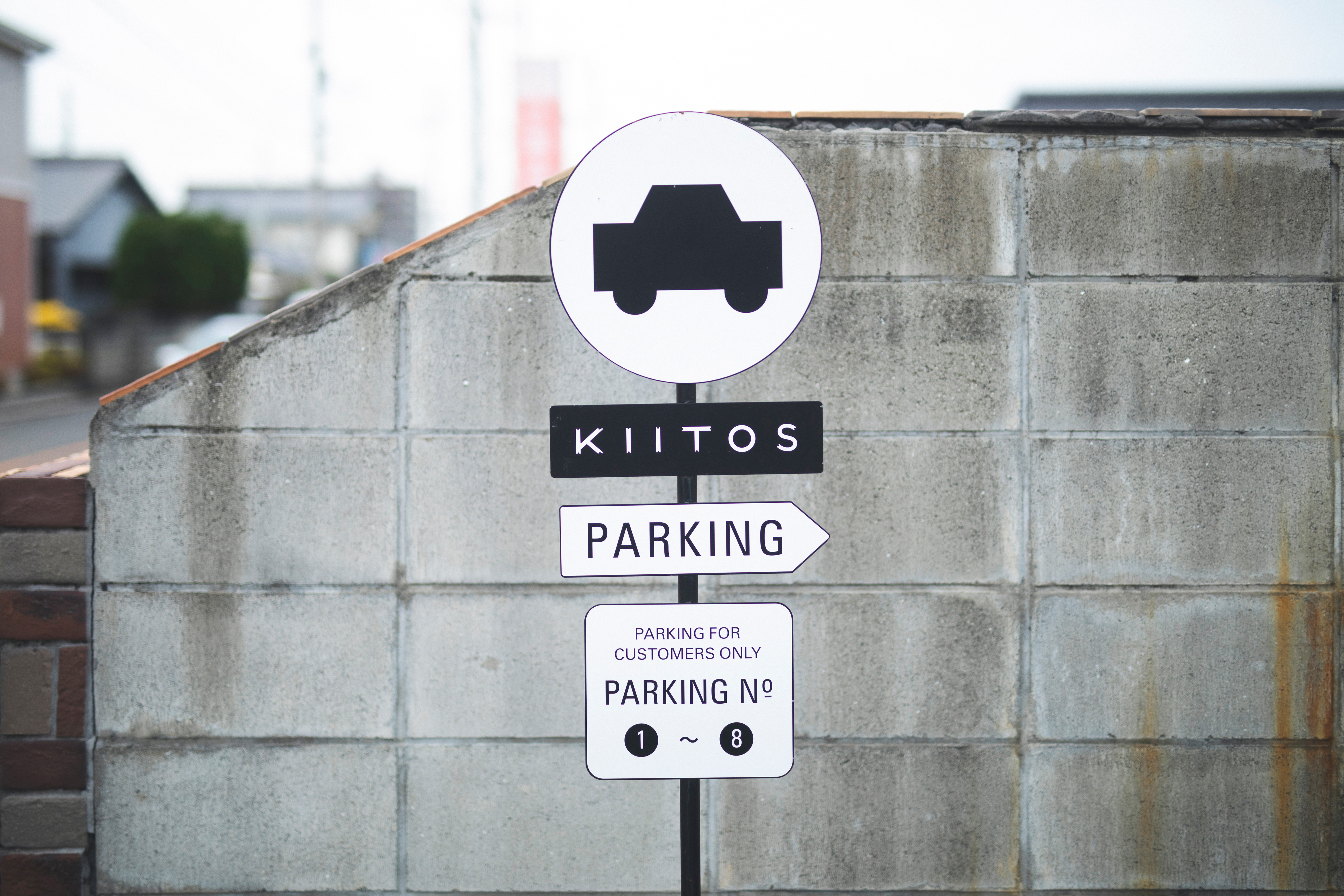 Sign
Sign
愛媛県新居浜市にて、ライフスタイルをベースに全てのスタイルに向き合う理容室「KIITOS(キートス)」。“上質をたしなむ“をコンセプトに、コーヒースタンドと併設し、2017年リニューアルオープンした。
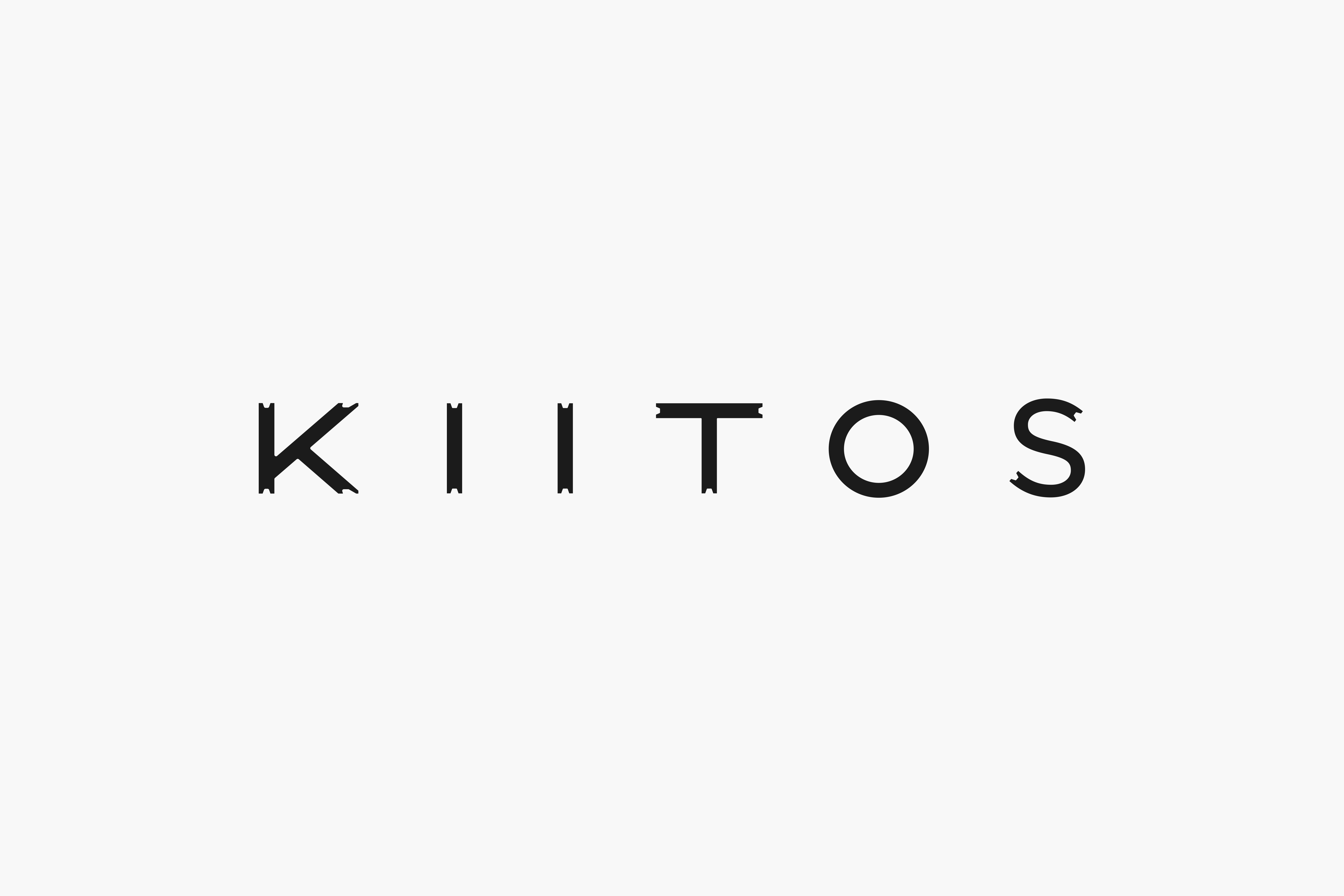
コンセプトを内包したロゴタイプには、メインターゲットである30代男性に届く無骨さのあるトーンとしながらも、抑揚を抑えたニュートラルなデザインとすることで、上質さを残した。各アルファベットの先端には、施術時に用いられる梳き鋏の刃先を表し、シンプルな中にもオリジナリティを出した。
また、ショップカードや名刺にはバーバーサインのトリコロールカラーを用いることで、感覚的に理容室であることが伝わるよう設計。併設するコーヒースタンドの各種サイン含め、店舗全体に伴うブランディングに広く携わった。
Located in Niihama City, Ehime, KIITOS the barber reopened in 2017 along with a newly added coffee stand. The shop’s concept is to enjoy good quality, and salon deals with all styles and attaches importance to everyone’s lifestyles. The logo to signify the concept with a moderate tone which appeals to men in their 30’s. Also, its neutral design maintains elegance. By adding thinning scissor details to the tips of each alphabet, we introduced simplicity and originality to the design.
Red, white and blue, the symbol colour of barbers, are used for their shop card and business card so it is intuitively recognized as a barber. We engaged widely with the branding of the barber shop, including the sign designs for the coffee stand.