THE BEDROOM SHOP sanbun_no_ichi
- Client :
- Miura mengyo
- Term :
- 2019
- Works :
- BrandingCi/Vi/BiGraphicsSpace
 Ci/Vi/Bi
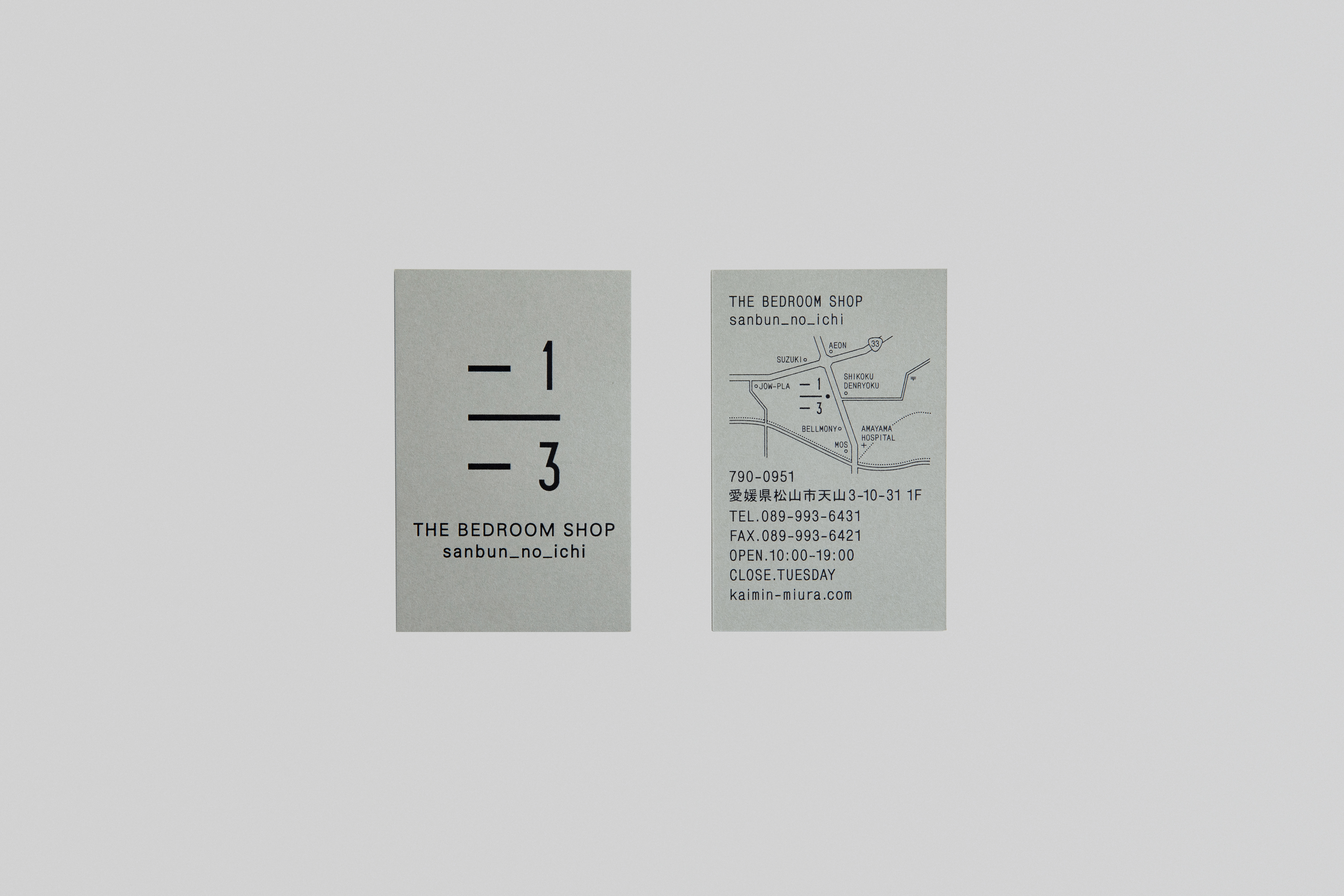 Shopcard
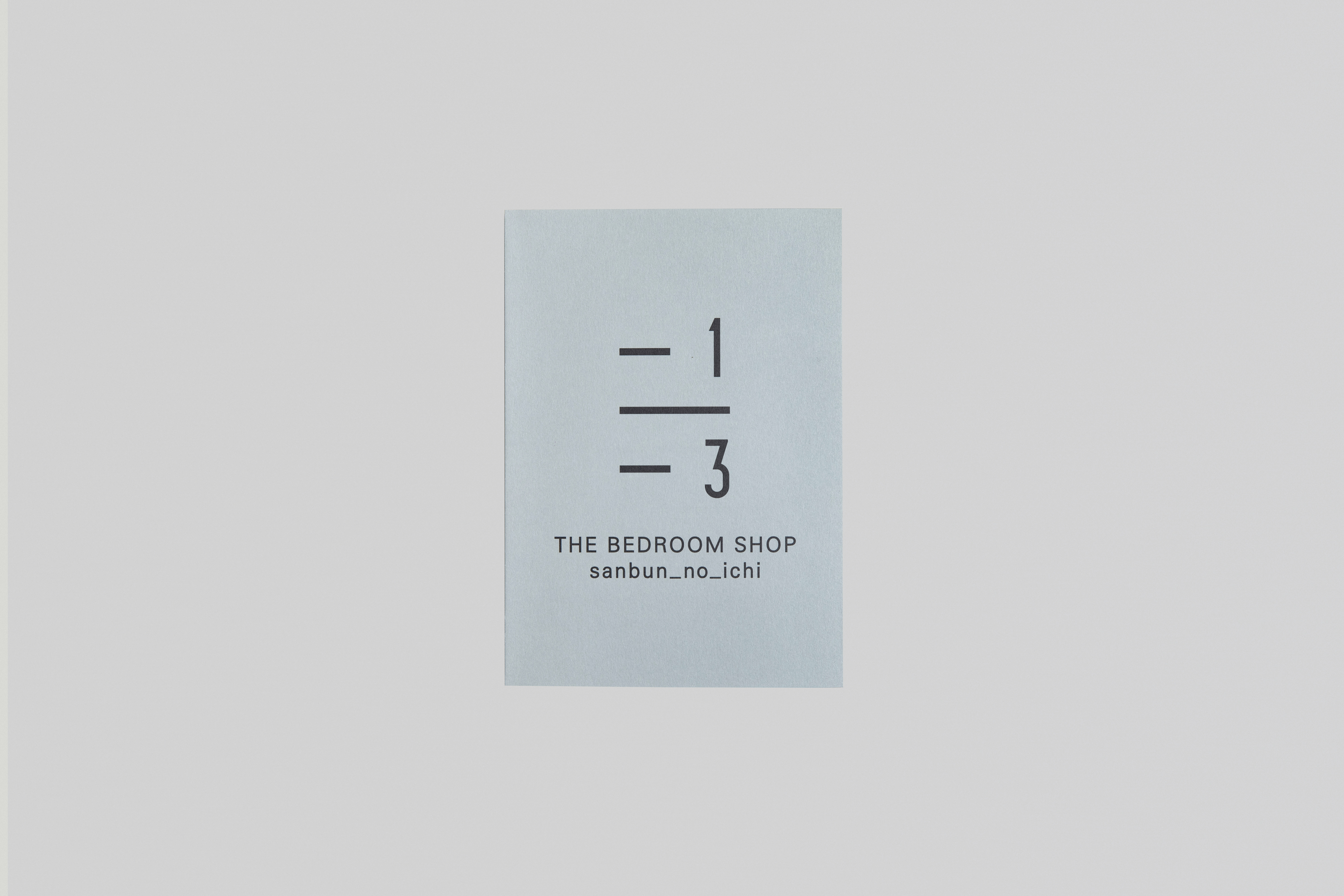 Leaflet
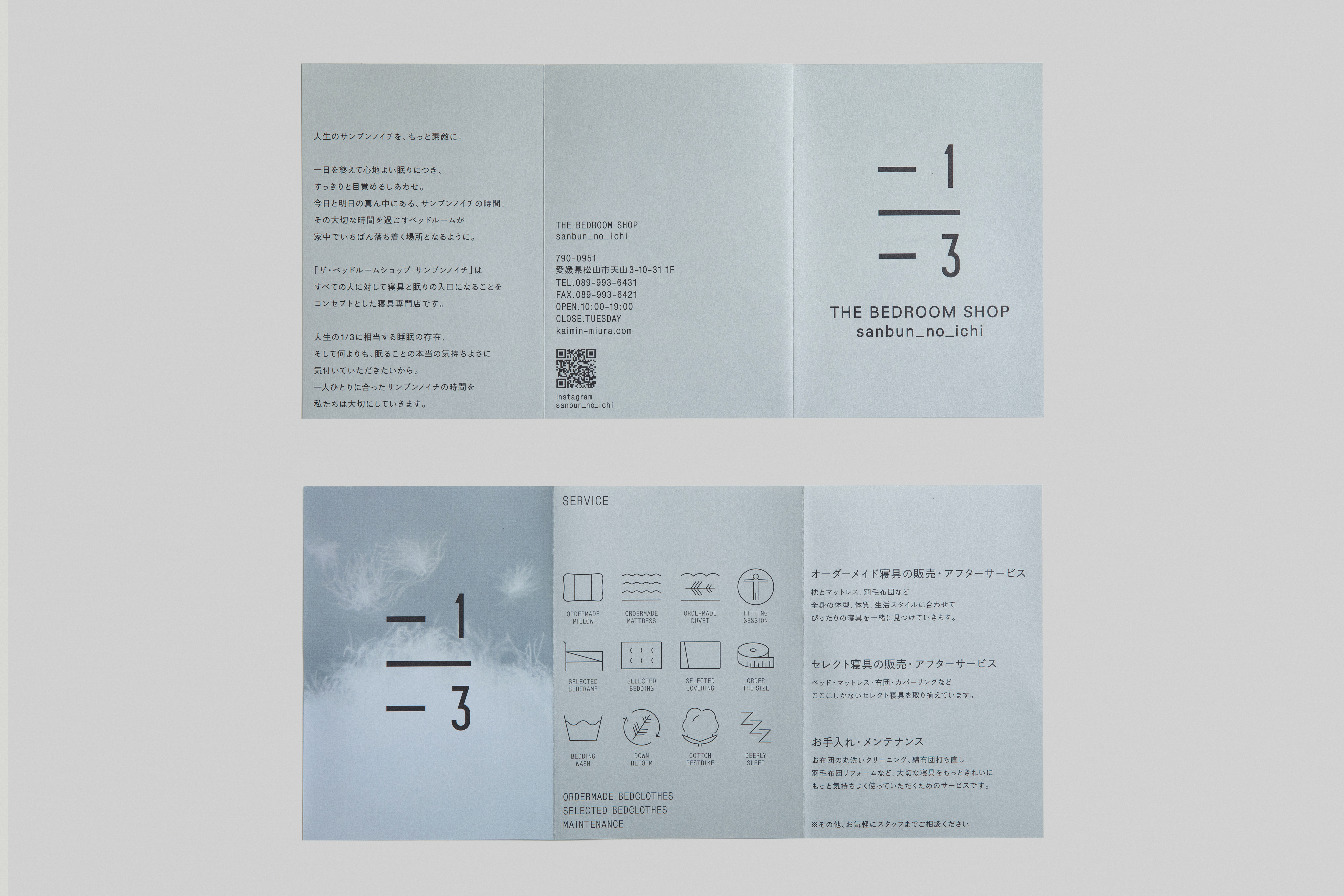 Leaflet
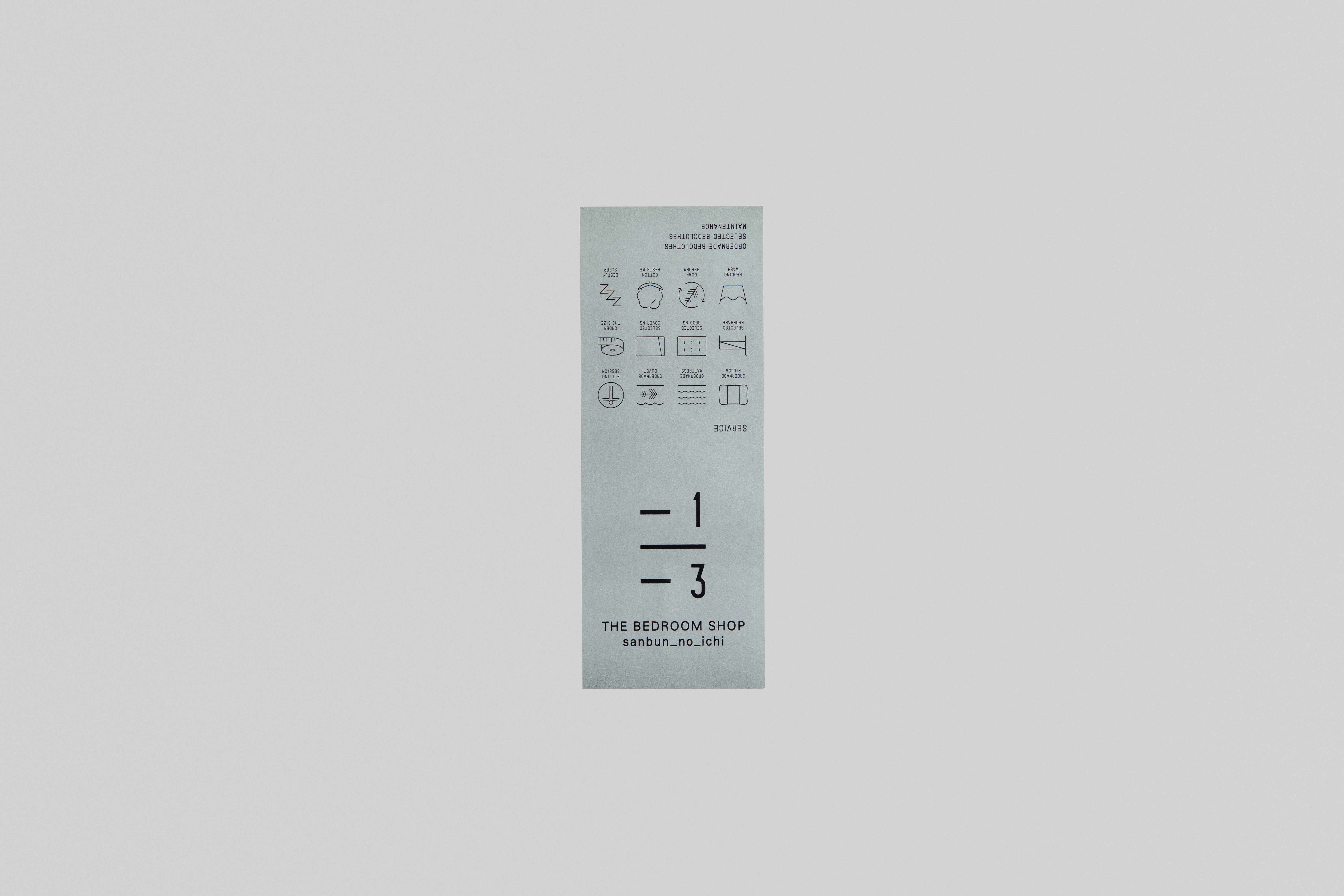 Label
Label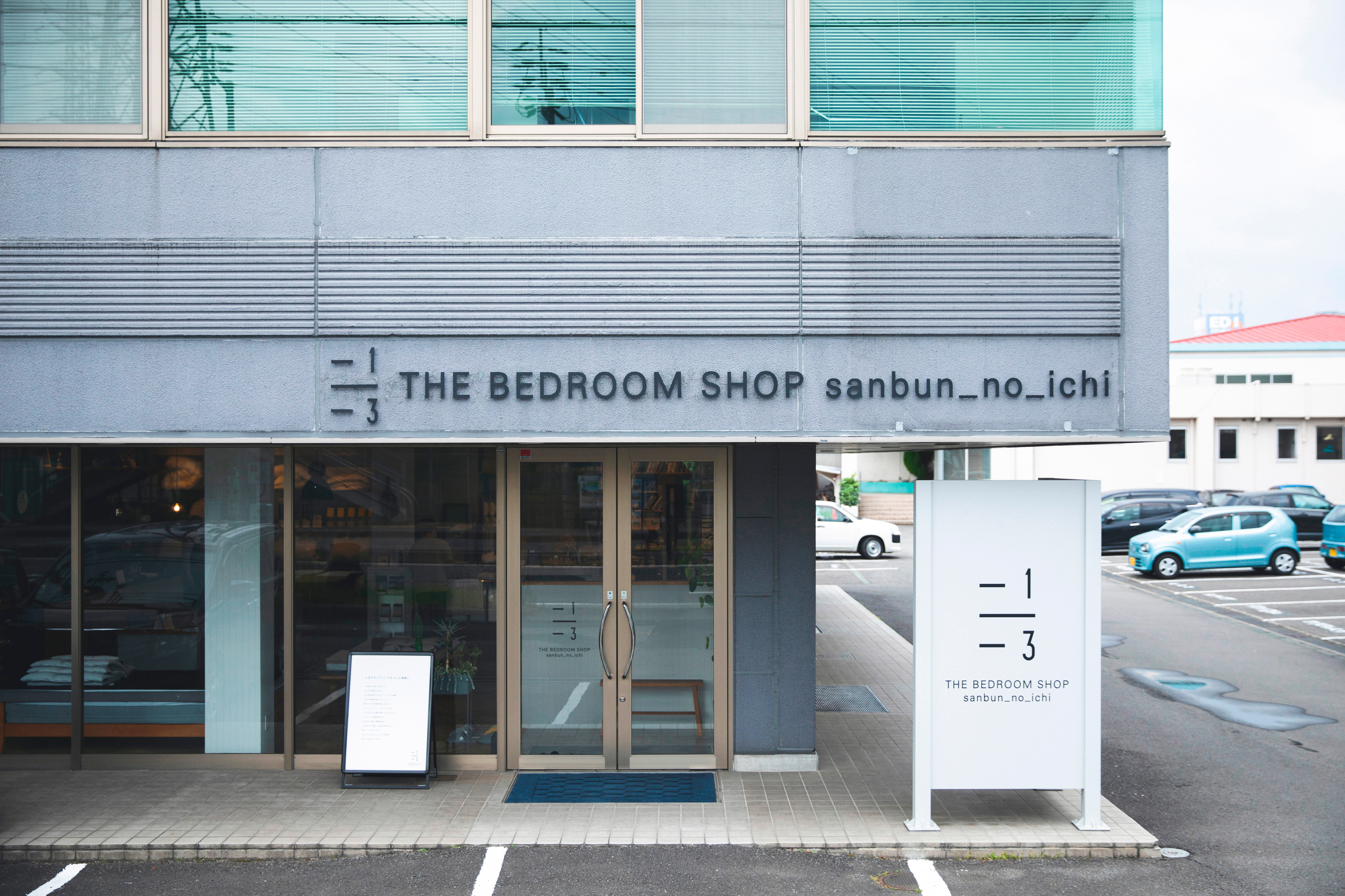 Sign
Sign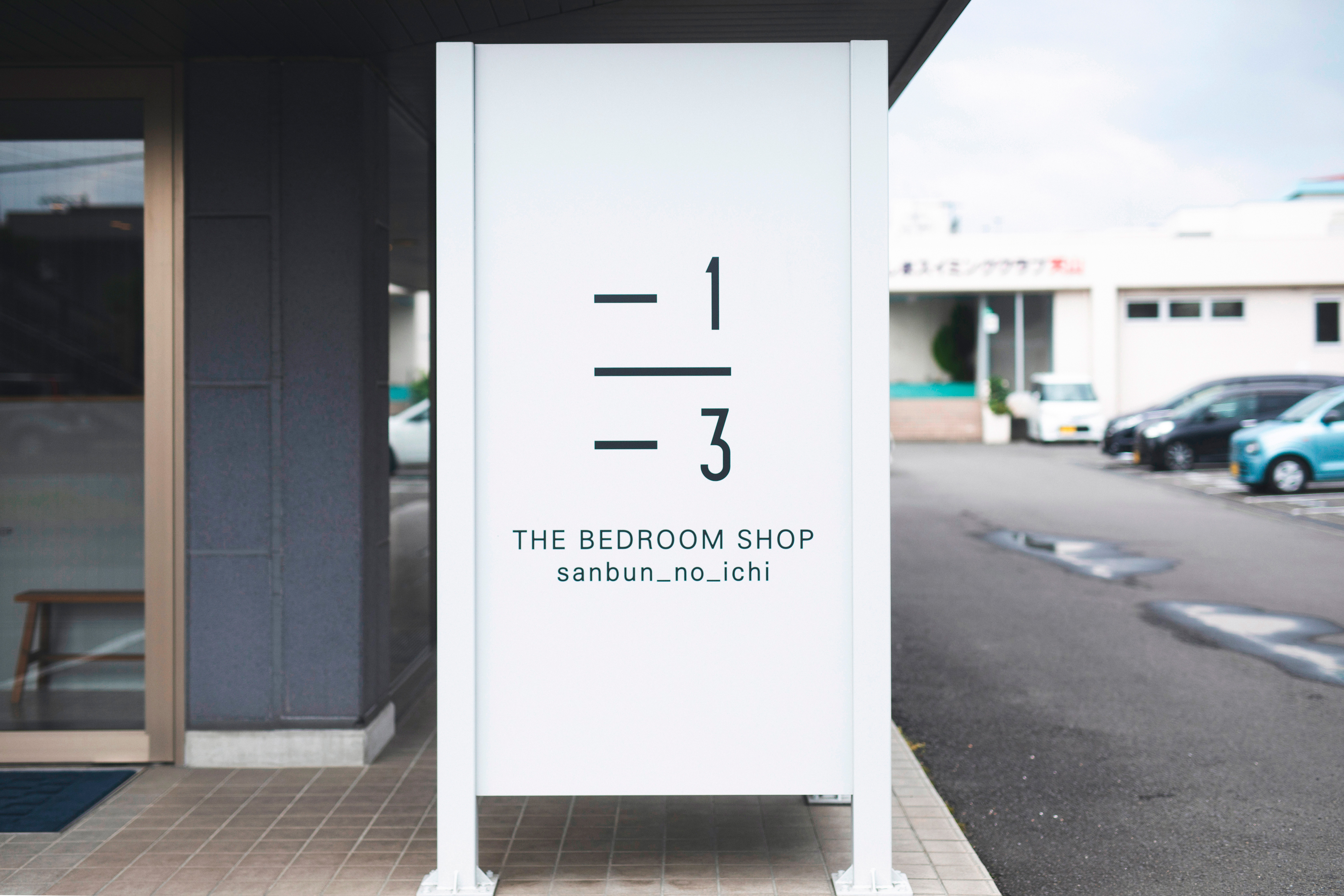 Sign
Sign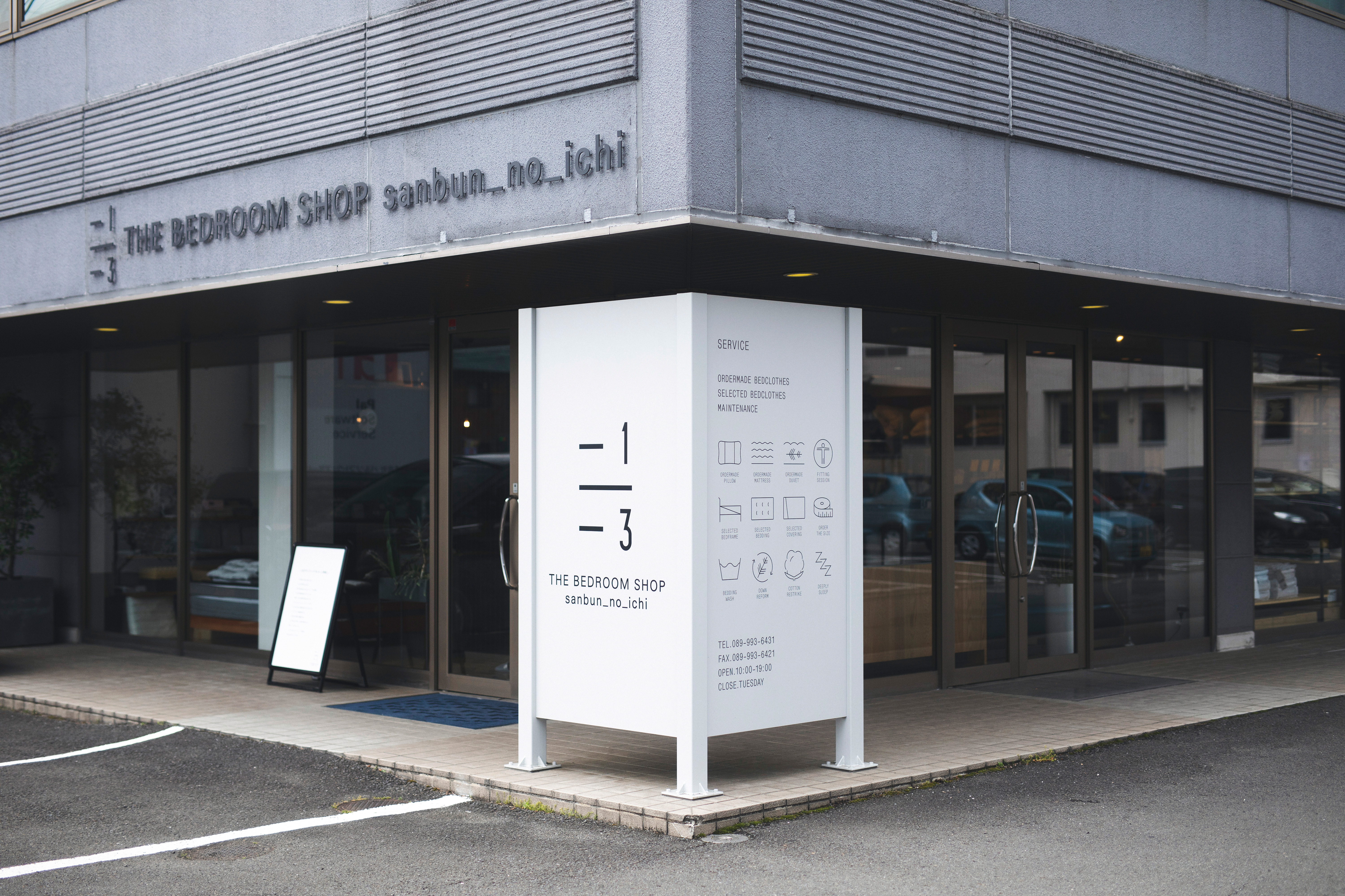 Sign
Sign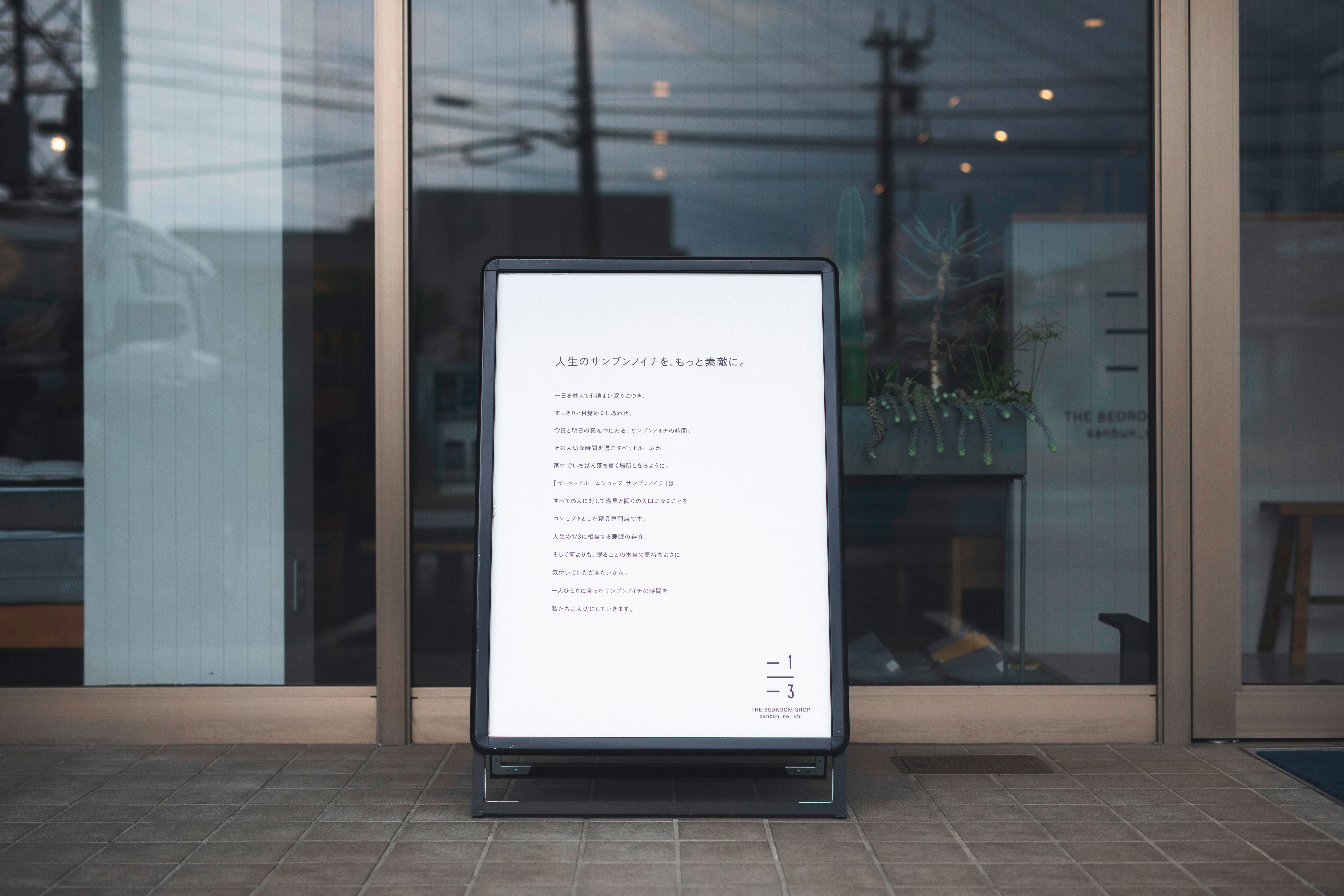 Sign
Sign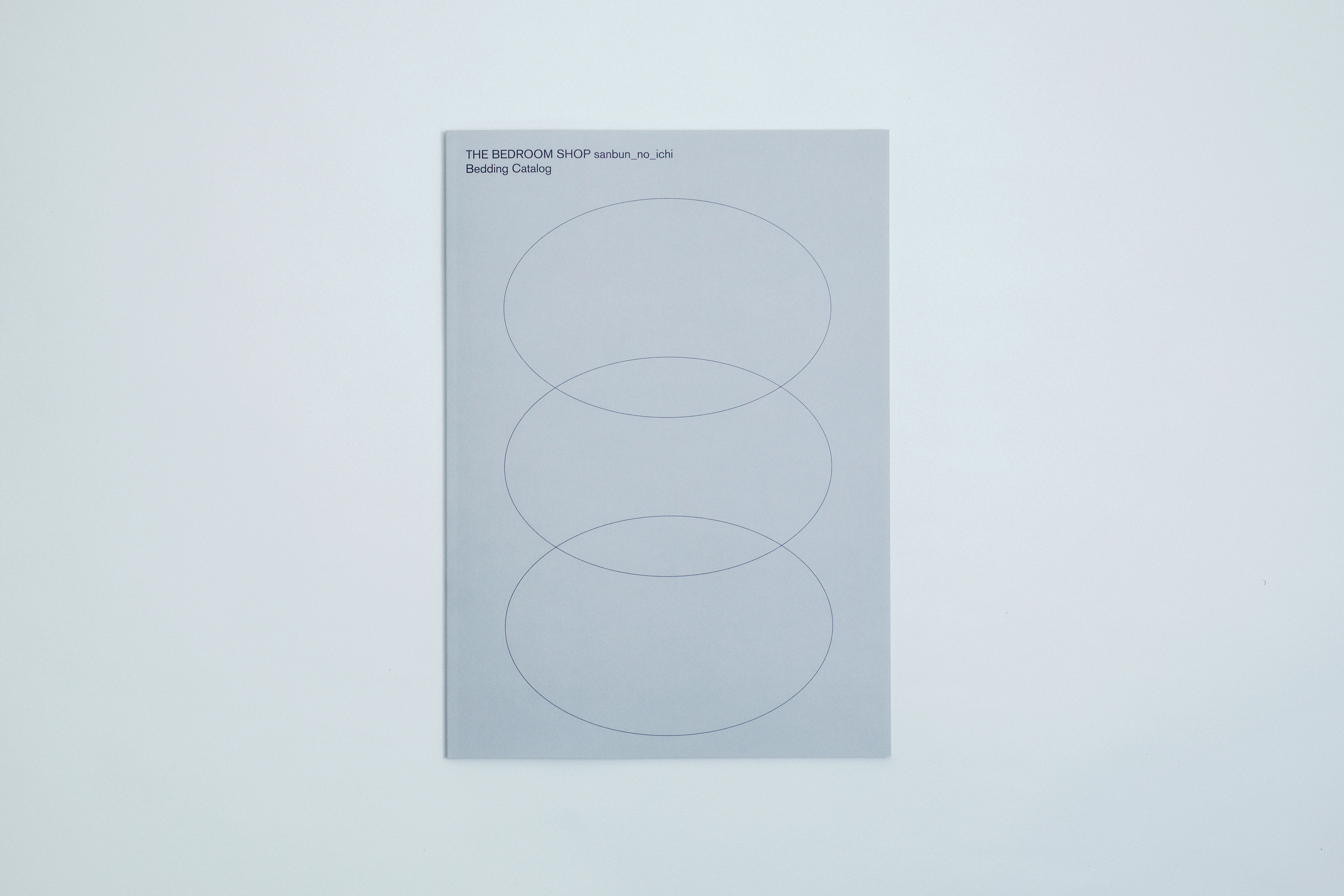 Catalog
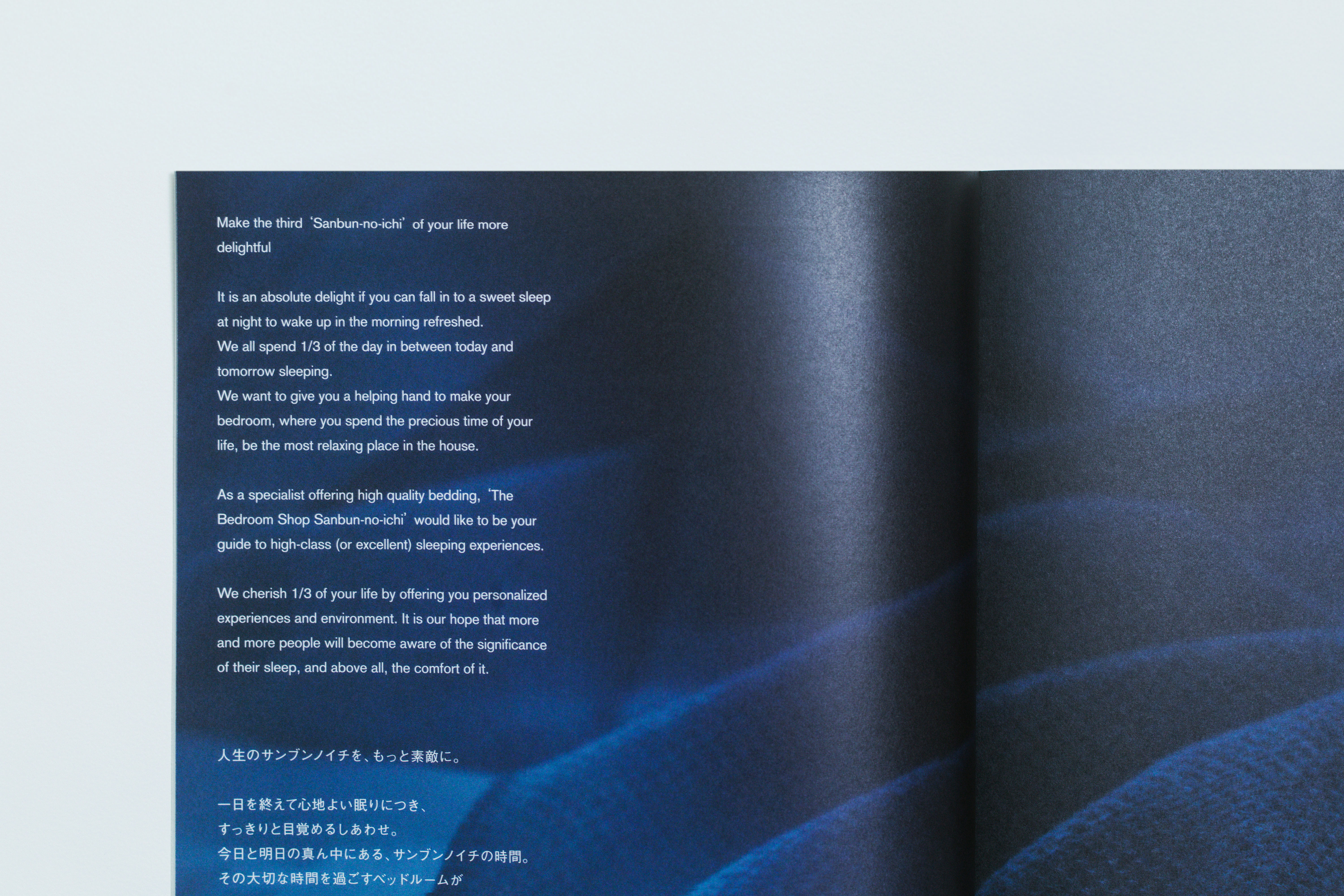 Catalog
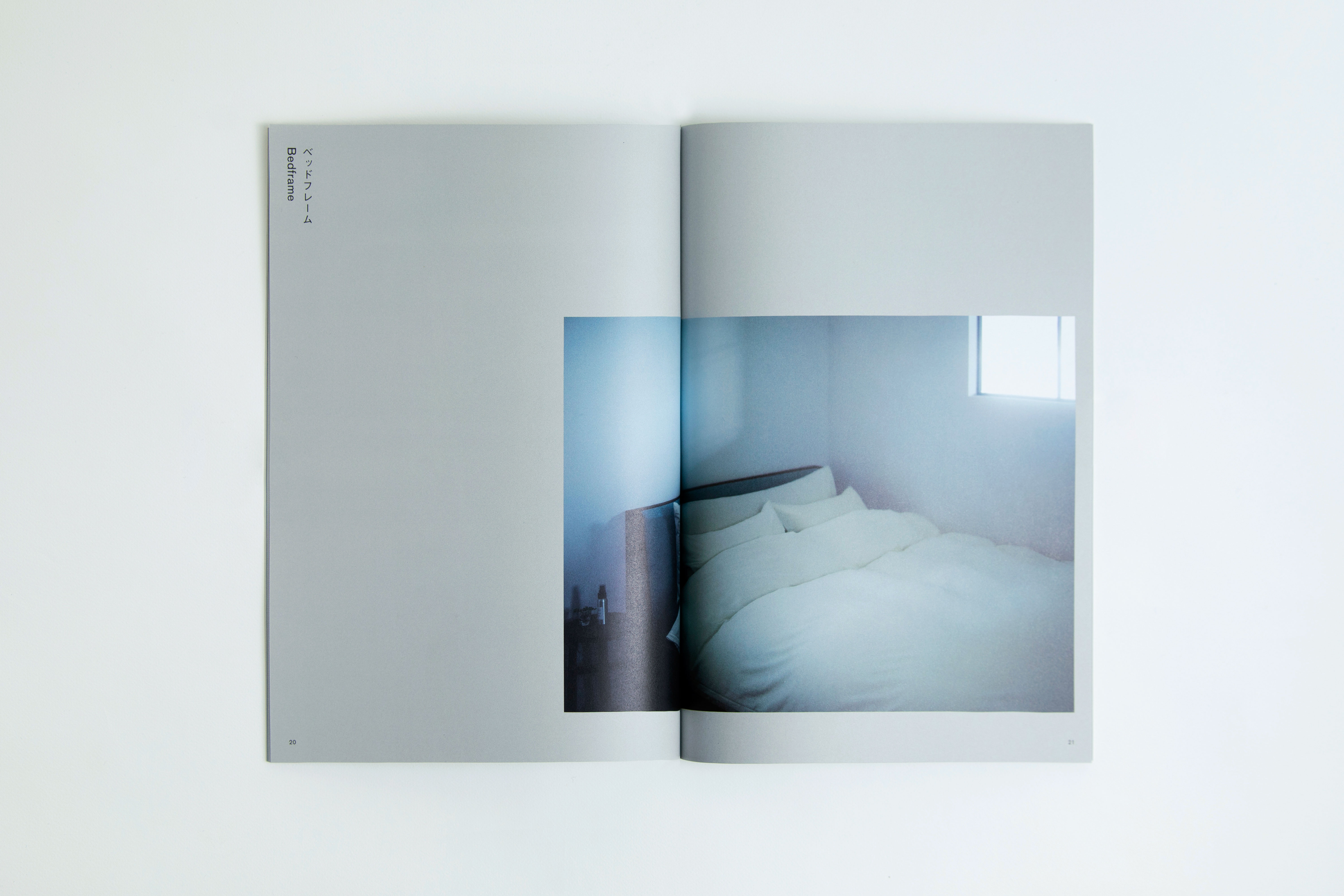 Catalog
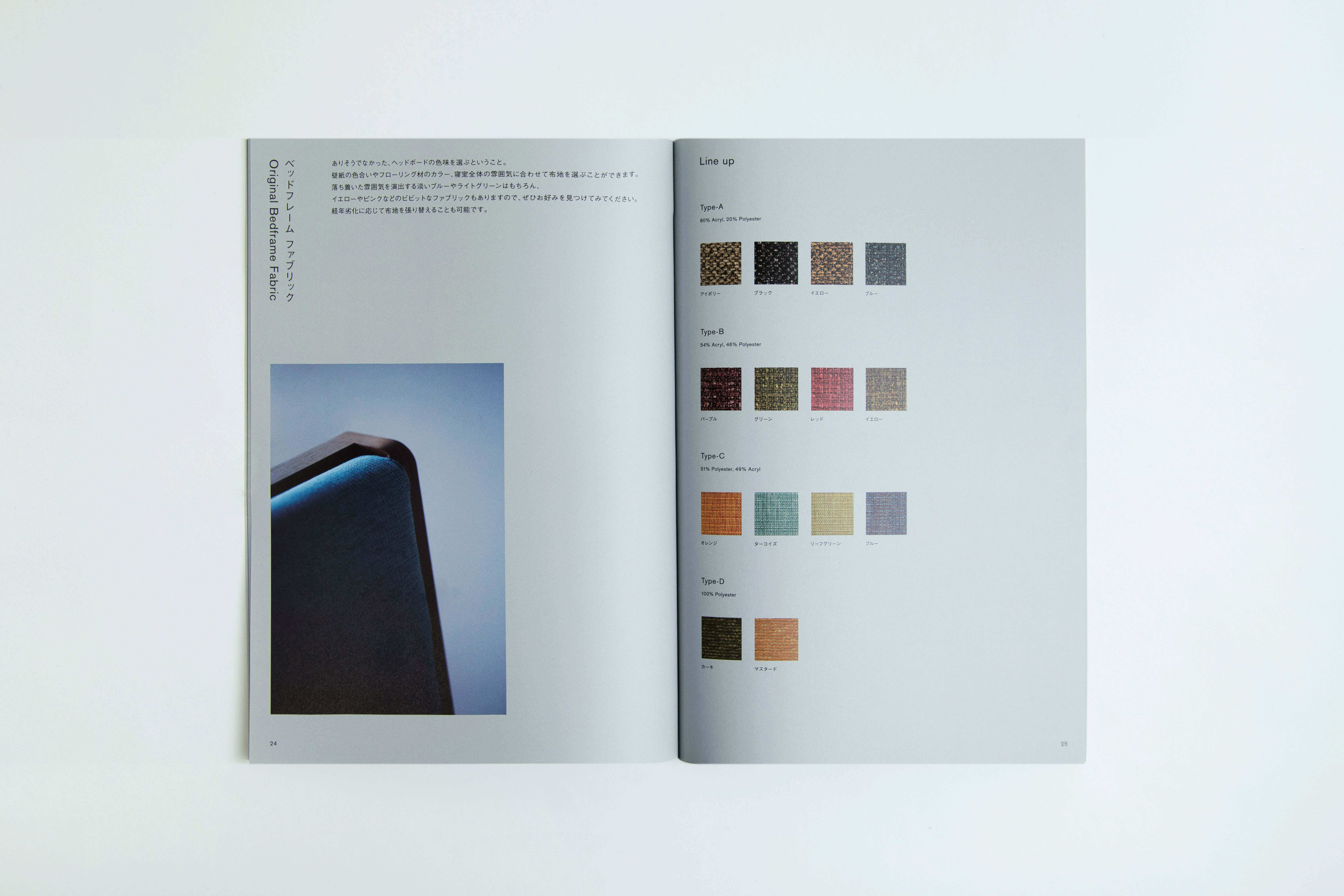 Catalog
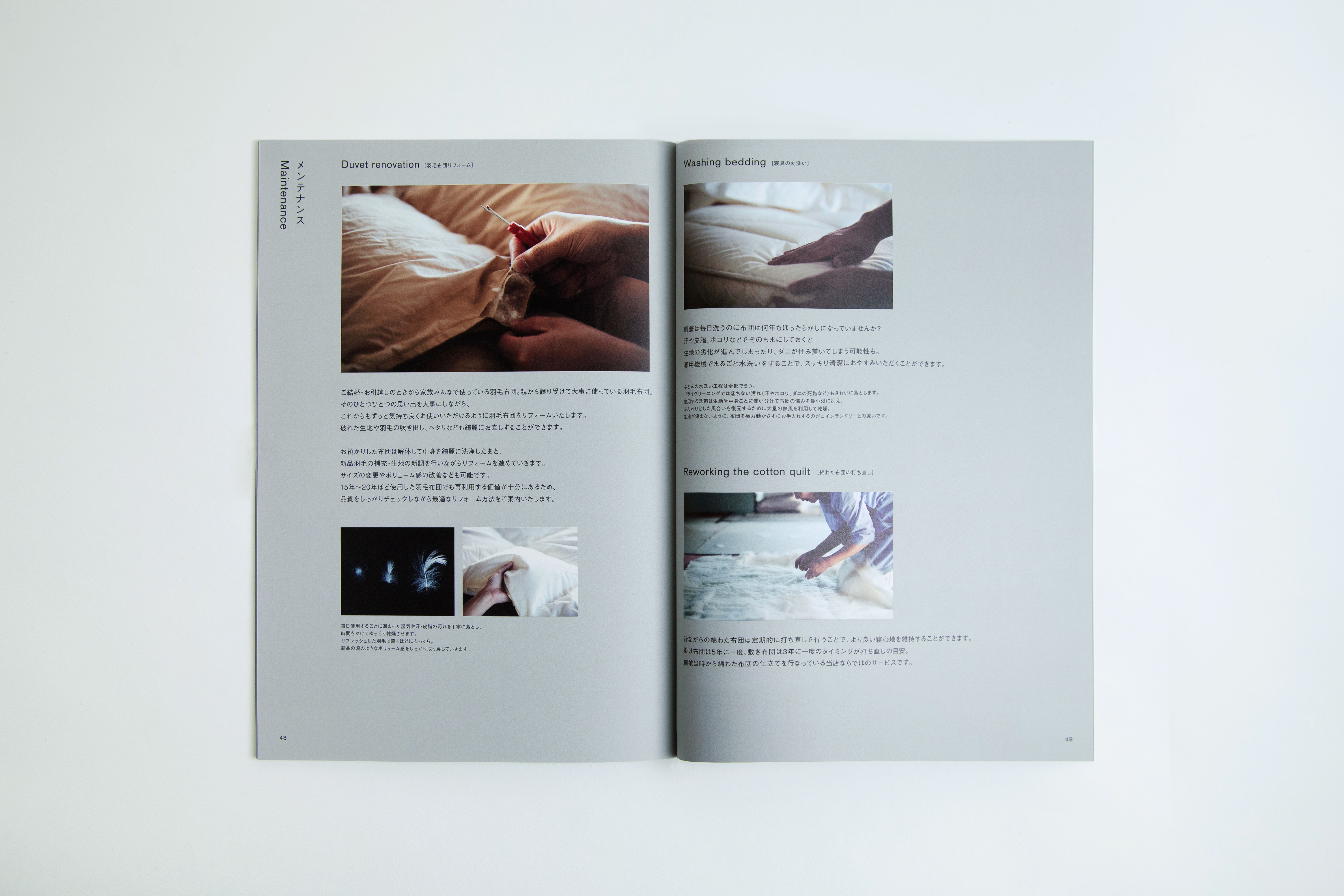 Catalog
人生のサンブンノイチを、もっと素敵に。オーダーメイド寝具から羽毛布団リフォーム、セレクト寝具などを取り扱う寝具専門店「THE BEDROOM SHOP sanbun_no_ichi(ザ・ベッドルームショップ サンブンノイチ)」。
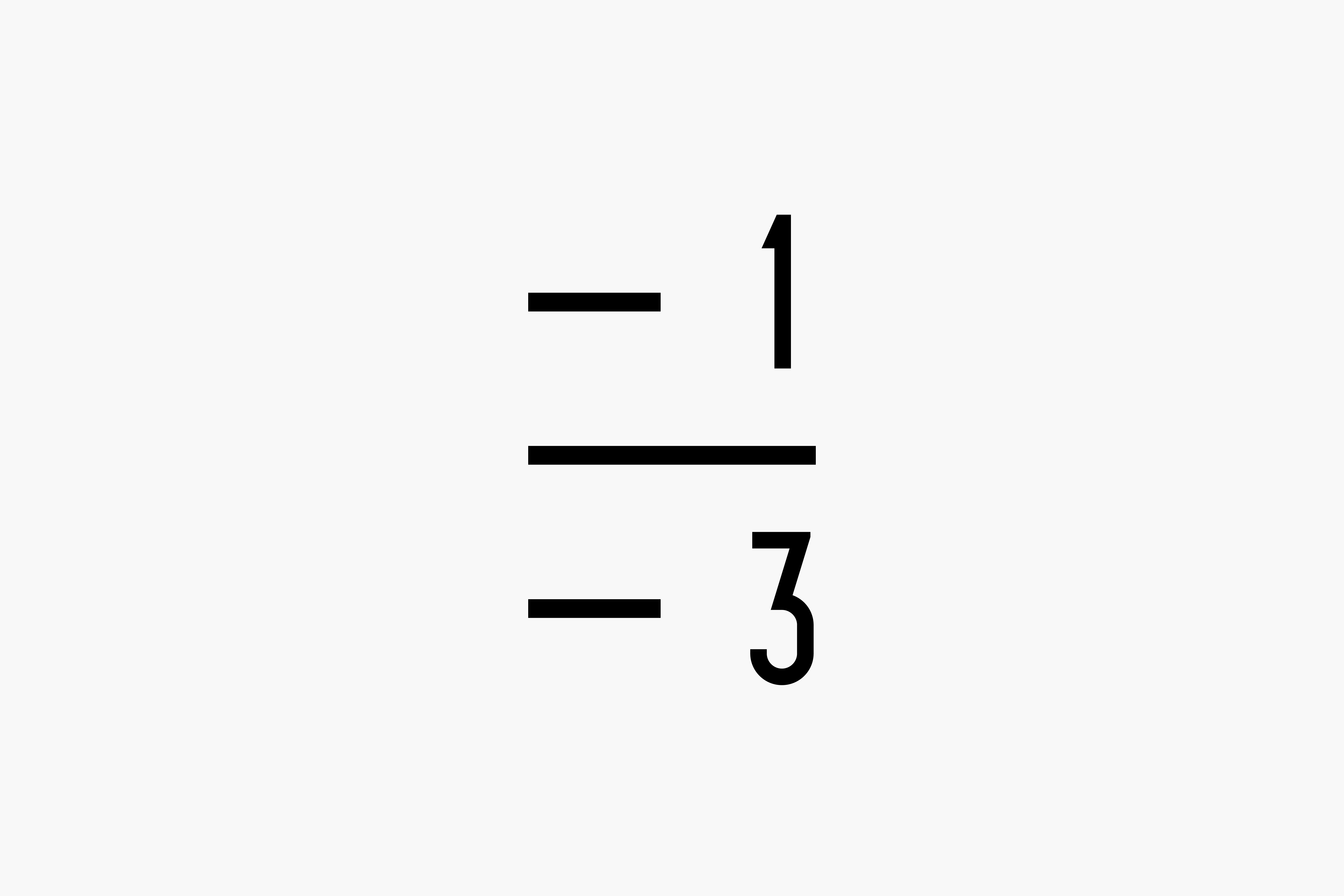
店名に掲げている「1/3」は、人生における睡眠の割合を示している。睡眠の質が高まる様子を目盛をモチーフにシンボル化し、理化学的なトーンで寝具の専門家であることを表現。また、目盛には睡眠時間を満たすという意味を込めた。クラフト感・工房感のあるトーンとすることで、親しみやすく、時代に流されない普遍的なロゴデザインを目指した。各種ツールの環境色にはライトグレイを用いており、寝具や睡眠をイメージさせるよう設計している。店舗のサインデザインにも携わり、専門家であるオーナーご夫婦から、これまで気がつかなかった寝具の魅力を楽しみながら学べる店舗を目指した。
Make one third of your life more charming. THE BEDROOM SHOP sanbun_no_ichi a bedding supplier who specialises with custom made or select bedding and remake of down quilts. The name ‘1/3 (sanbun no ichi)’ suggests the length of time people spend on sleeping in their entire life. The motif of the logo is a scale which imply the shop’s physico-chemical approach to sleep and signifies the improvements in the quality of their sleep in the hope that everyone can satisfy the recommended length of sleep. Adding handmade and workshop like feels to it, we arrived at a universal logo design that is approachable but not affected by trends. The background colour we selected for a variety of sales promotional materials is light grey, which reminds of bedding or sleep. We were involved also with the design of the interior of the shop. We aimed to create a shop where the customers can enjoy learning about the bedding from the couple who own the shop and are specialists of sleep.