SALON dé MARPLE
- Client :
- SALON dé MARPLE
- Term :
- 2020
- Works :
- BrandingCi/Vi/BiPackage/ProductsGraphicsSpace
 Logo
Logo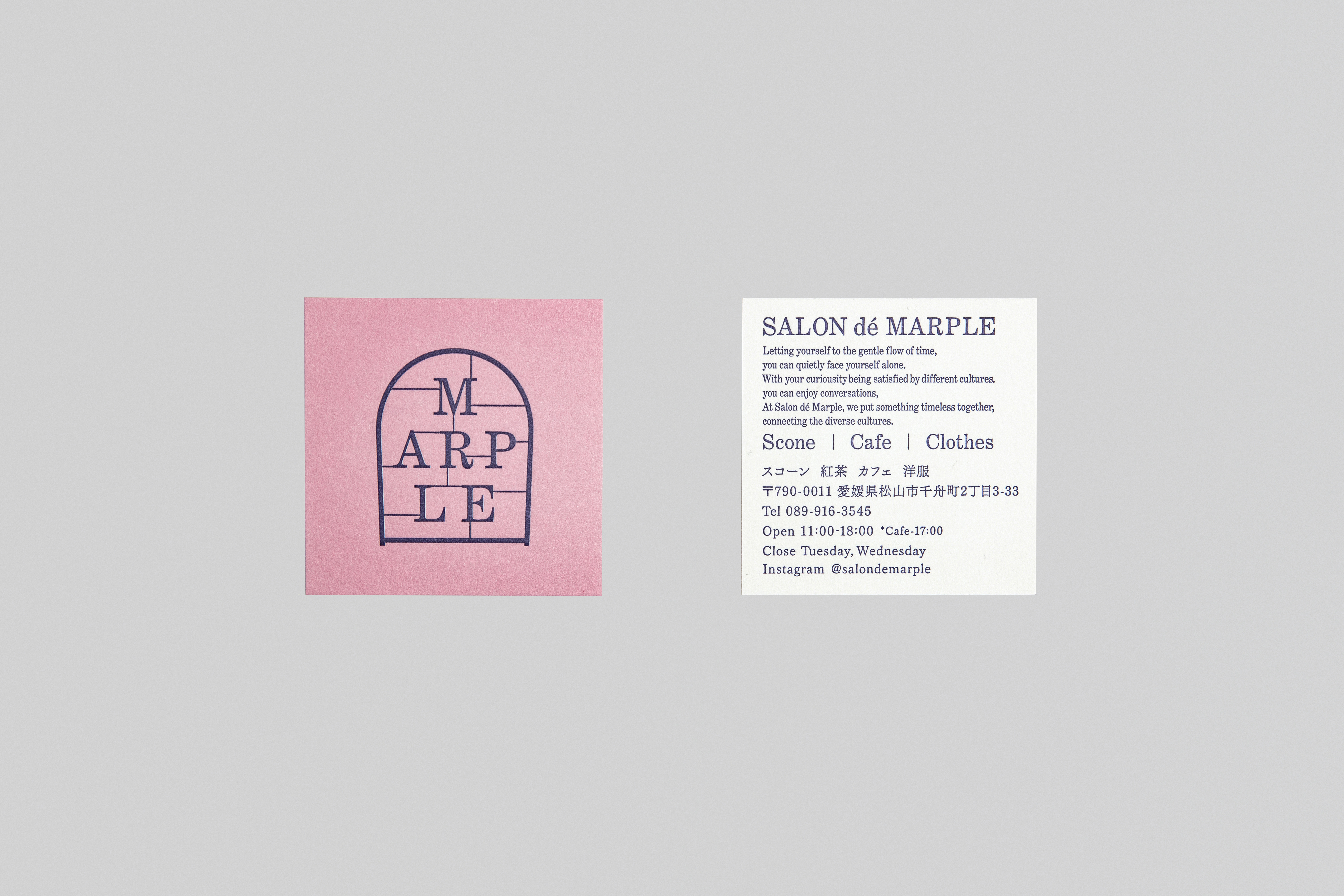 Shopcard
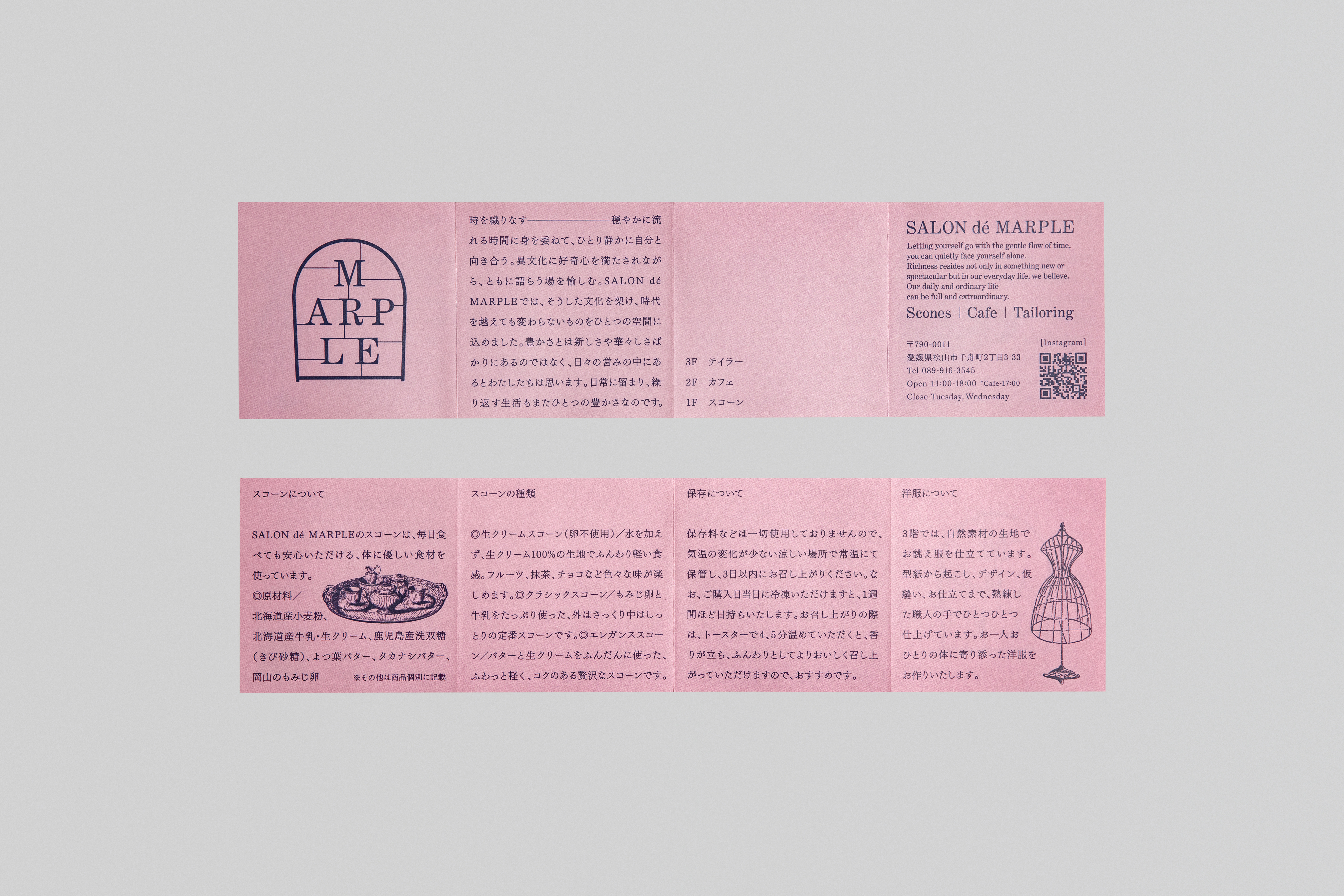 Leaflet
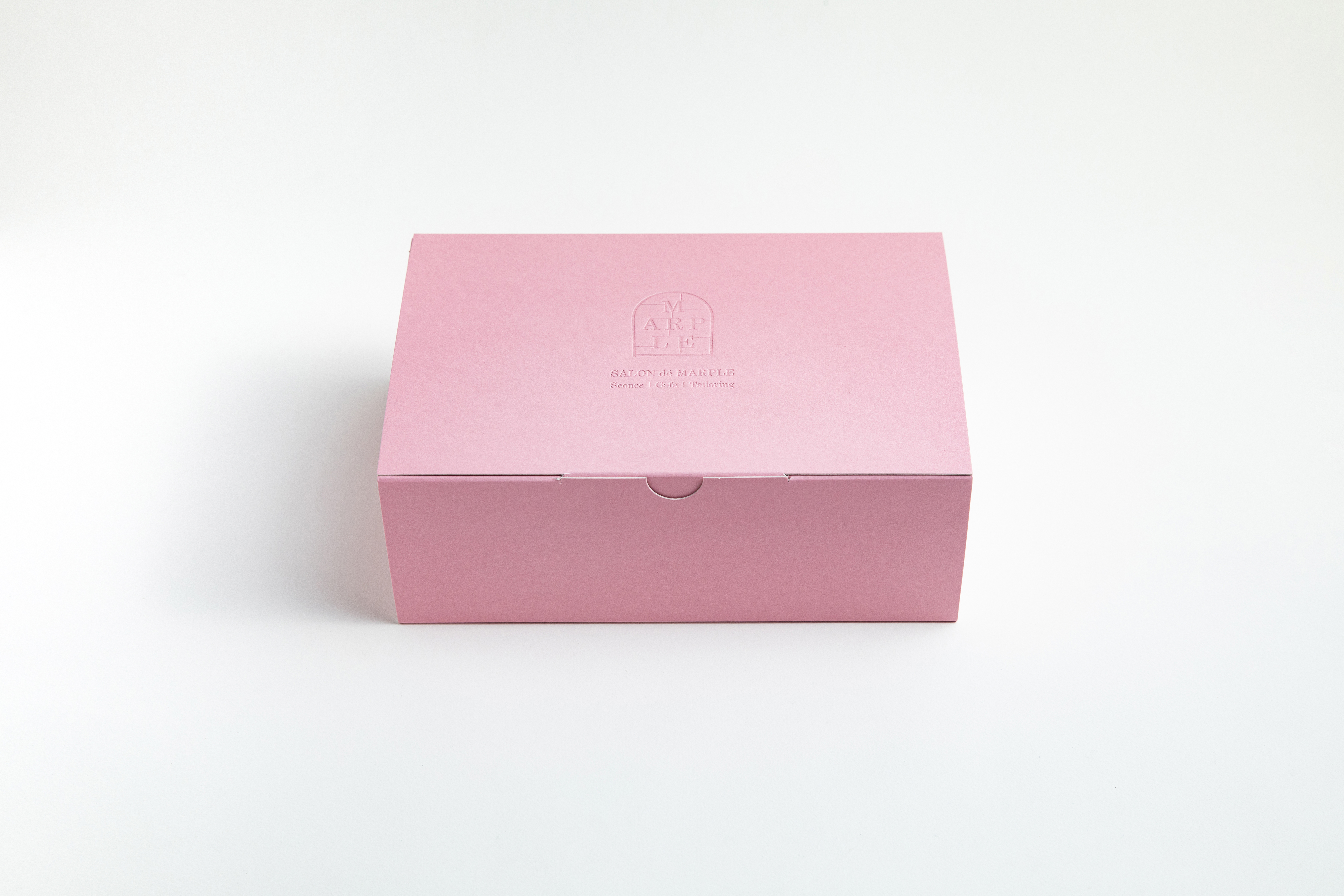 Package
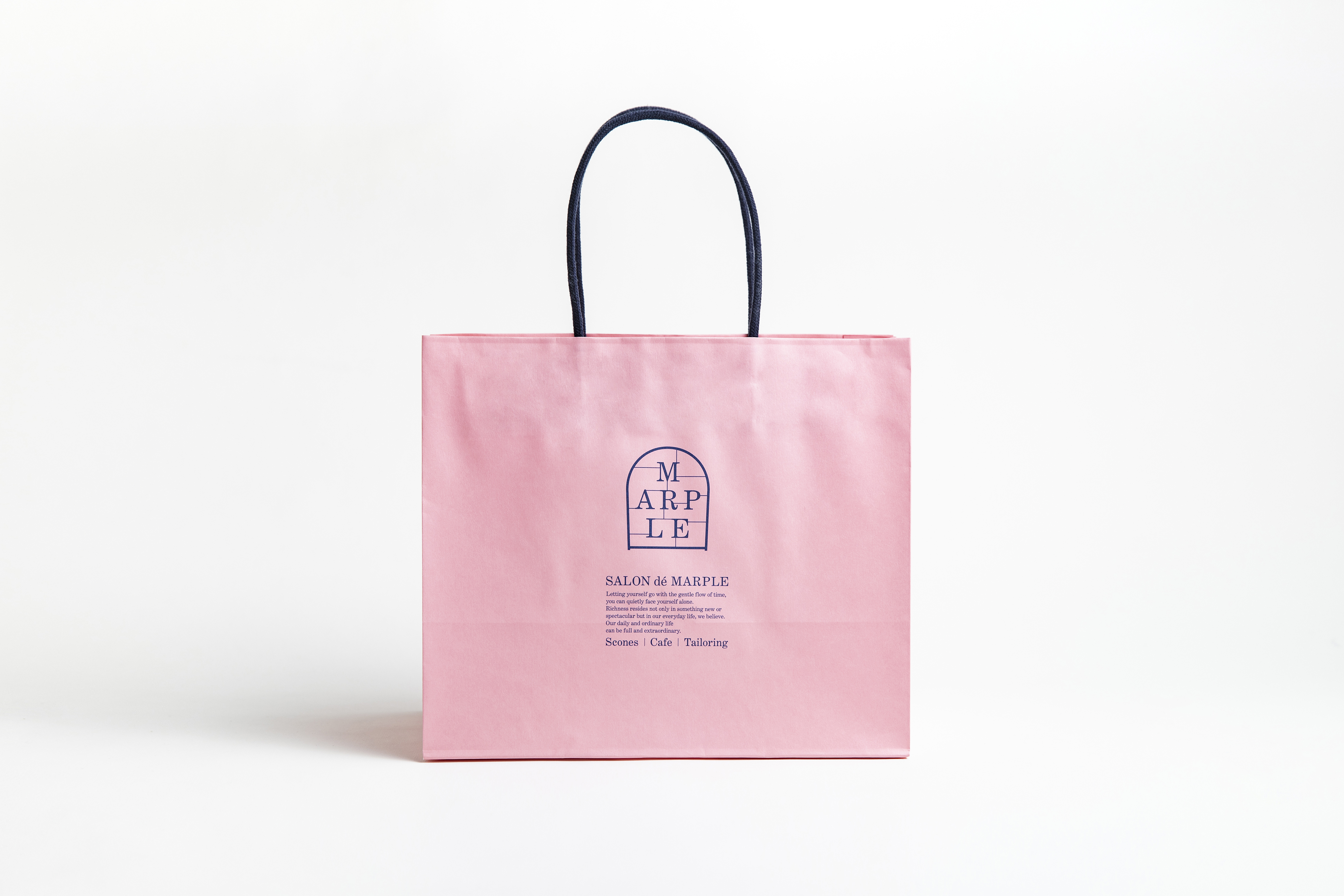 Shopper
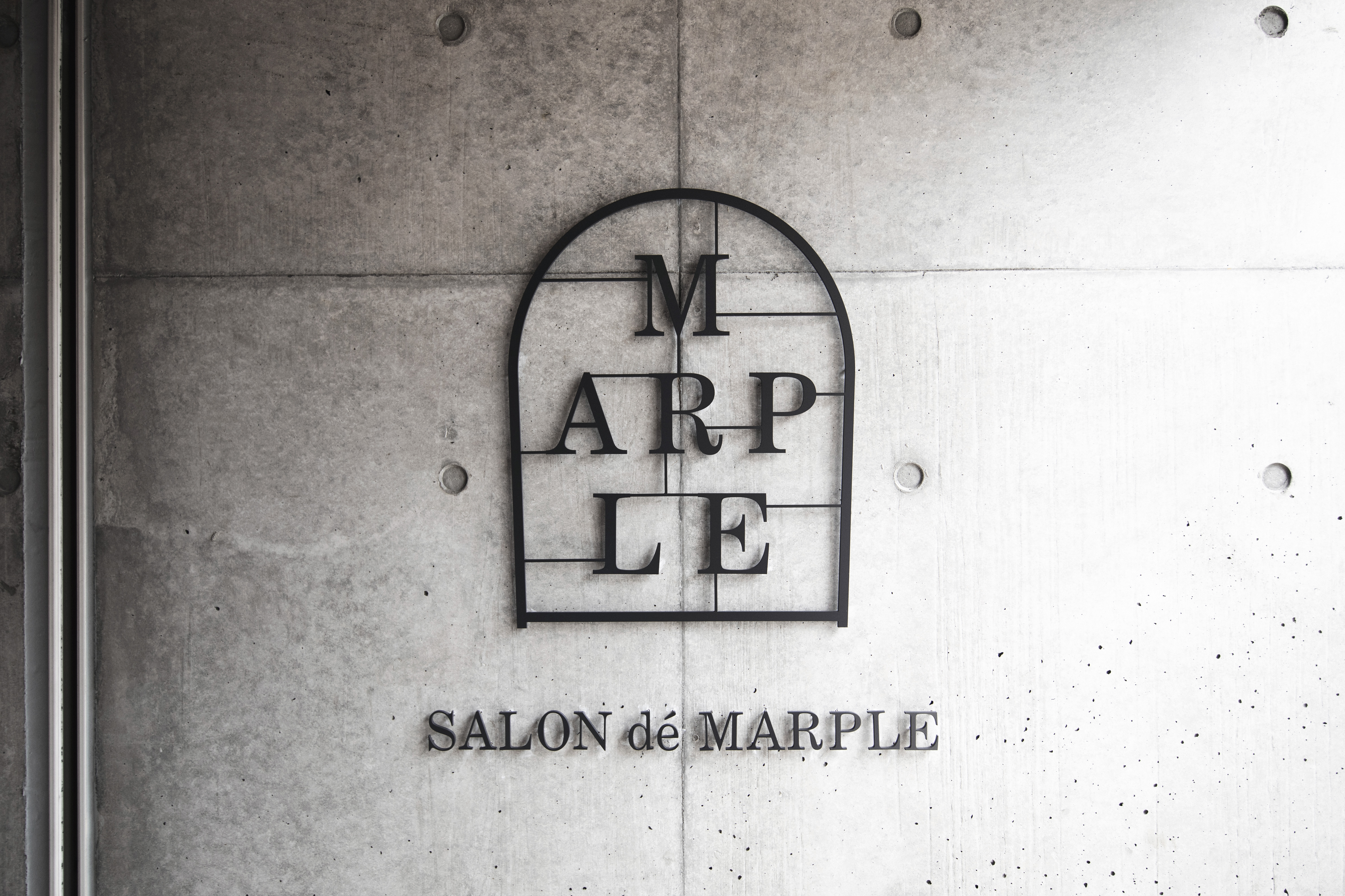 Sign
Sign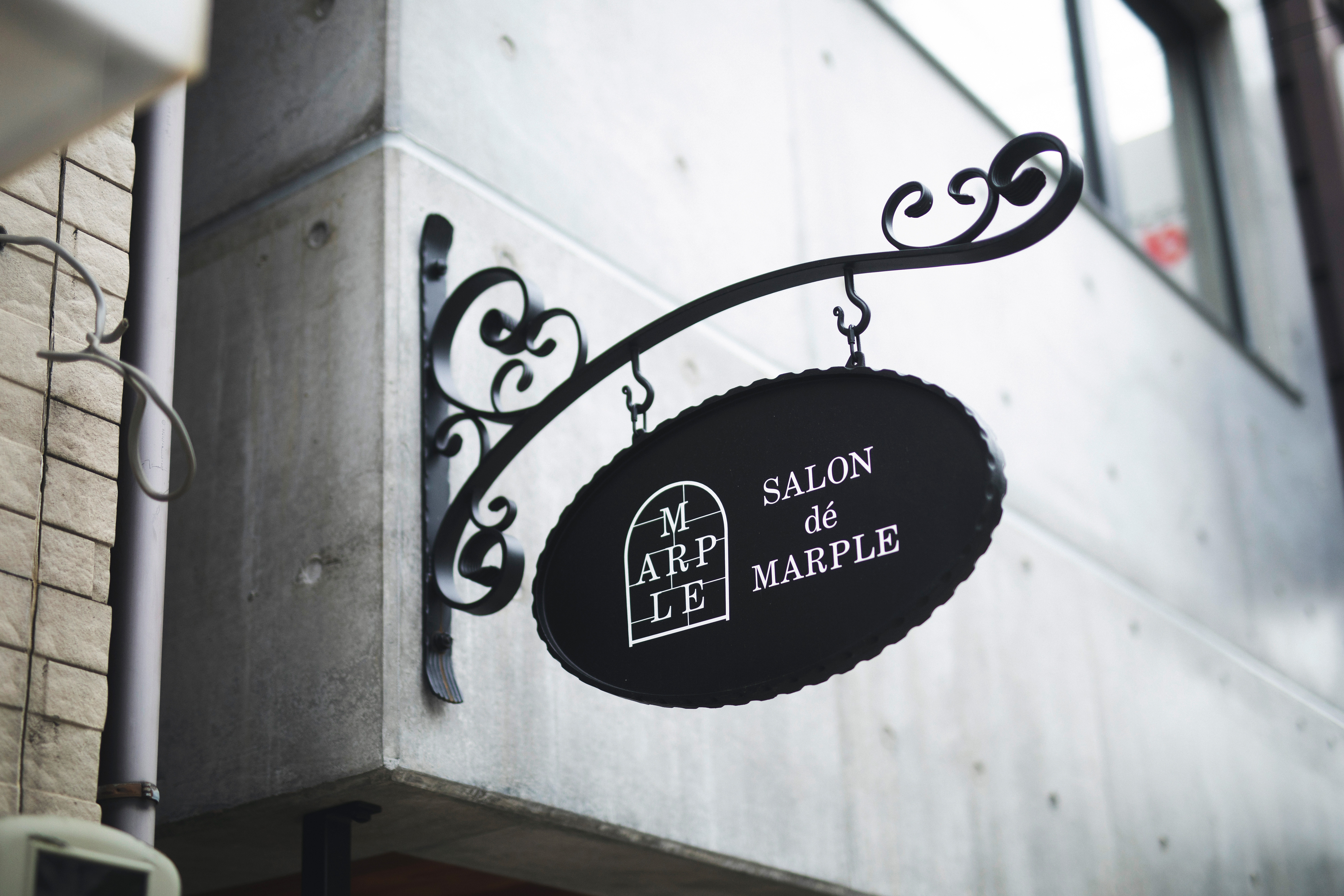 Sign
Sign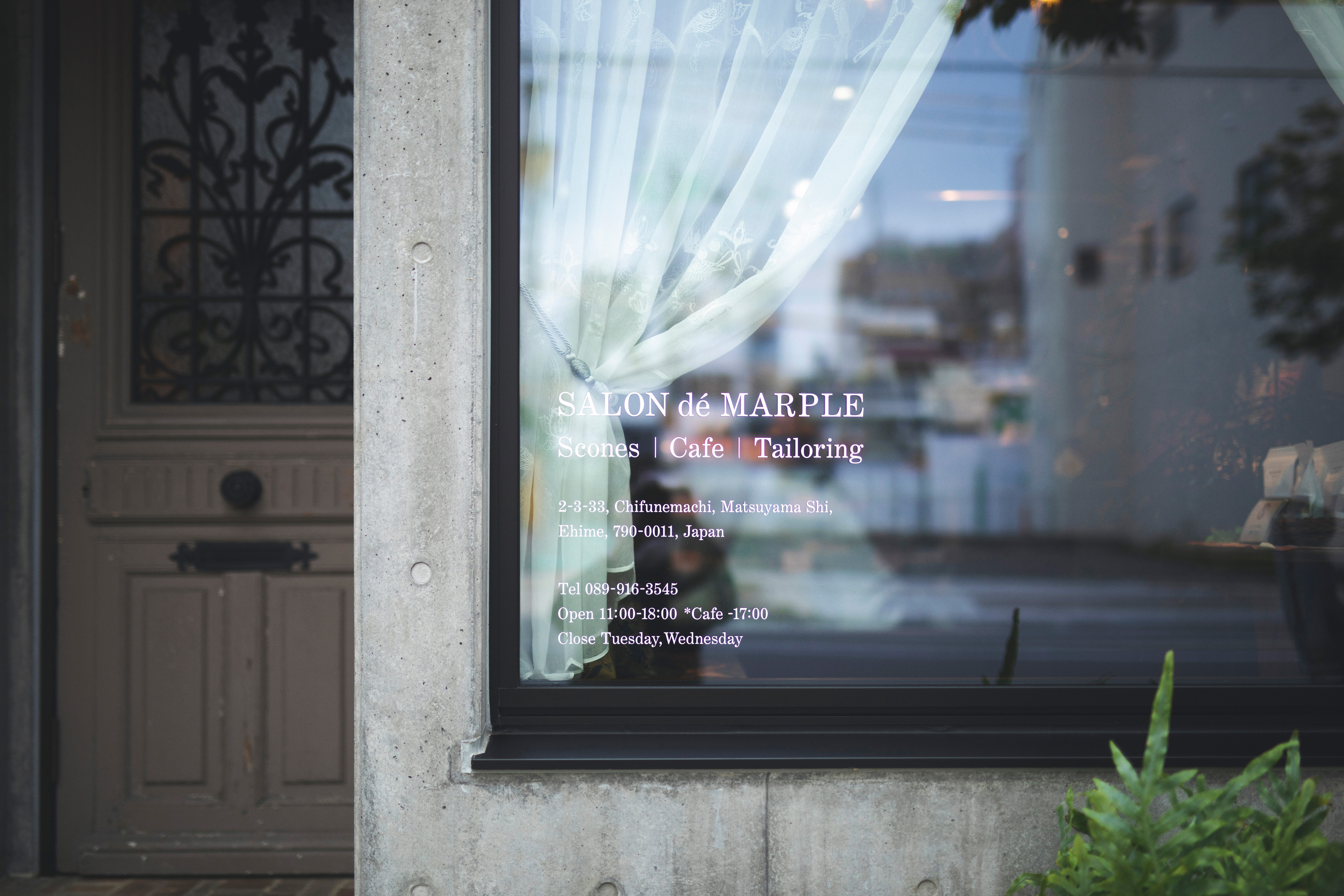 Sign
Sign
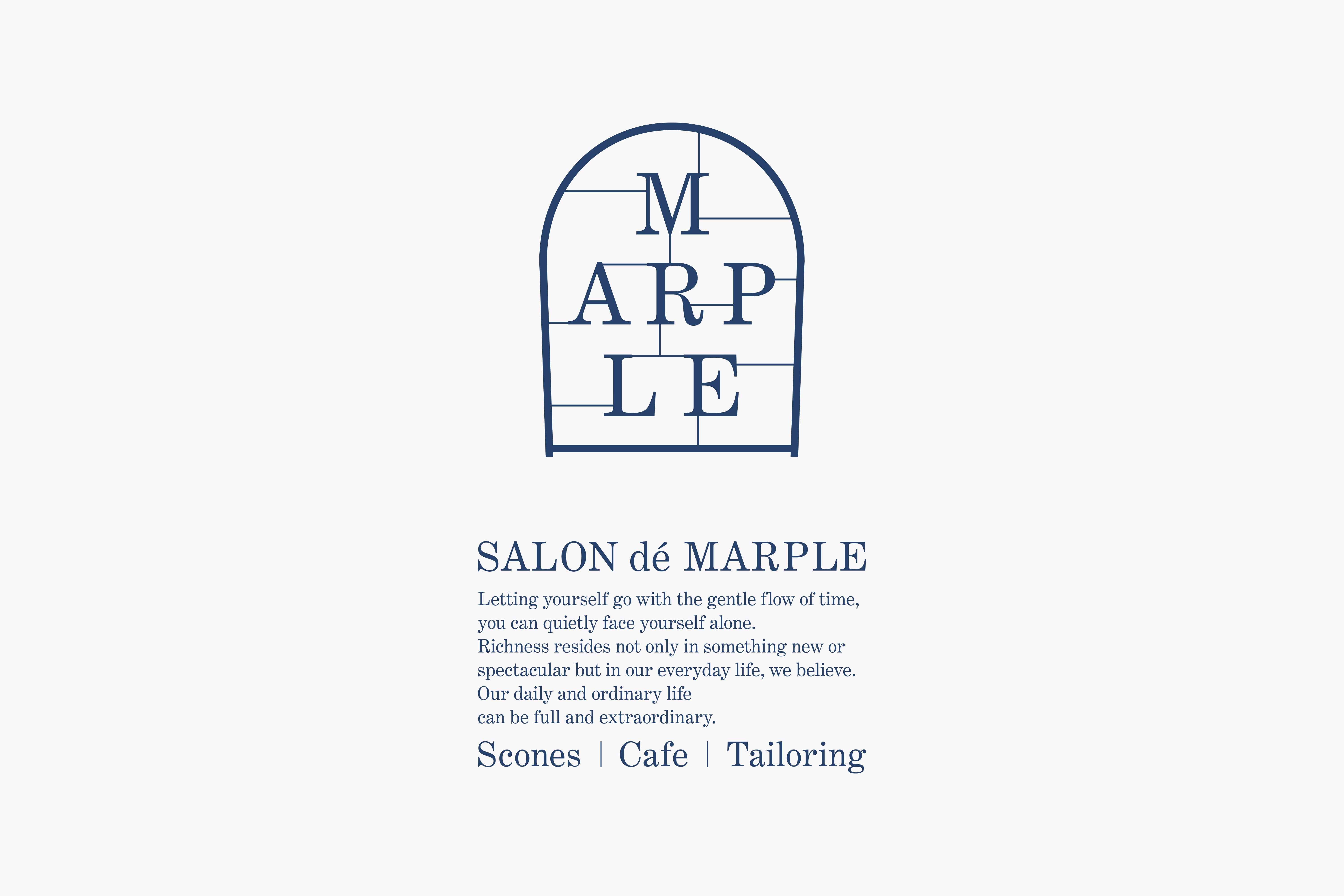
穏やかに流れる時間に身を委ねて、ひとり静かに自分と向き合う。異文化に好奇心を満たされながら、ともに語らう場を愉しむ———文化を架け、時代を越えて愛されるスコーンとグラノーラの専門店「SALON dé MARPLE(サロン・ド・マープル)」。
コンセプトの核となるのはオールドイングランド。立ち上げにあたっては当時代の背景や暮らし方を丁寧に抽出するところから始め、その空気感と店主の想いをロゴマークに集約した。ロゴマークは面格子の丸窓をモチーフにサロン(客間や応接間の意)を表現。職人やクラフト感、工房などを感じさせる本質的なトーンとした。また、環境色として設定したサーモピンクにより、柔らかさと女性的なニュアンスを付加し、柔らかさと本質さの両特性を持たせた。各種ショップツールをはじめギフト用パッケージ、ショップサインに至るまで統一した世界観のもとデザインを行なった。
Letting yourself to the gentle flow of time, you can quietly face yourself alone. With your curiousity being satisfied by different cultures, you can enjoy conversations —
SALON dé MARPLE specialises scones and granola which have been loved timelessly over the time irrespective of cultural differences.
The underlying concept is Old England. At the launch of the shop, we slowly and carefully tried to extract the essence of the way of life of Old England and the owner’s thoughts and feeling of the olden days summarised into a logo. The motif of the logo, a round window with surface lattice symbolises a drawing room or a salon. The quintessential form conveys the essence of craftsmanship, handmade and workshop feelings. Also, the choice of salmon pink for the background colour adds femininity and softness that resonate with the structured design. We designed all the promotional tools including packages for gift and shop signs, based on the same view of the world.