Ehime Folk Crafts Museum
- Client :
- Ehime Folk Crafts Museum
- Term :
- 2020
- Works :
- Ci/Vi/BiGraphics
 Ci/Vi/Bi
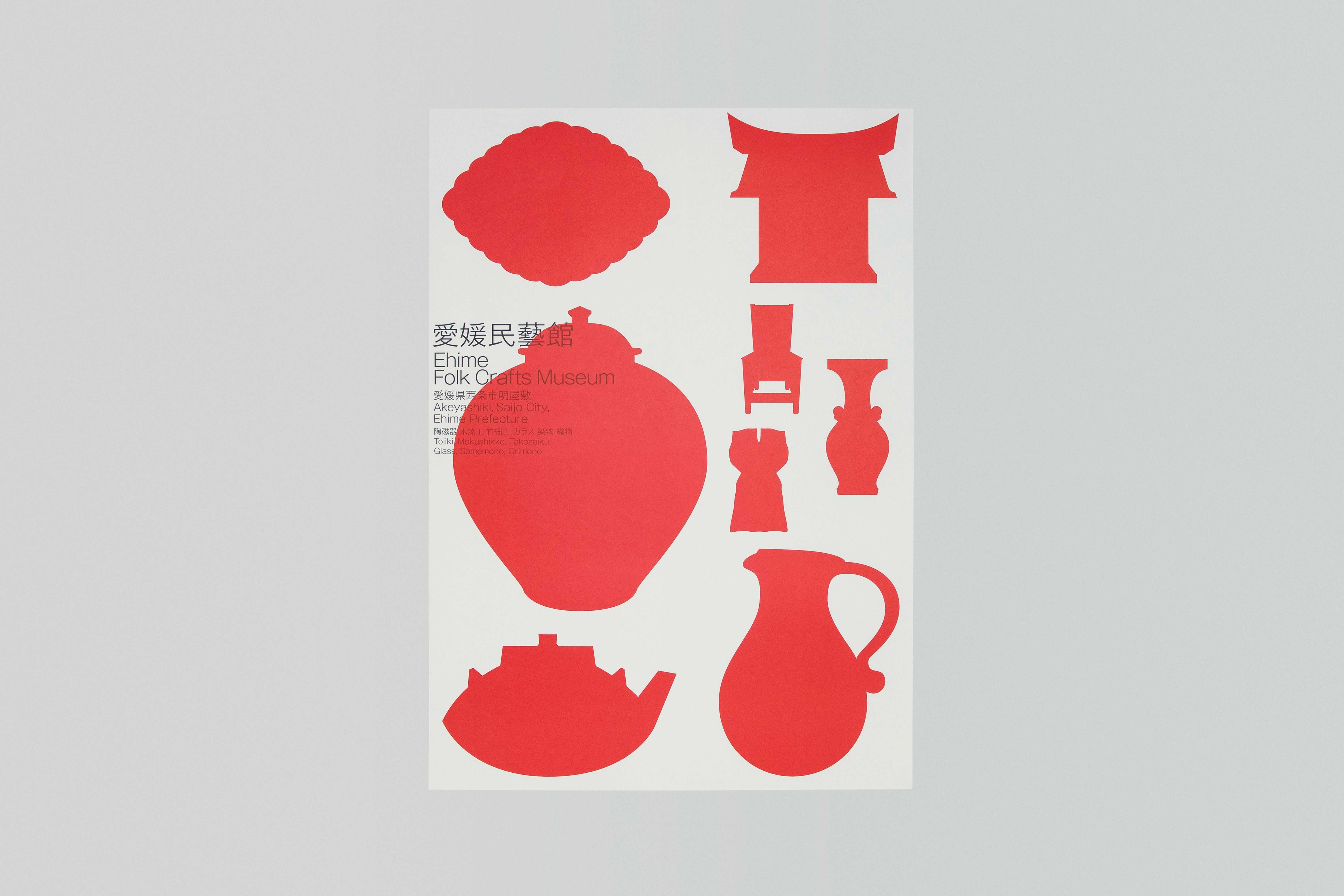 Poster
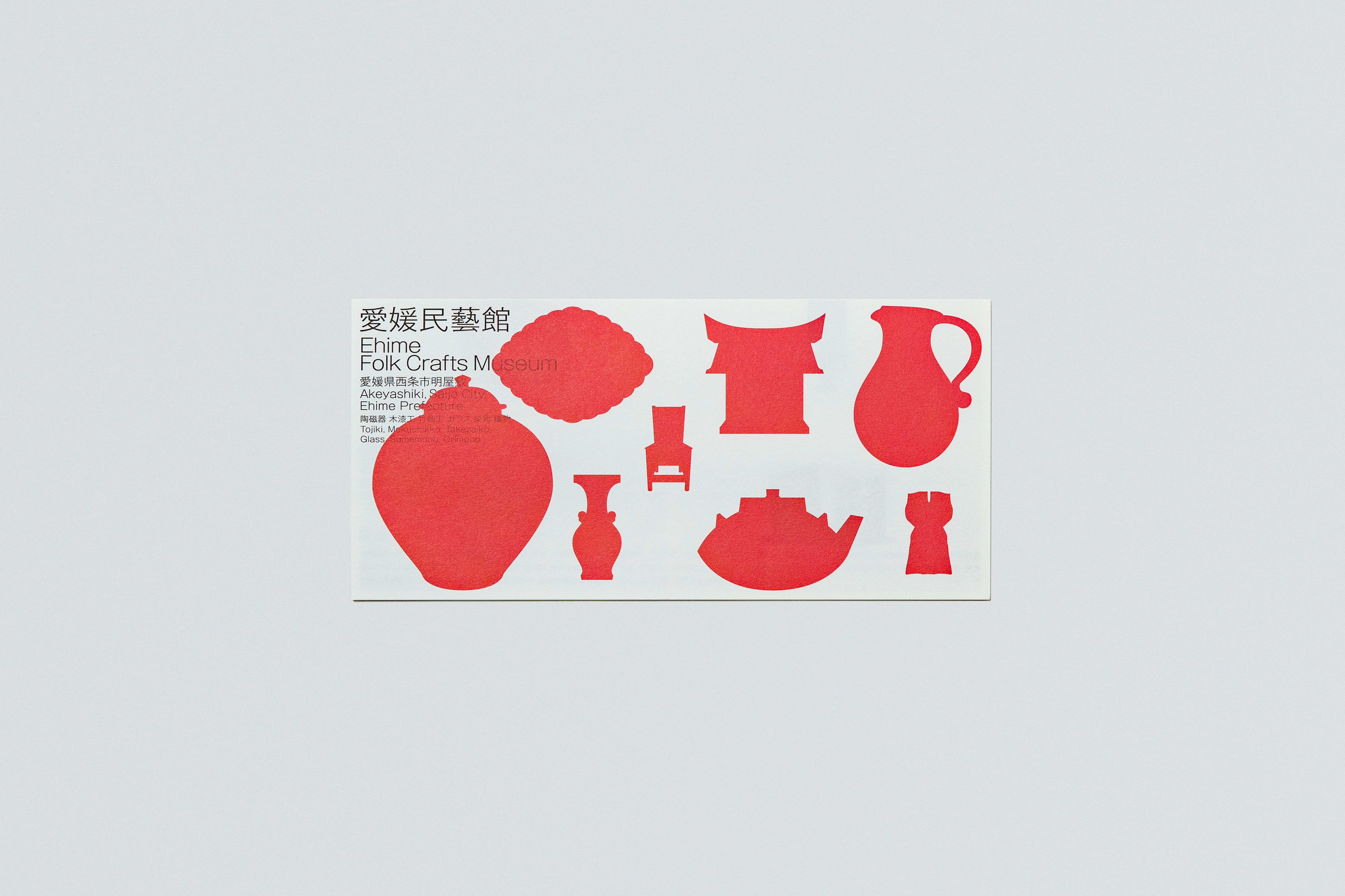 Leaflet
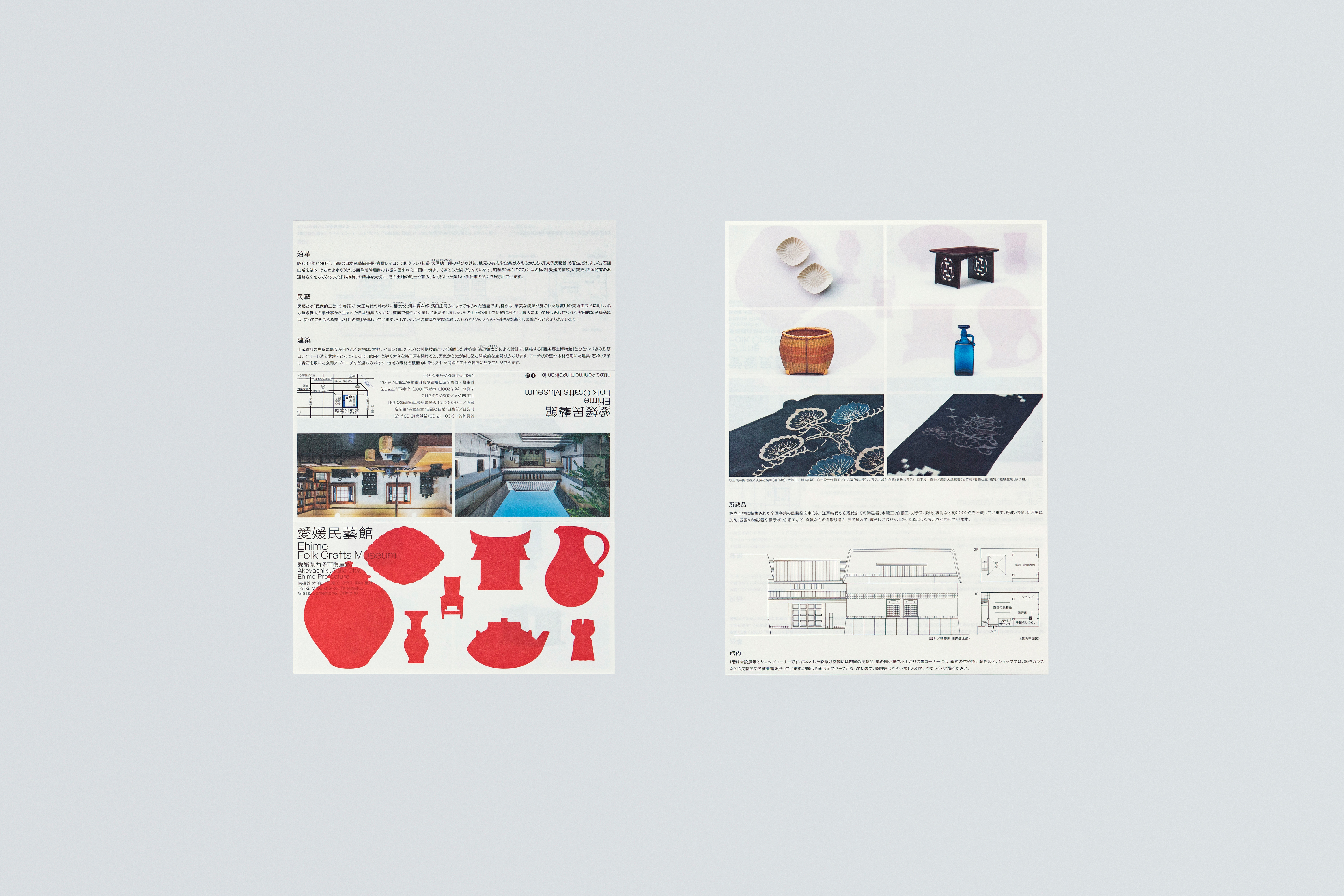 Leaflet
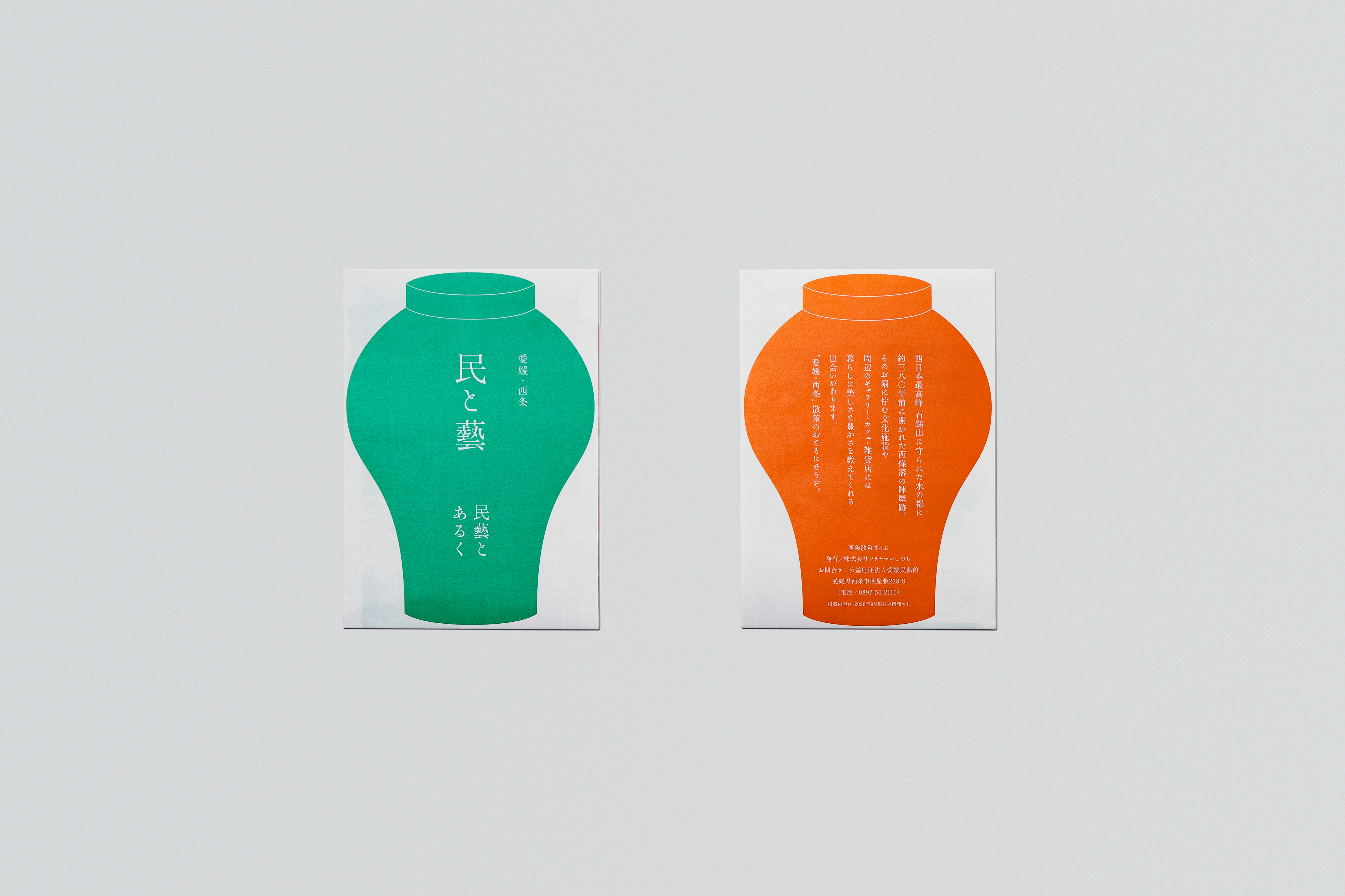 Map
Map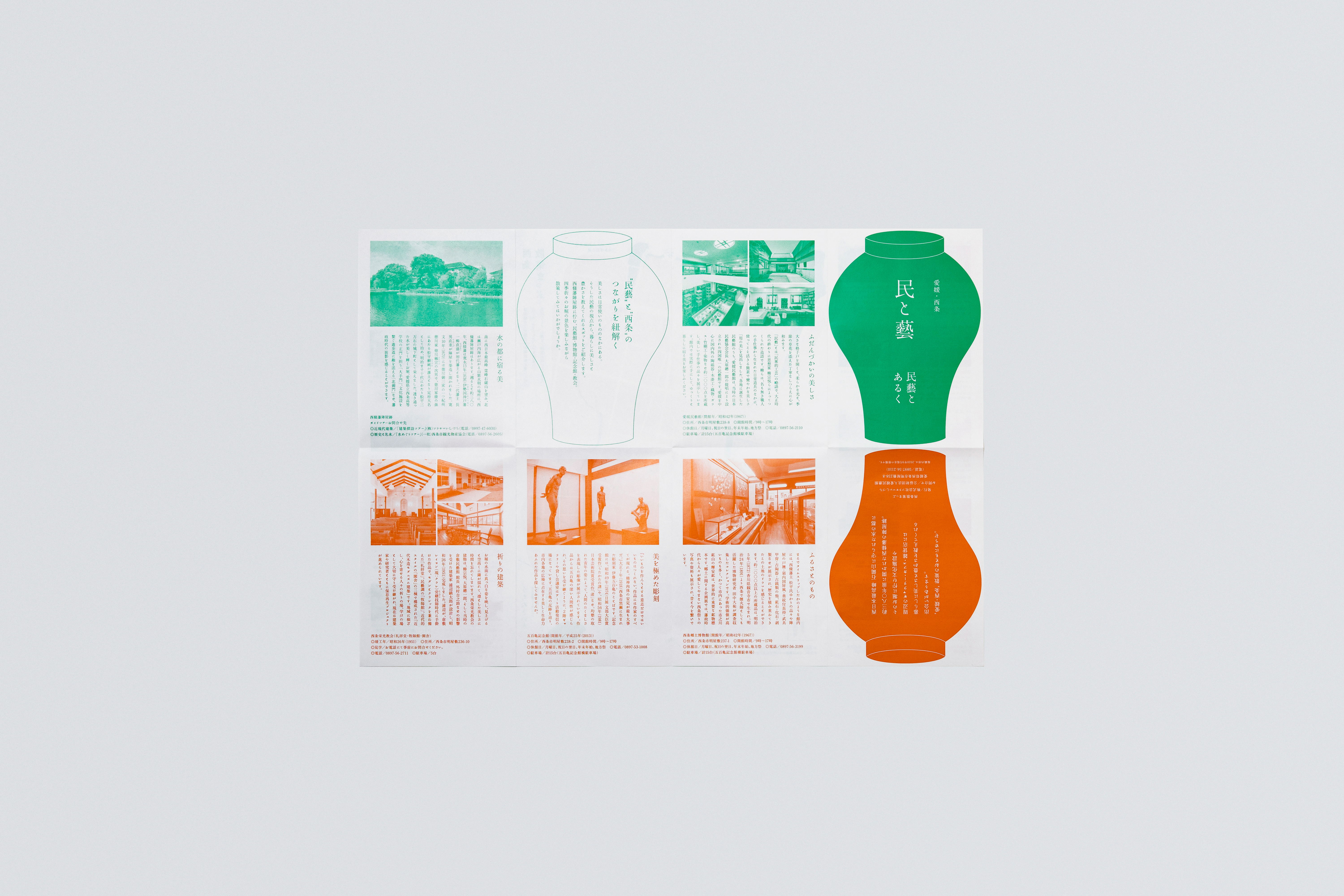 Map
Map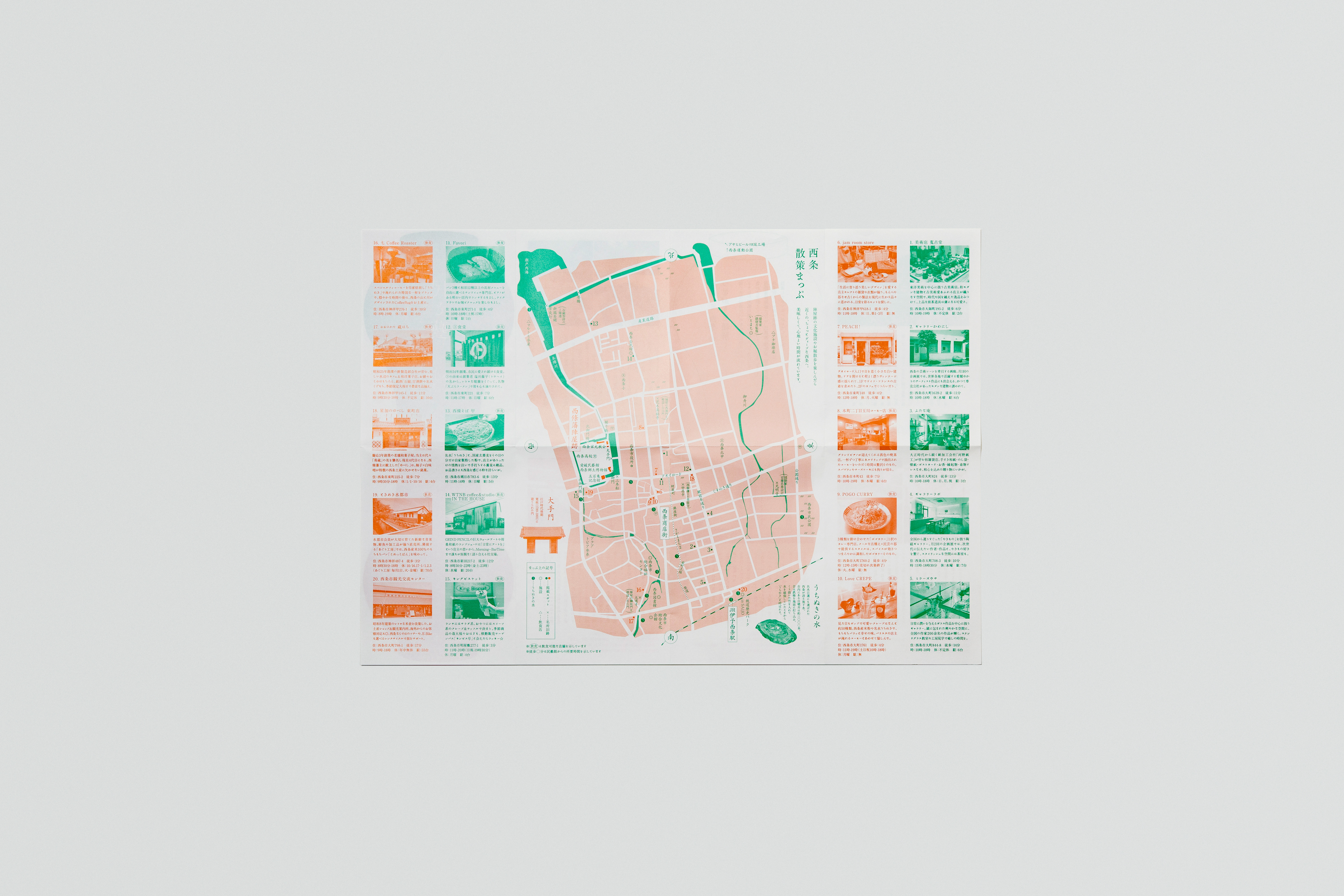 Map
Map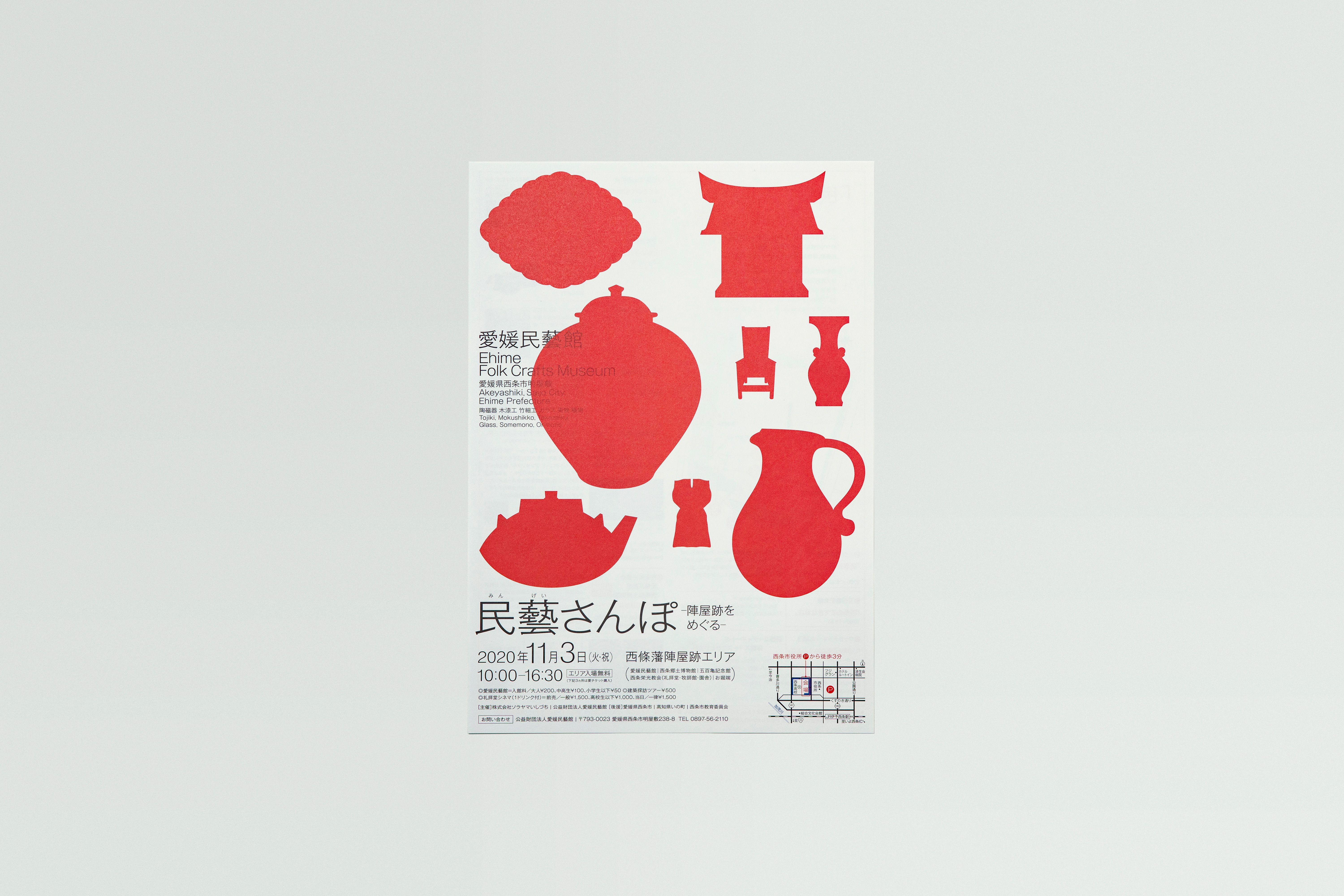 Flyer
Flyer
四国唯一の民藝館「愛媛民藝館」は、愛媛県西条市に昭和42年(1967)に「東予民藝館」として設立し、昭和52年(1977)に現名称に変更となった。
本プロジェクトでは、より広い層に民藝の魅力を知ってほしいという想いを軸に、キービジュアルの一新から始めた。新ビジュアルでは、西条と関係の深い当施設の象徴的な民藝品数種をモチーフに、これまで民藝に馴染みのある方をはじめ、新ターゲットに据えた民藝へ馴染みの少ない若年層にも届く表現とした。民藝特有の愛らしく、温もりのある表情を朱色のモチーフで示し、時代に左右されない“普遍性“を込めている。また並行して、施設ロゴタイプの再整理、各種館内ツール、周辺環境を紹介した散策マップを制作し、統一した顔つきとすることで、西条一帯を民藝の意思が根付く無二の環境であることを示した。
Ehime Folk Crafts Museum is the only museum of folk craft in Shikoku region. It was established originally in 1967 in Saijo City, Ehime as Higashi Iyo Crafts Museum and renamed in 1977.
The project started with a complete change of the main visual, with a wish to improve awareness of folk crafts among wider range of people. The motif of the new visual is based on some symbolic folk crafts related closely with Saijo. The design is aimed to reach young people who are less familiar to folk crafts, as well as those who feel familiar to them.
The adorable and warm features of crafts are expressed in vermilion which also embodies the universality and timelessness. In parallel with the main visual, we worked also on a readjustment of the logo, several tools inside the building and a guide map to give visitors information about the surrounding area. Keeping a unified look on all the designs, we suggested that the Saijo area is one and only location with a heritage of folk craft is rooted deeply.