NHK Shikoku
 Ci/Vi/Bi
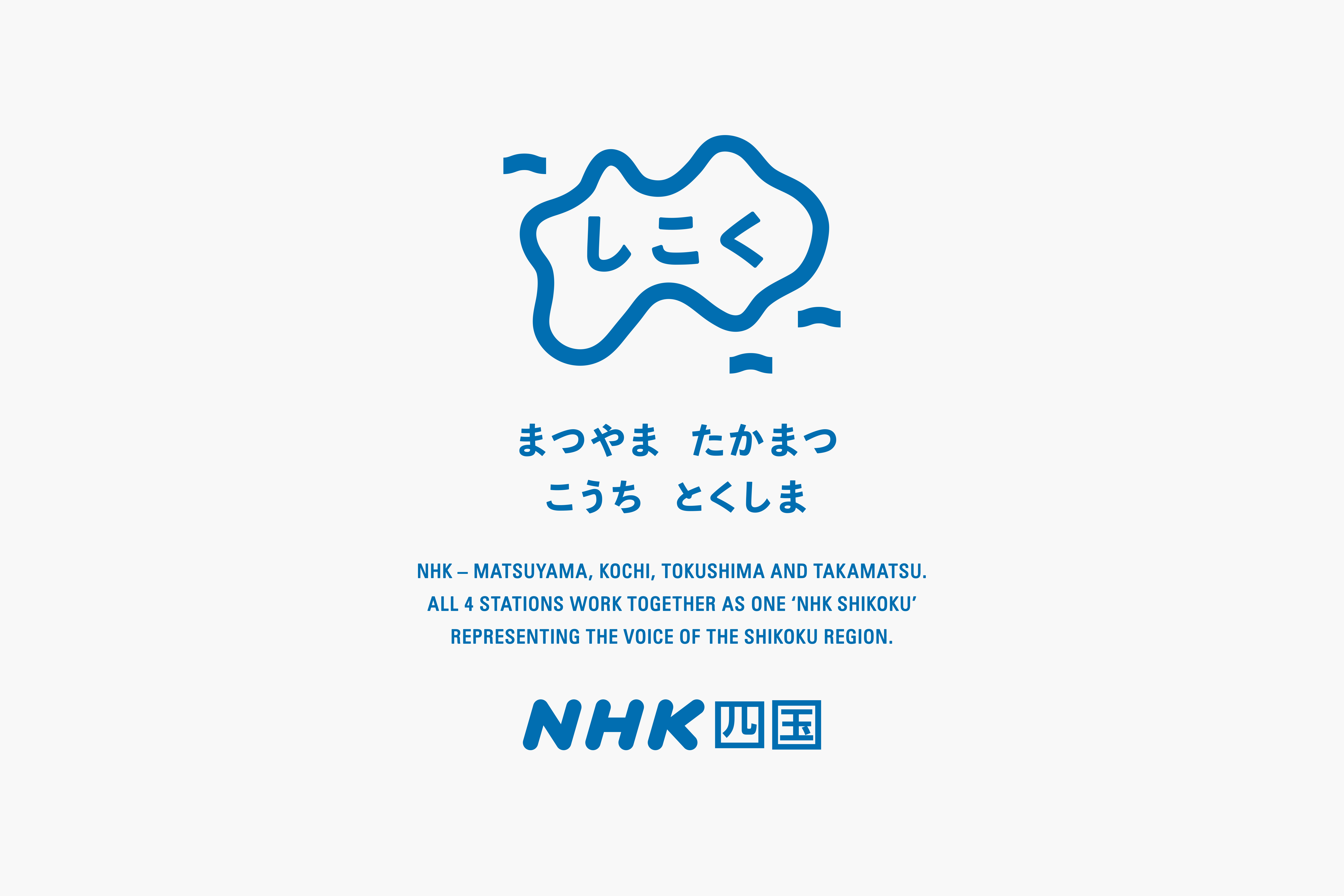 Ci/Vi/Bi
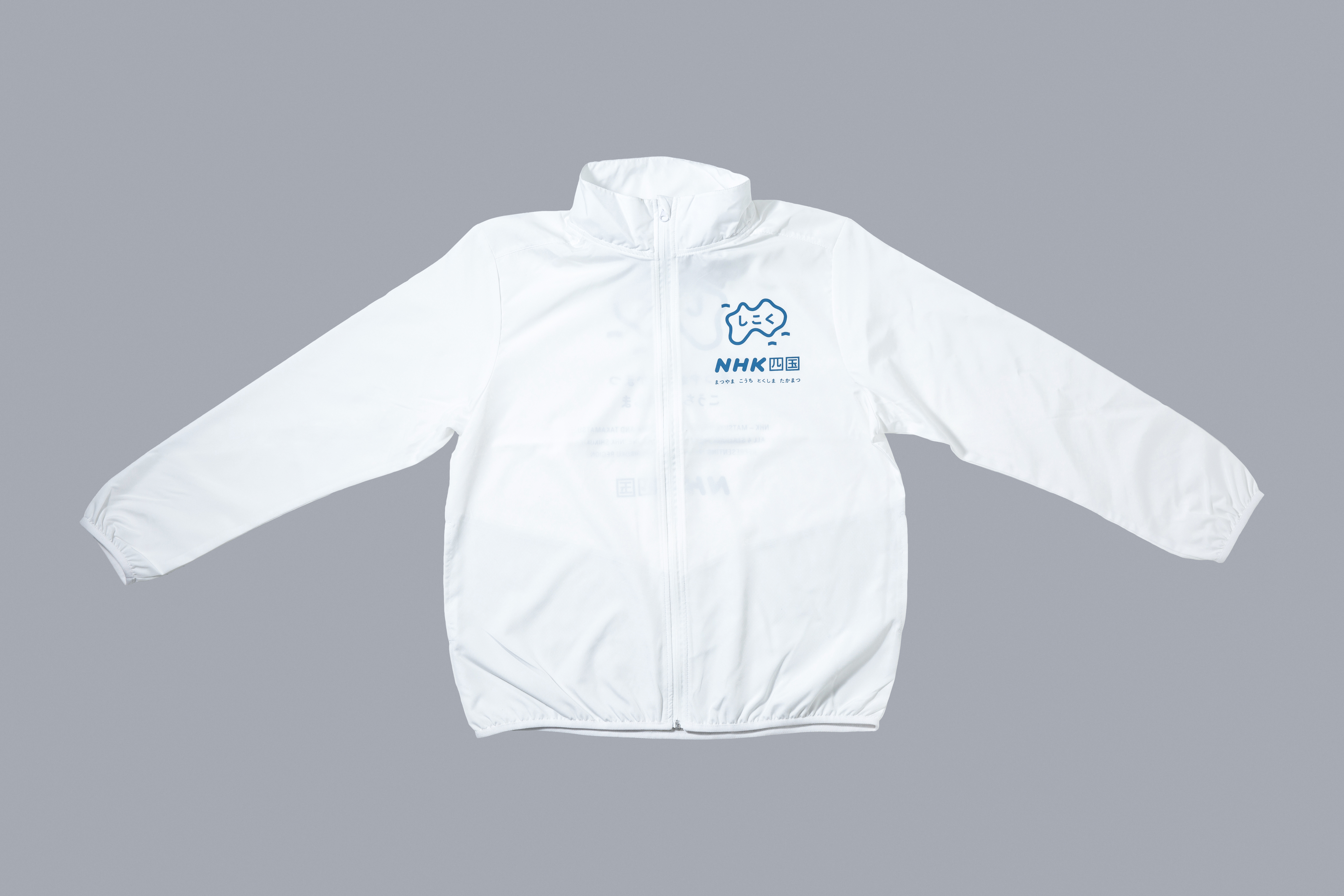 Wind Breaker
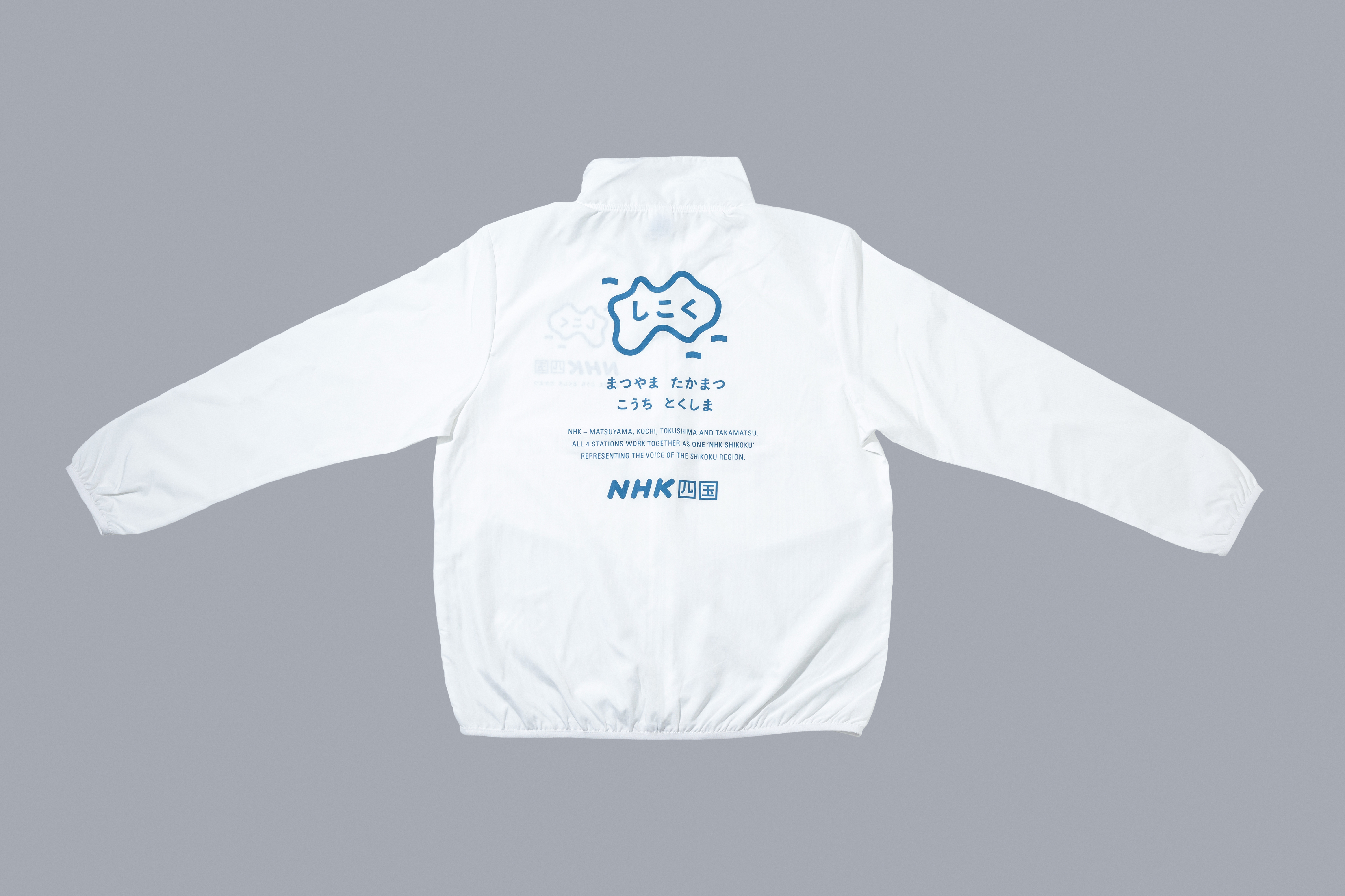 Wind Breaker
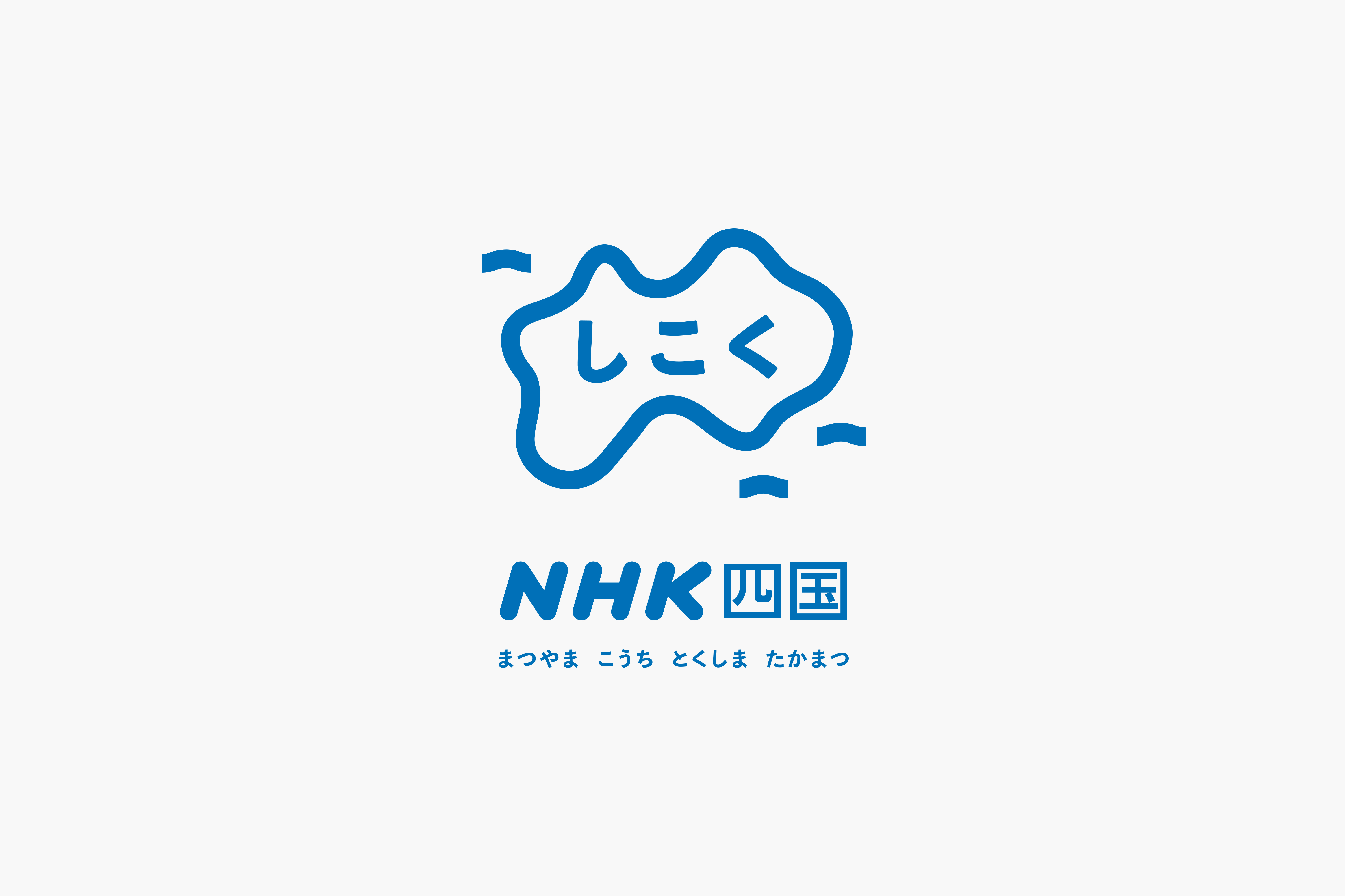
松山・高知・徳島・高松の各県に配され、地域に根付いた報道・発信を行なっている四国のNHK各局。それら4局が一層連携を強め、時には一体となり活動する姿勢を「NHK四国」という名称とオリジナルのシンボルで表現した。周囲を海に囲まれた島国四国。海を示した紺碧色によるゆるやかな一本の輪と、その内に配した「しこく」の文字は、当環境に由来している。地元に密着したローカルならではの土着的で愛着を感じさせるシンボルは、スタッフジャンパーの背と胸に配され、局員各々が当シンボルを背負って活動している。
NHK (Japan Broadcasting Corporation) Shikoku is the name given to a group of four broadcasting stations on the Island of Shikoku: Matsuyama, Kochi, Tokushima and Takamatsu which provide the local people with information and news of the areas. The logotype is an original symbol of the unity and cooperation of the four stations. The azure loop with gentle curves represents the sea, and the word ‘Shikoku’ located in the middle the sense of being surrounded by the sea. The pastoral and affectionate touch given to the symbol mark signifies the corporation’s closeness to the local community. Each staff of NHK shikoku is supplied with a staff jacket to which the logo is attached on the back and chest. It looks as though they carry their identity on their back.