Aratama Suidou
- Client :
- Aratama Suidou
- Term :
- 2017
- Works :
- Ci/Vi/BiGraphics
 Logo
Logo
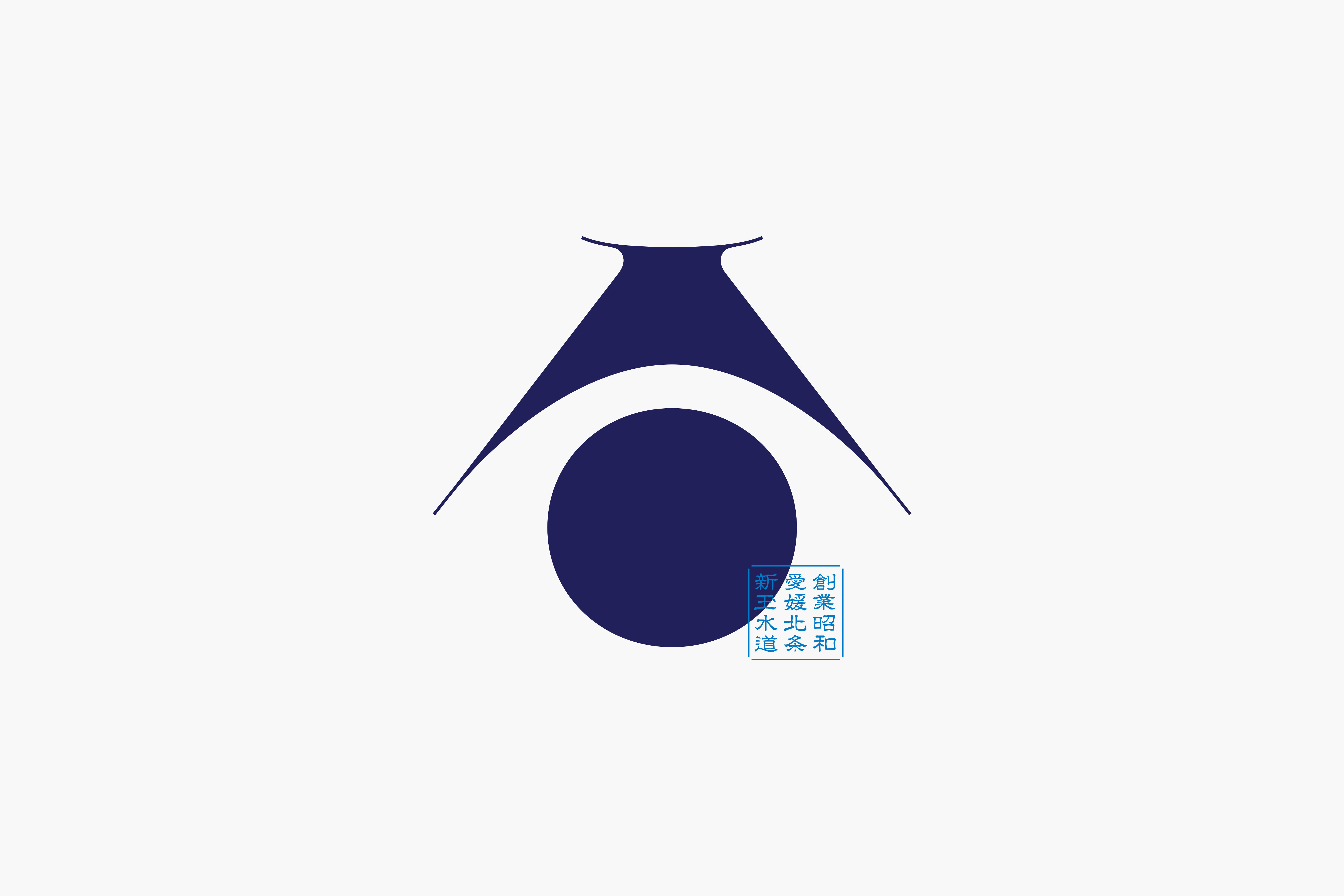
愛媛 北条にある水道工事会社「新玉水道」。創業時からの想いを、今回初めてロゴマークとして図案化した。
抽象的な造形であるロゴマークには、新玉(Aratama)の頭文字の「A」と、水を連想させる「しずく」を表現した。同時に、水を意味するラテン語“Aqua(アクア)“の意も内包しており、水との深い繋がりを示唆している。また全体像では、山と海に囲まれた“北条“というロケーションをも表している。右下に抑えるように配したロゴタイプは、全体を締める役割とともに必要な情報を込めた。濃紺色と水色をコーポレートカラーに設定し、水を連想させながらも当社の専門性の高さを表している。
当社の特徴を内包させながらも、唯一無二の造形となるよう幾度も調整を重ね、この形に至った。
Aratama Suidou is a plumbing company in Hojo, Ehime. The company’s vision from the time of its foundation has been visualised as a logo for the first time. The design is derived from the letter A, initial of Aratama, and the shape of a water drop. At the same time, the form represents the Latin word Aqua, to suggest the company’s identity closely linked to water. As a whole, the design also represents Hojo, the location which is surrounded by the sea and mountains. The letters sitting modestly on the bottom right of the logo gives an accent to the entire design and provides the necessary information. Deep navy and light blue are chosen for the cooperate colour to express the company with a high level of professionalism. This was achieved after countless adjustments to achieve a one and only design in which the features of the company being embodied.