TAKAMATSU ORNE
- Client :
- Shikoku Railway Company
- Term :
- 2021-
- Works :
- Ci/Vi/BiGraphicsSpace
- Award :
- 第58回日本サインデザイン賞 入選・四国地区デザイン賞(SDA)
 Ci/Vi/Bi
 Pictogram
 Pictogram
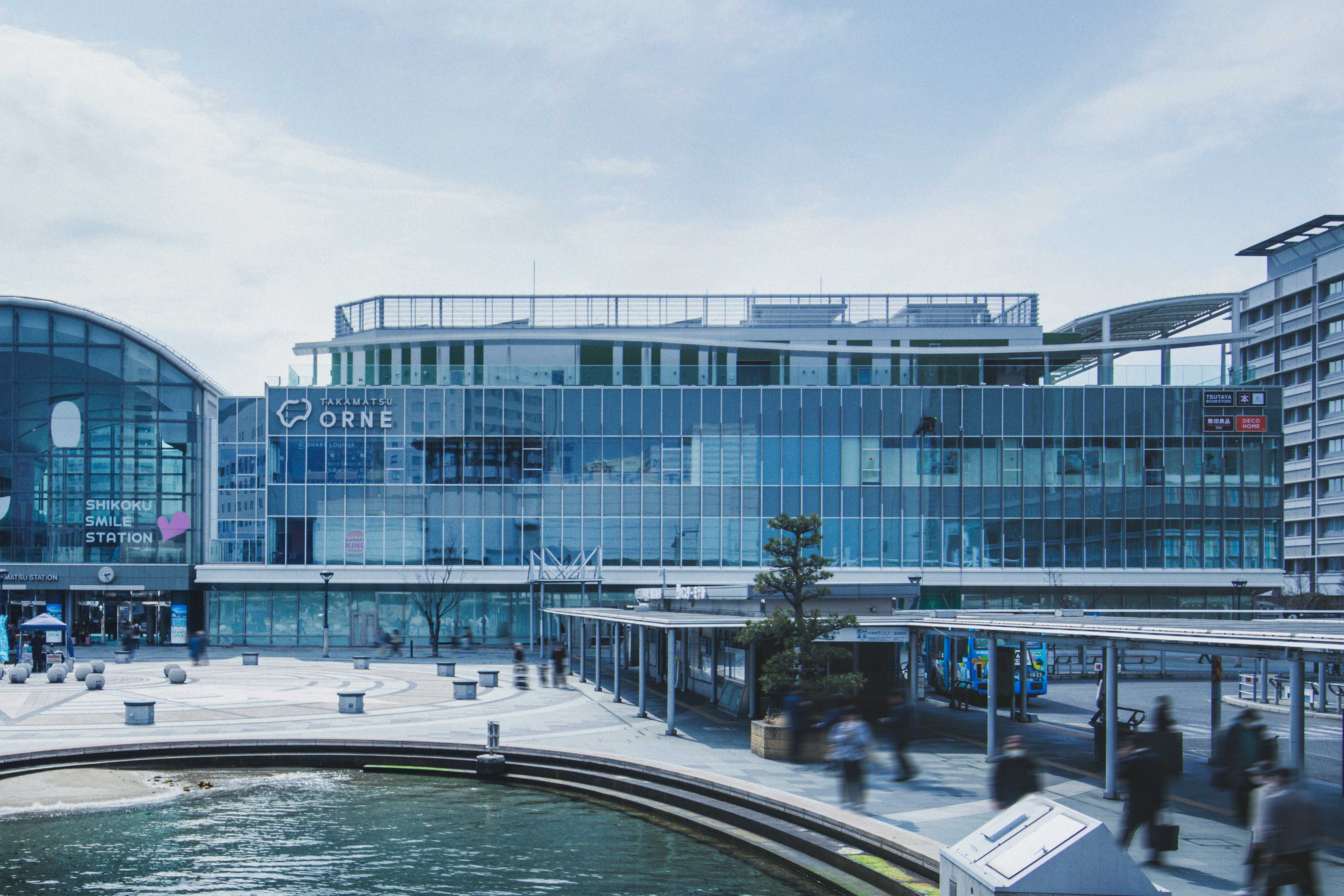 Sign
Sign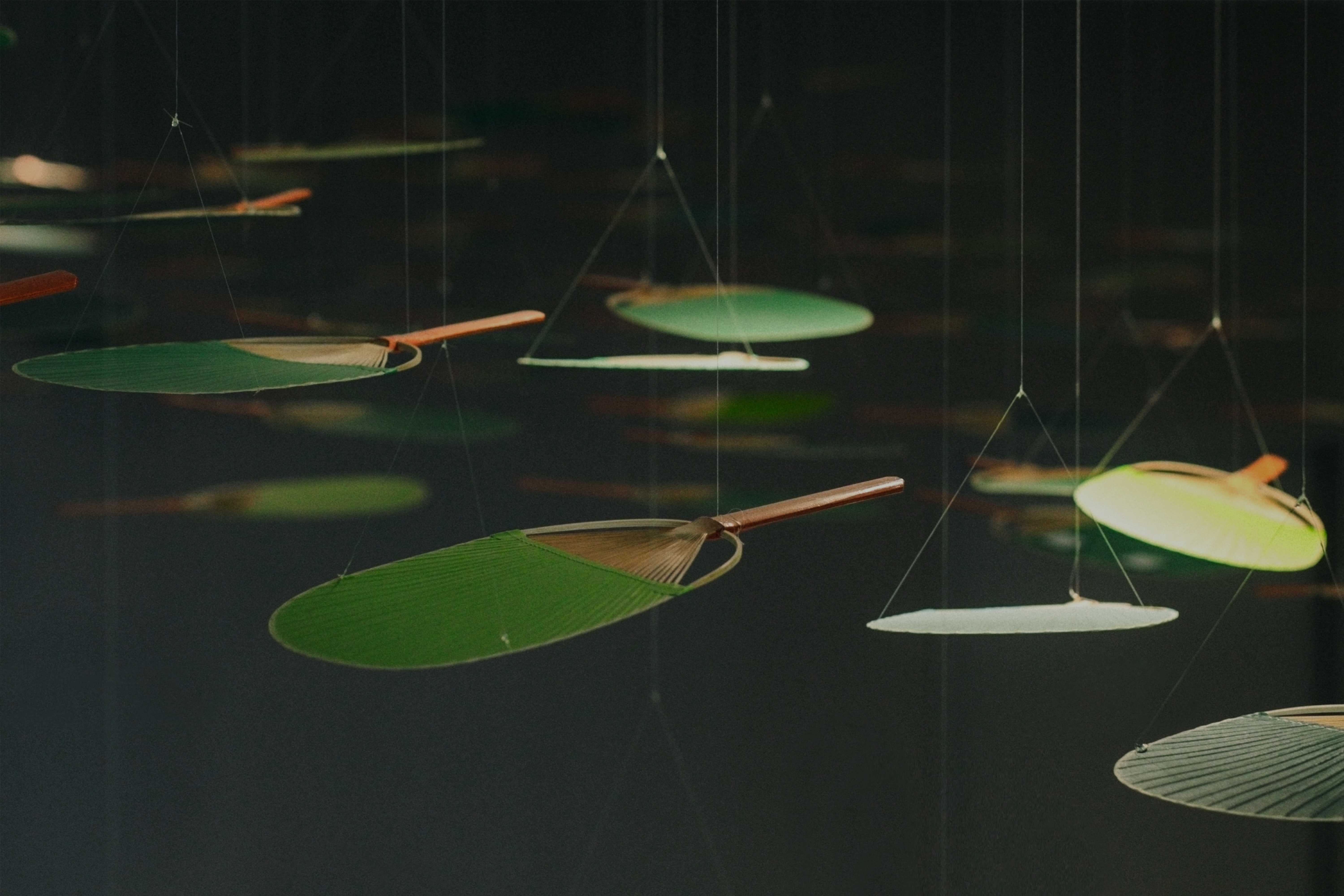 Art Work
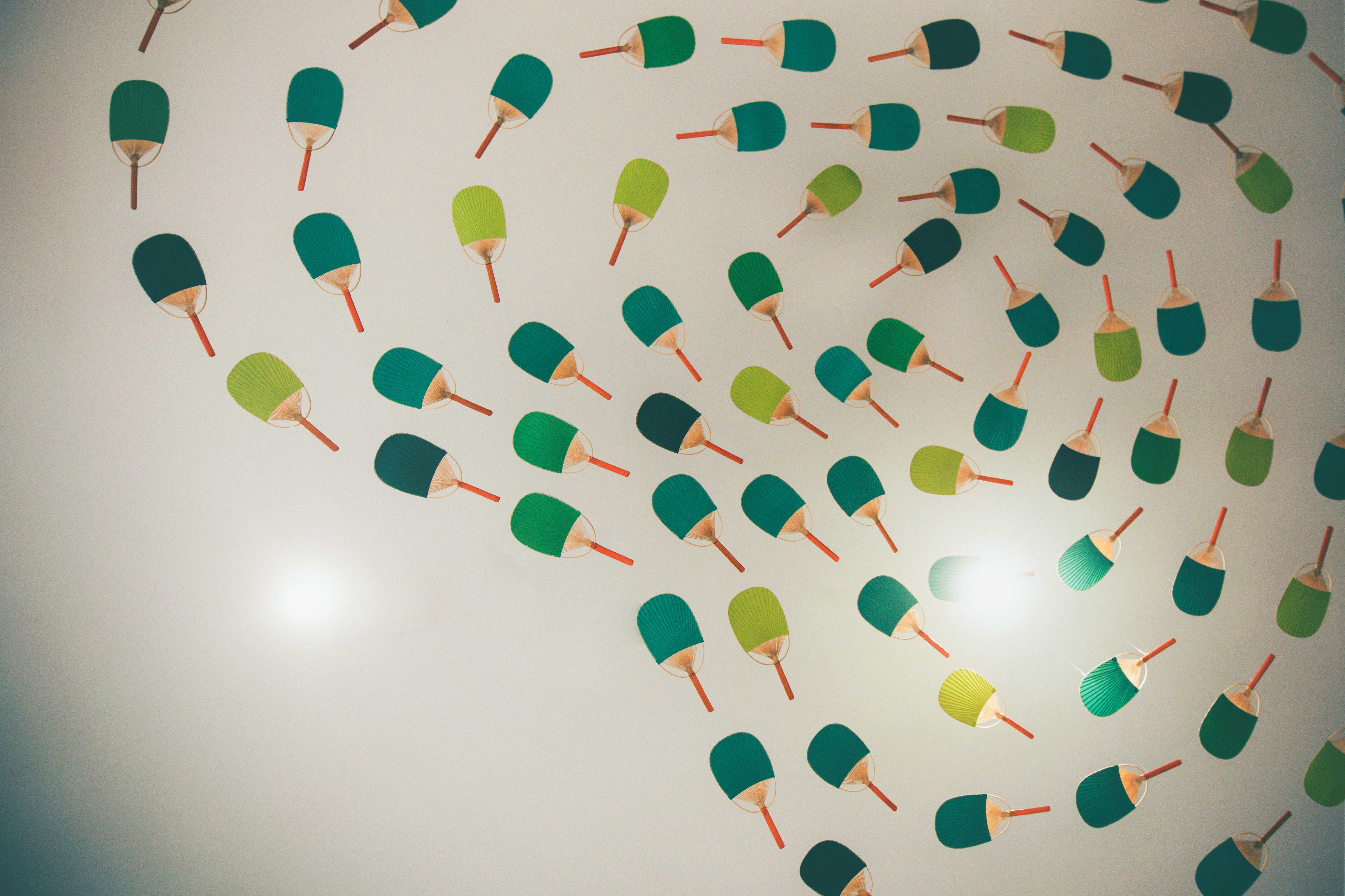 Art Work
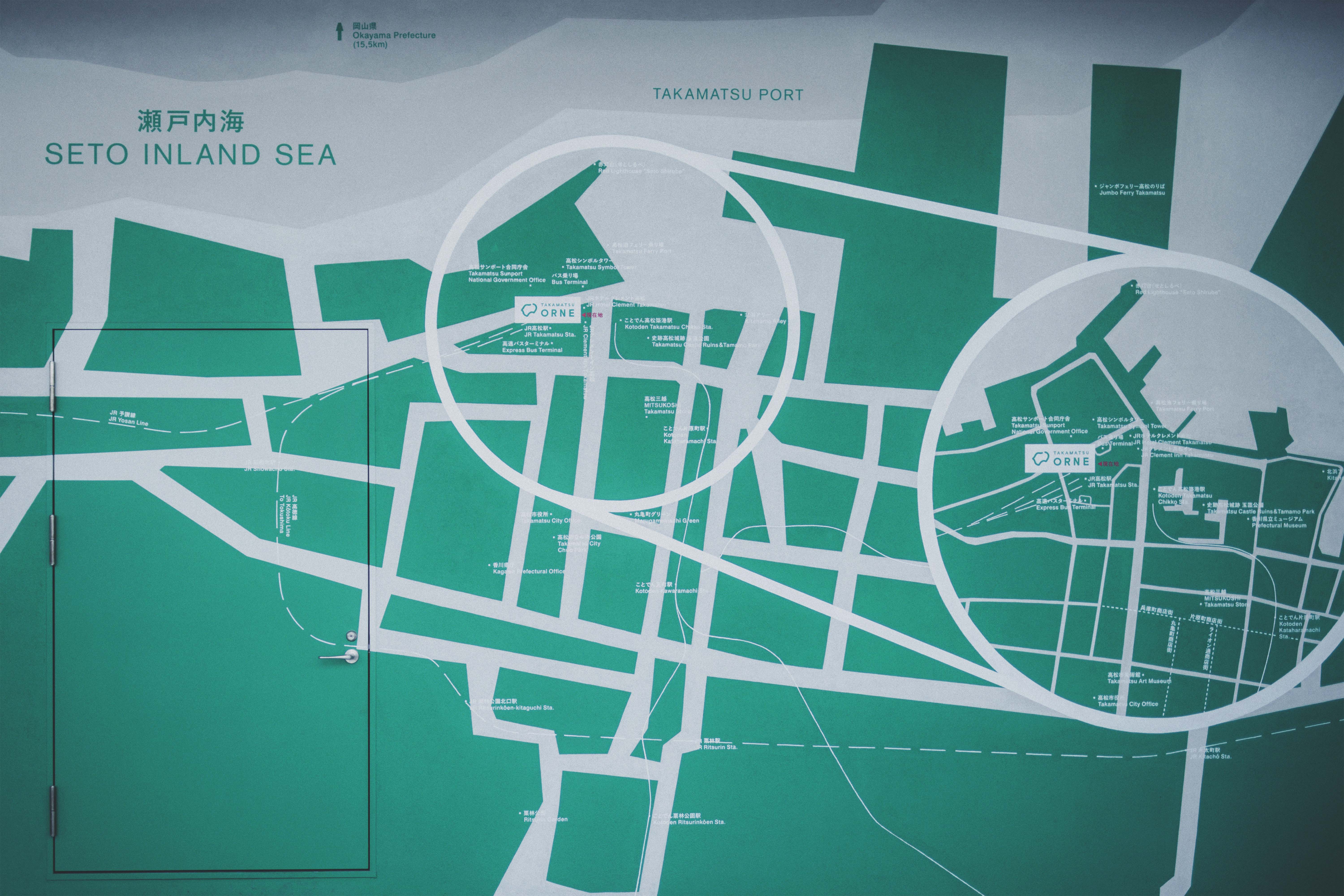 Graphic
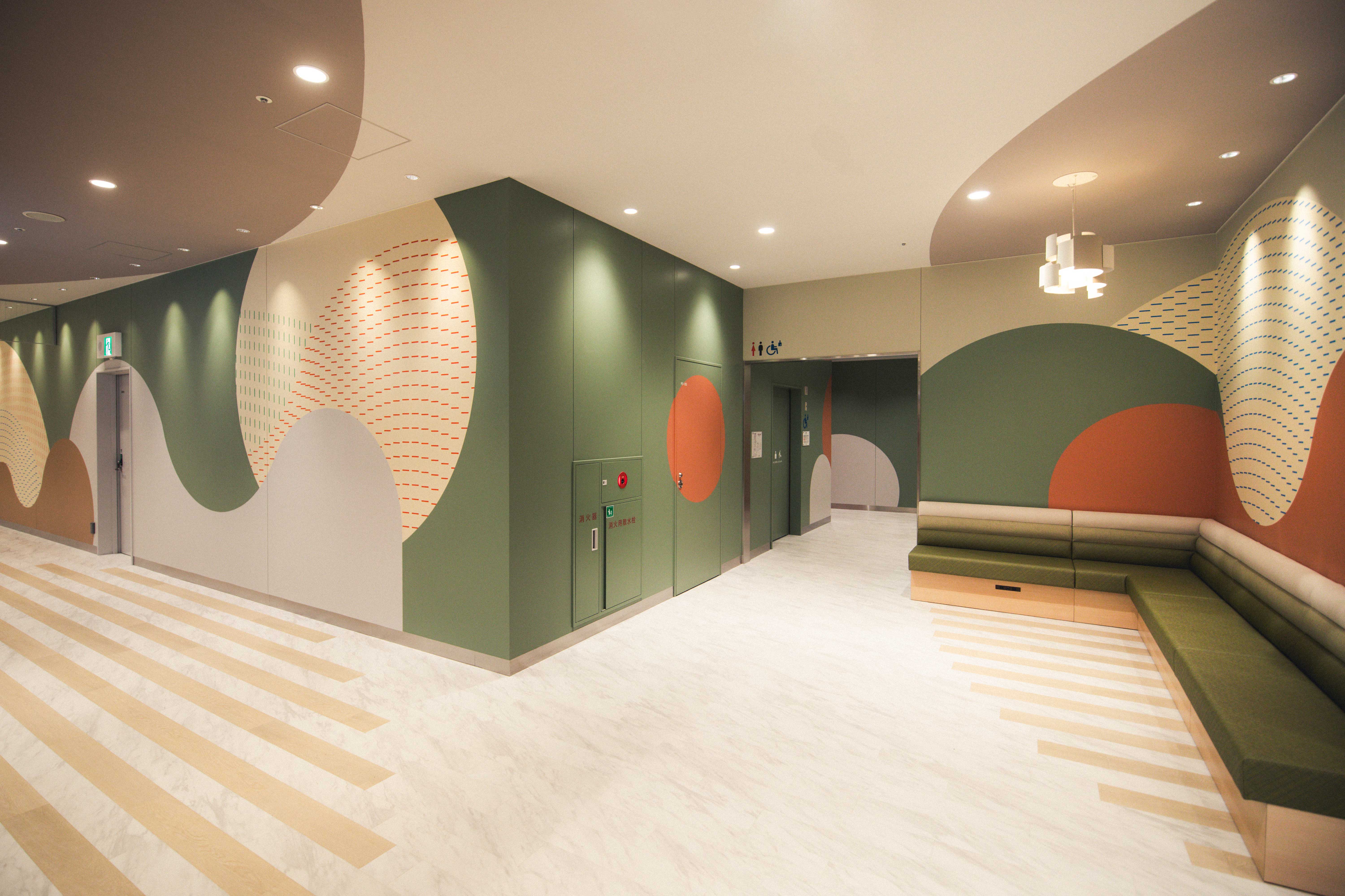 Graphic
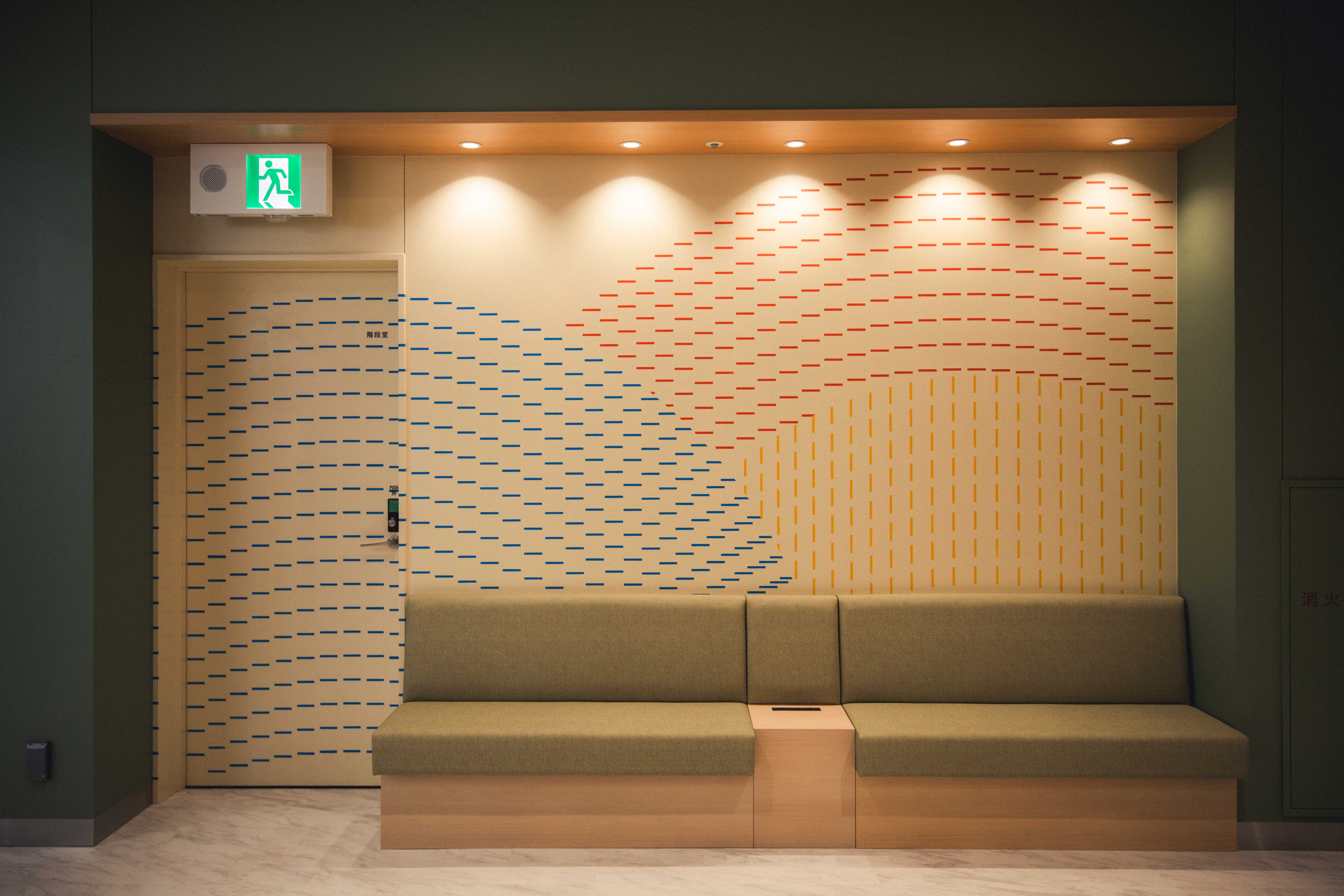 Graphic
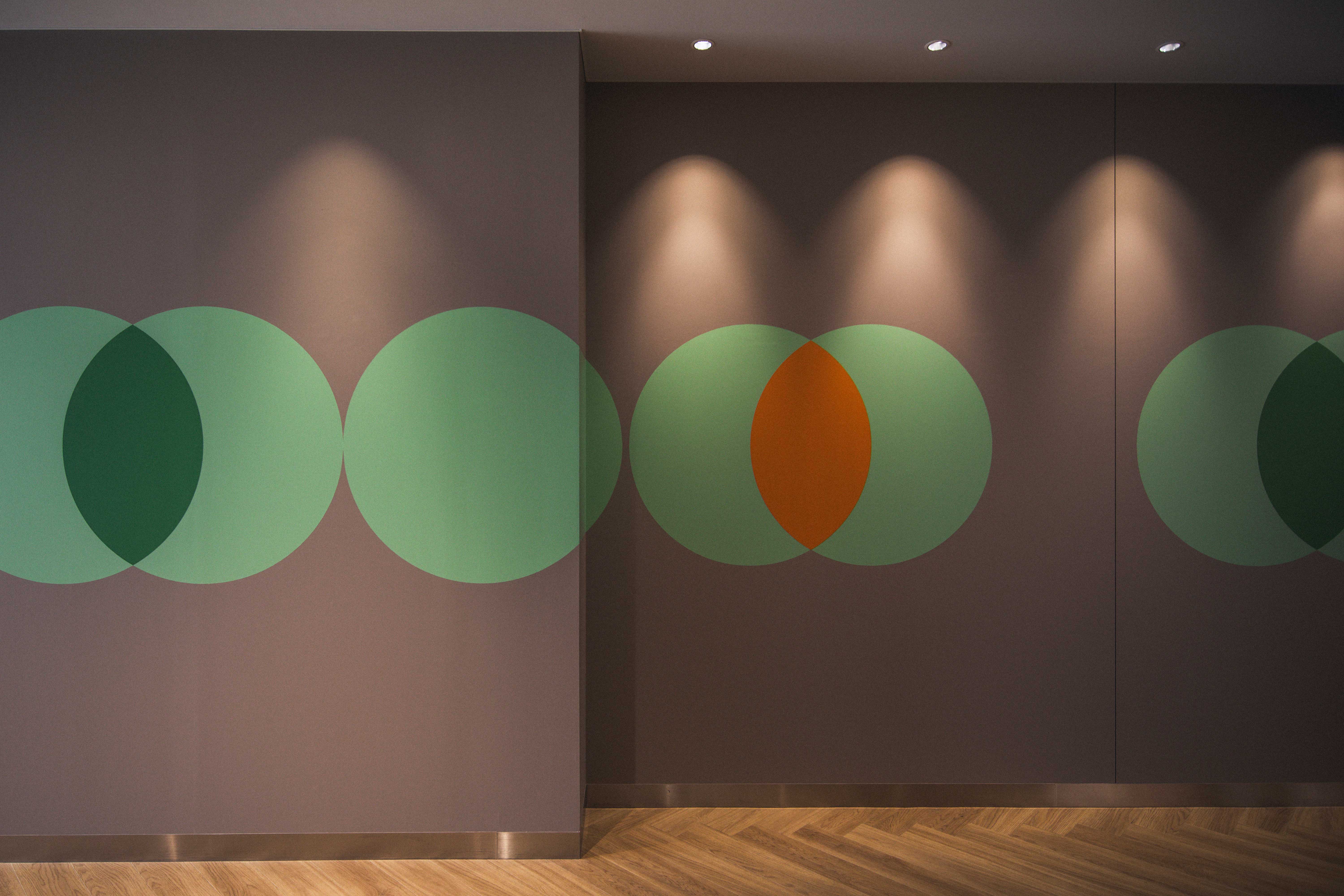 Graphic
 Sign
Sign Sign
Sign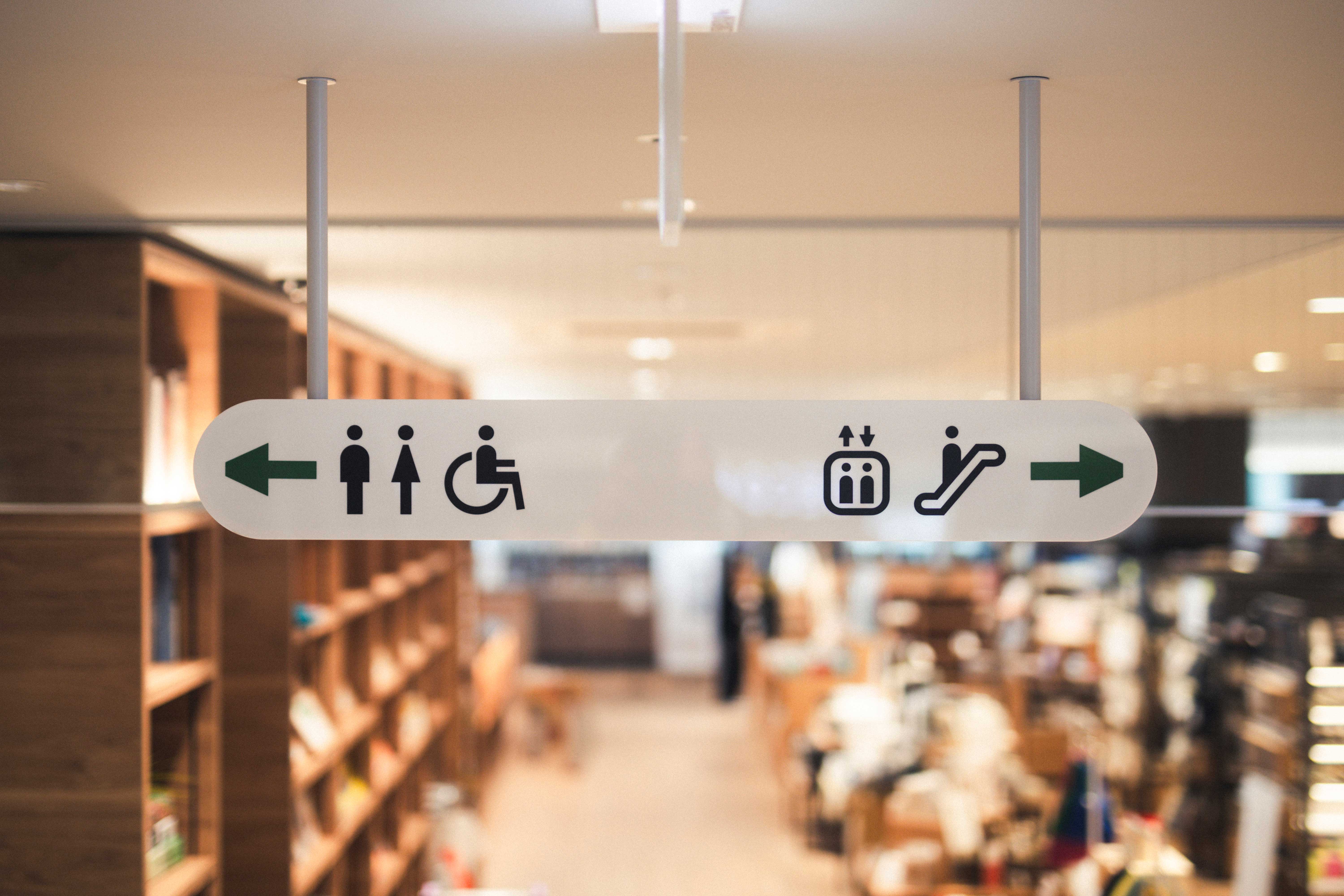 Sign
Sign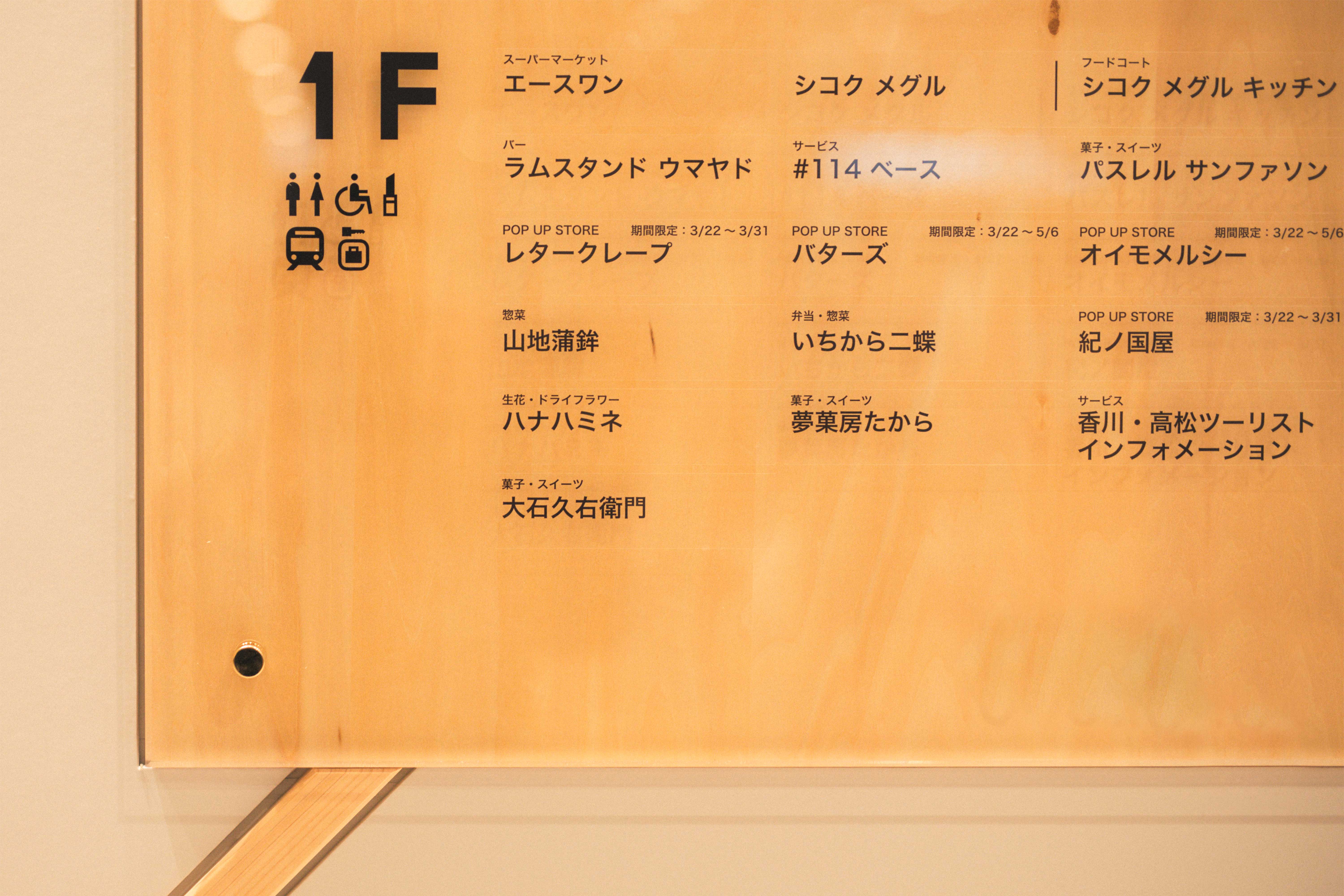 Sign
Sign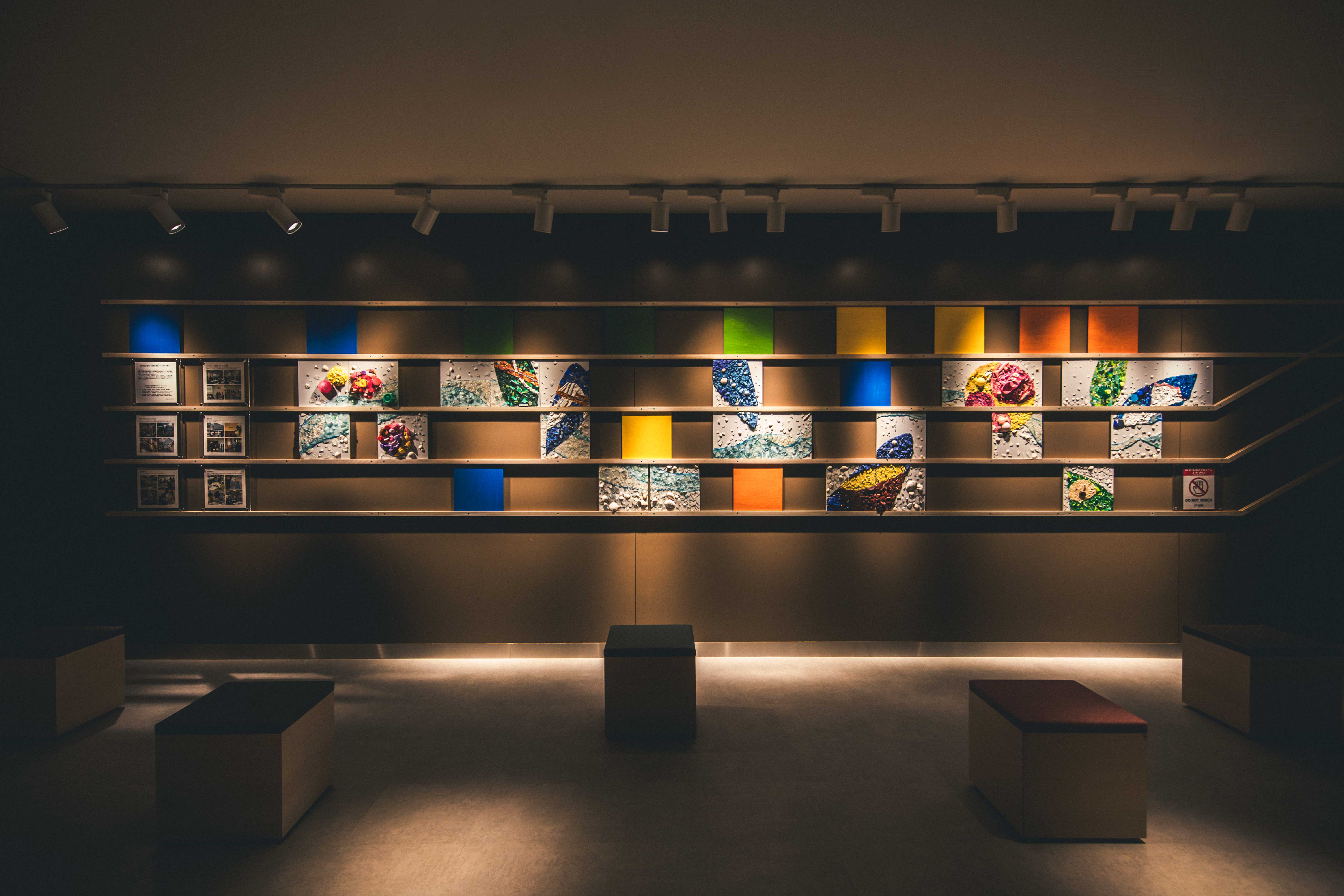 Public Art
2021年に始まり、3年の構想期間を経て2024年3月に開業となったJR高松駅の新駅ビル・商業施設「TAKAMATSU ORNE(タカマツオルネ)」。県都高松の玄関口として「点と線/ひととひと、ひとともの、ひととばしょ 様々なものをはこび、つながる新しい駅」をコンセプトに、県内外の多様なテナントや施設を内包した施設となっている。計画段階から携わり、当施設全体のコンセプト整理からアートディレクション・ロゴマーク・各種内装グラフィック・アートワーク・サインまで一貫して携わった。
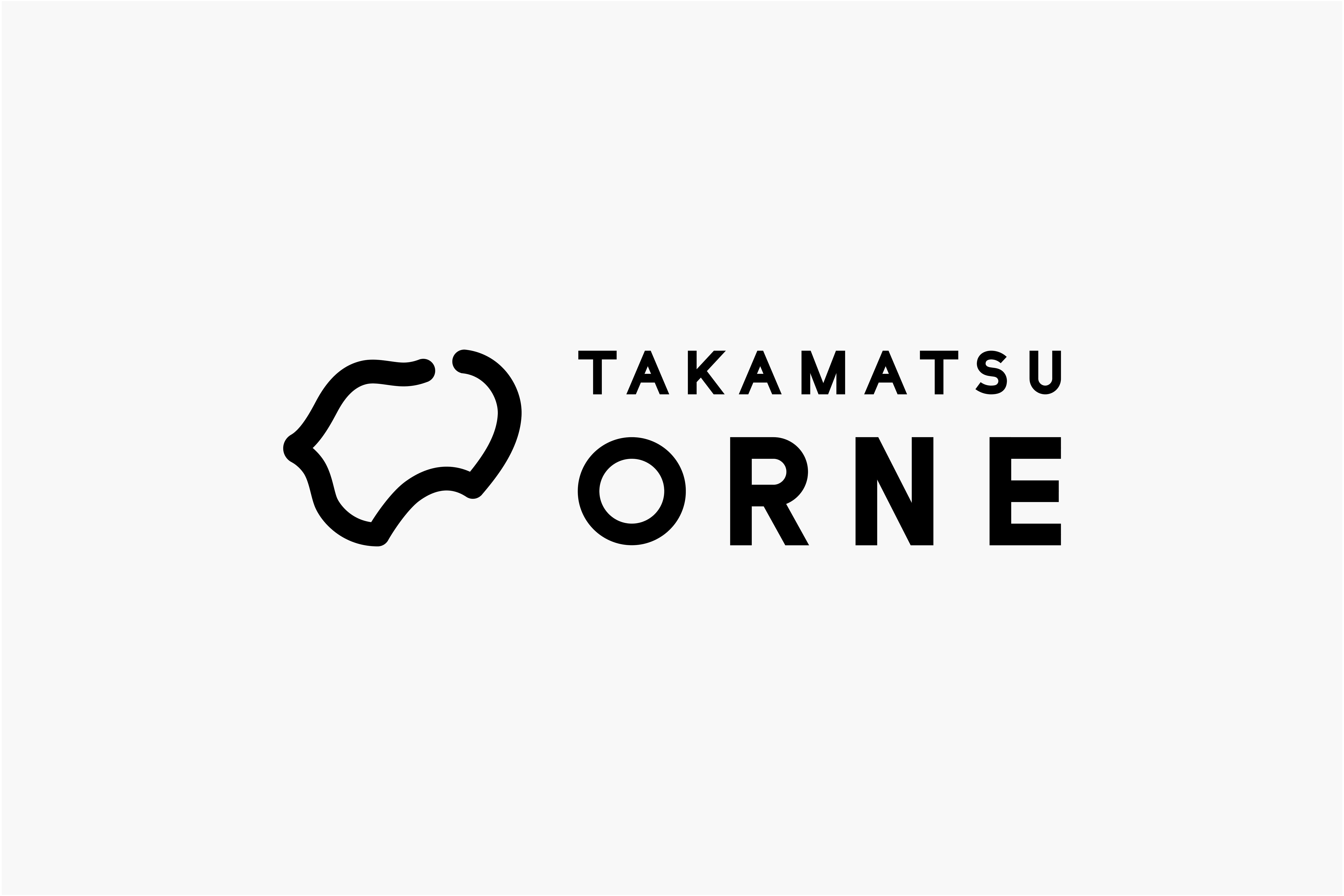
ロゴマークは各地域の核となり「目的地」「居場所」「出発地」となる当施設を、四国内に点在する駅や拠点、ものやひと、文化や価値などの多様な“点”の集合に準え構成している。また館内グラフィックについては、各階ごとに設定された内装・デザインテーマに即した表現・アートワークの模索を行った(◎内装コンセプト:点と線 ◎フロアコンセプト 4F:つむぐ 3F:むすぶ 2F:ゆらめく 1F:つながる)。当地との連動性や意義のあるアートワークとするための要素整理を進めていく中で、瀬戸内国際芸術祭をはじめ県内には自律的に流れるアート文脈があり、また地の利や国民性を生かした多種多様な伝統工芸品も広くあることが分かった。方向性の異なる候補の中でコンセプトや安全性などを軸に検討を重ね、4Fの共用部に瀬戸内の多島美を模した「丸亀うちわ」を用いたアートワークを行なった。また並びの壁面には、香川短期大学有志メンバーによる瀬戸内の海洋ゴミを用いた産学協業のパブリックアートも展示されている。
ひと・もの・まちをつなぎ、新しい出会いの創出へ。瀬戸内海の穏やかな海のゆらぎを感じながら新たな活動の輪が広がっている。
(施設概要)
・施設名称/TAKAMATSU ORNE(タカマツオルネ)
・所在地/香川県高松市浜ノ町1-20 1-52
・クライアント/JR四国(四国旅客鉄道株式会社)
・クリエイティブディレクション・設計施工管理/株式会社スペース
・アートディレクション・デザイン/株式会社グラフィックデザイン事務所ストローク
TAKAMATSU ORNE, the new station building and commercial complex at JR Takamatsu Station, will finally open in March 2024 after three years of planning that began in 2021. As the gateway to the prefectural capital of Takamatsu, it is a facility that encompasses a variety of tenants and facilities from within and outside the prefecture, based on the concept of ‘this is the destination and the starting point’ while enjoying ‘time’ and ‘things’. We have been involved in the project from the very beginning, from organising the overall concept of the facility to art direction, logo design, various interior graphics, artwork and signage.
The logo represents this commercial complex, which serves as the core of different regions, and as a ‘destination,’ ‘a place to be,’ and ‘the starting point.’ It is composed of a collection of various ‘points’, such as stations, locations, things, people, culture, and values, scattered throughout Shikoku. In addition, for the graphic concept for the interior of the building, we searched for expressions and artworks that match the interior and design themes set for each floor (◎ Interior design theme dots and lines ◎Themes for each floor: Tsumugu (to unfold) for the 4th floor, Musubu (to exchange) for the 3rd floor, Yurameku (to waver) for the 2nd floor, and Tsunagaru (to be connected) for the 1st floor. I In the process of sorting out the elements that are linked to the region and have meaning for the creation of artworks, it became clear that there is an art context that flows autonomously in the prefecture, including the Setouchi Triennial, and that there is also a wide variety of traditional crafts that take advantage of the land and characteristic of the people of the region. Among the candidates with different directions, we repeatedly examined the concept and safety, and created an artwork with ‘Marugame uchiwa’, inspired by the beauty of numerous islands of the Seto Inland Sea, in the common area on the 4th floor.
Connecting people, things and places to create new encounters, and feeling the waves of the calm waters of the Seto Inland Sea, a new circle of activity is expanding.
(Facility Overview)
・Name of the complex: TAKAMATSU ORNE
・Location: 1-20, 1-52 Hamano-cho, Takamatsu, Kagawa
・Client: Shikoku Railway Company
・Creative Direction, Design & Construction Management: SPACE CO., LTD.
・Art Direction, Design: Graphic Design Atelier STROKE Inc.