Watashi no Soba
- Client :
- Umineko-do
- Term :
- 2023-
- Works :
- BrandingCi/Vi/BiGraphicsWebSpace
 Ci/Vi/Bi
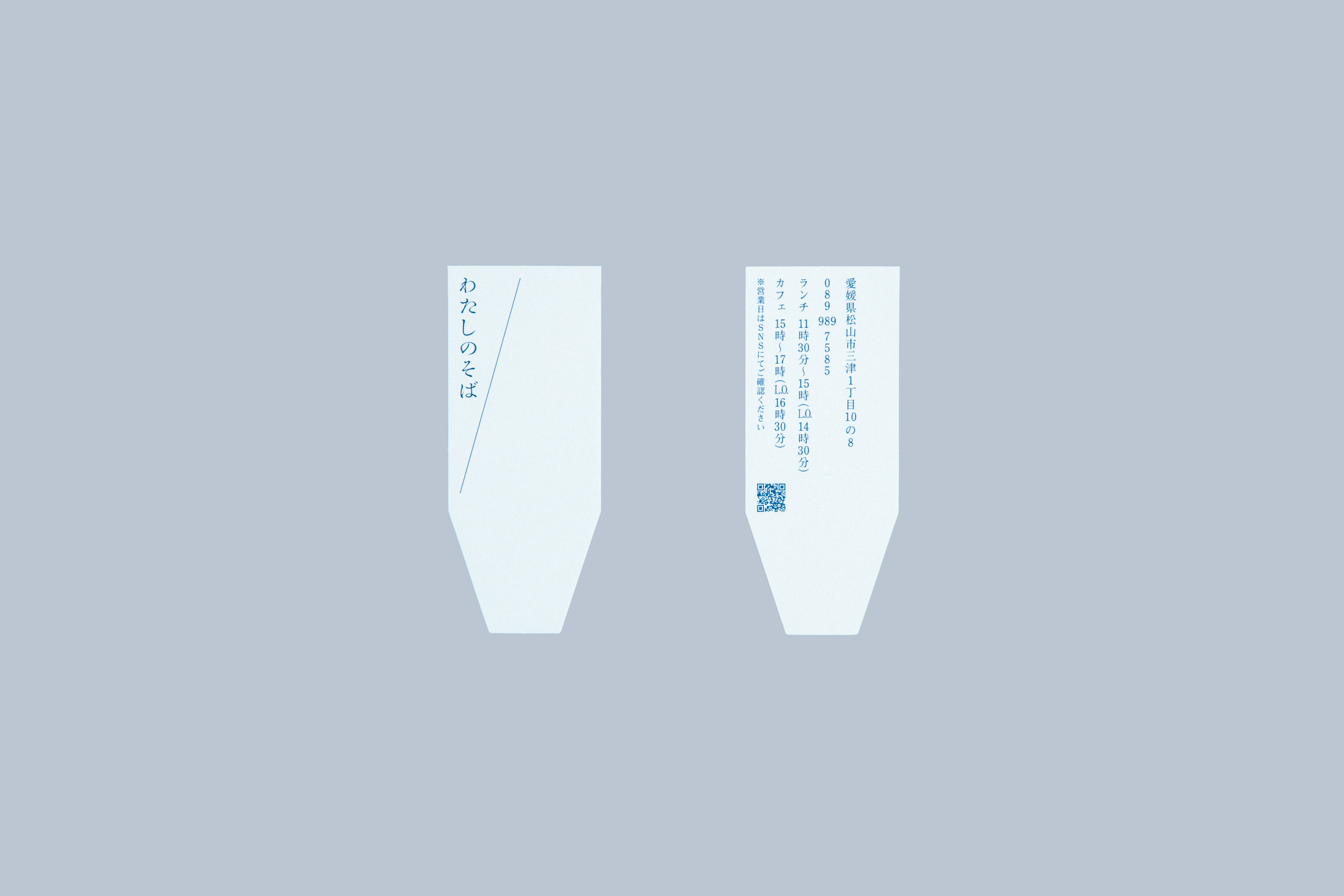 Shop Card
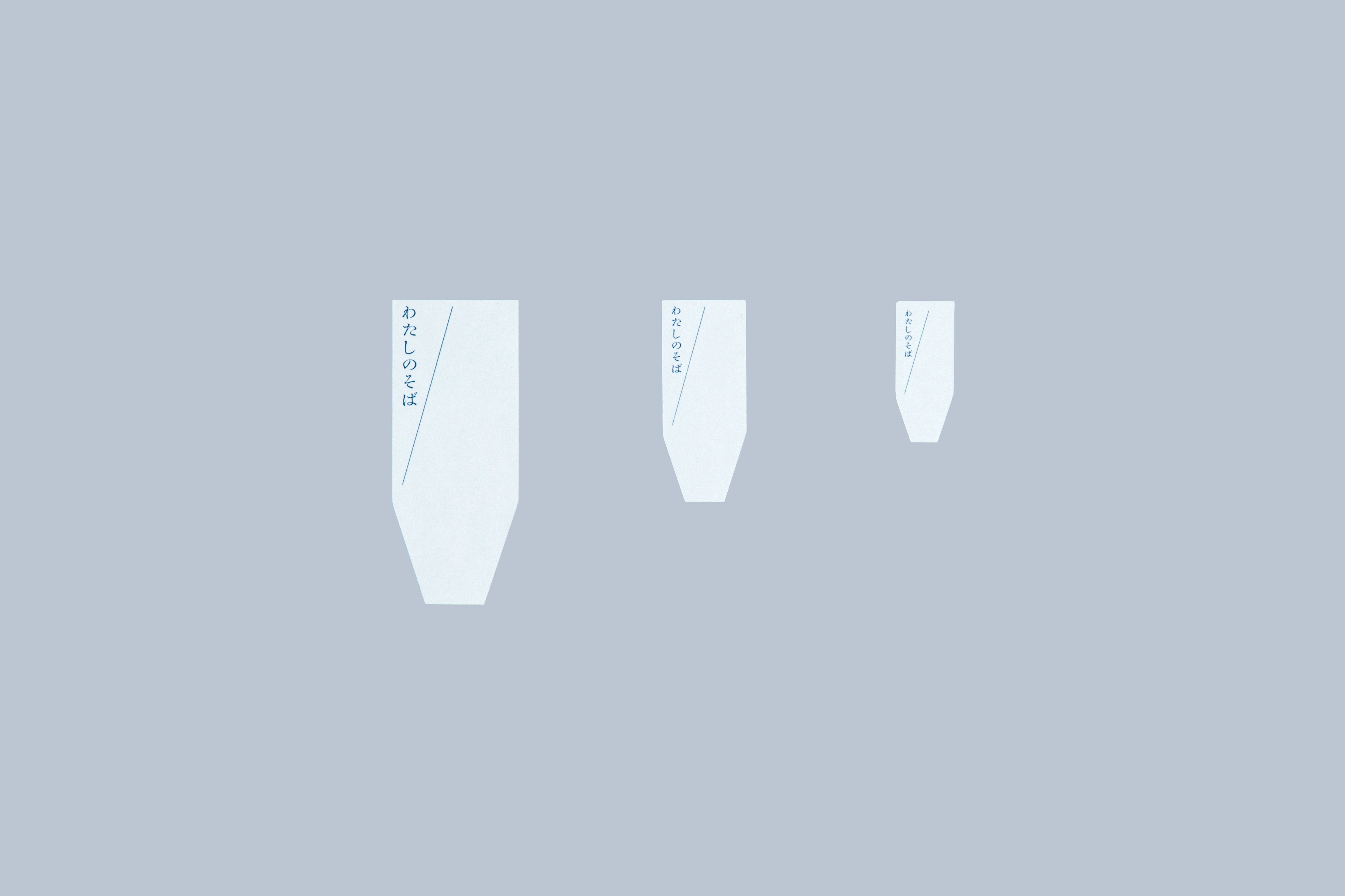 Label
Label
眼前に瀬戸内海が広がる愛媛・松山の西部に位置する三津浜。室町時代から漁業と商業で繁栄したこの地区は、今もなお当時の匂いや活気を緩やかに引き継ぎながら、やさしい空気に満ちている。
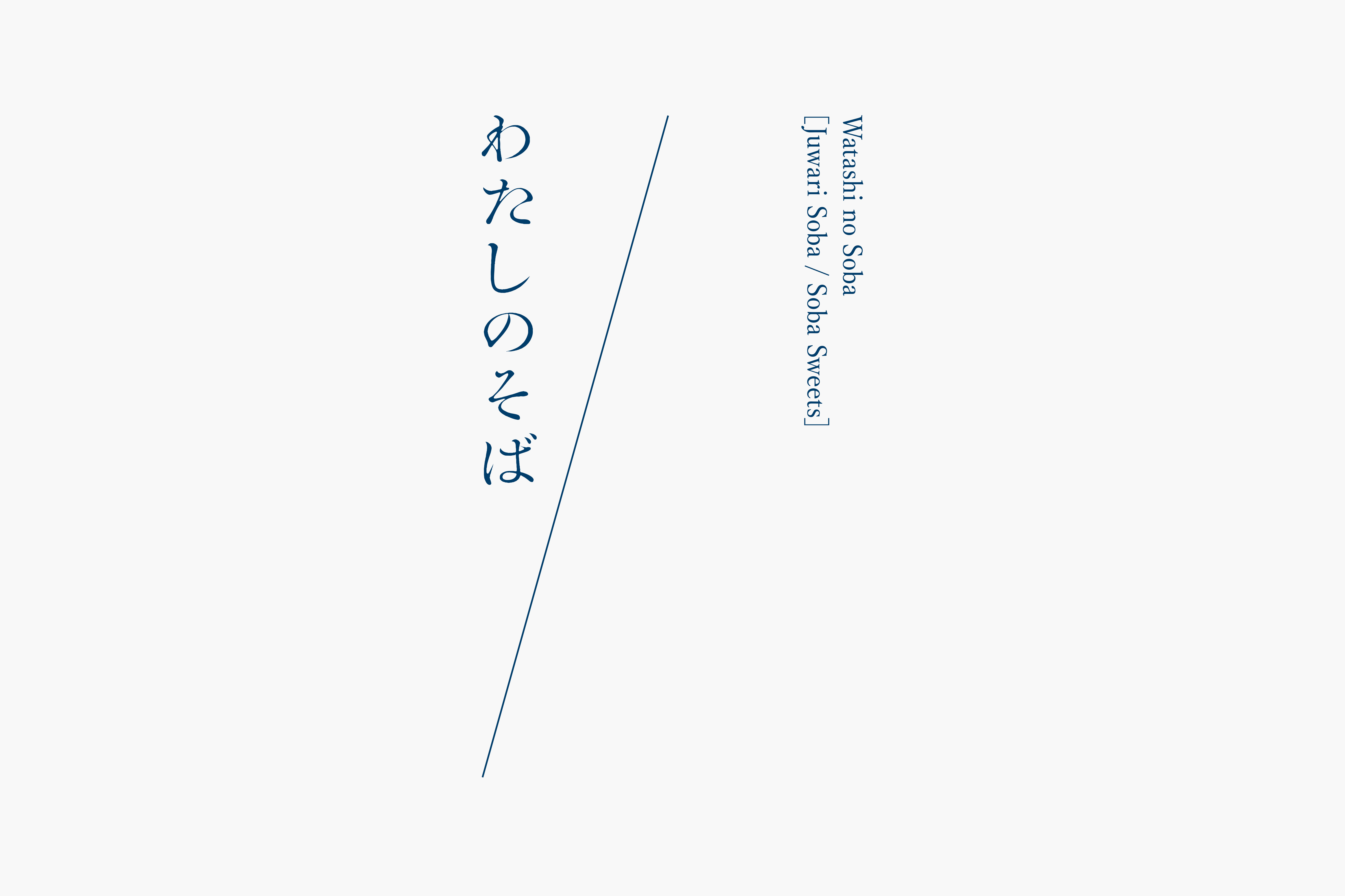
そうした歴史・文化の残る町で「“渡しの側”の“私の蕎麦”」をコンセプトにした蕎麦カフェ「わたしのそば」はある。十割蕎麦を中心に、健康や環境に配慮した変わり蕎麦や蕎麦粉を用いたスイーツを提供している。「渡しの側」は店舗に近接する渡し船「三津の渡し」からきている。そうした個性と時代感の入り混じる姿勢を「海岸線(防波堤)」と「私(I)」を1本の斜線に込めロゴマークとした。活字を模したロゴタイプは、日本の伝統食であるそばに寄り添いながらも、簡素に仕上げることで現代的な顔つきも持たせた。
日々、蕎麦の新しい可能性を探求しながら、ここにしかない蕎麦へ挑戦は今日も続けられている。
Mitsuhama is a port town located in the western part of Matsuyama, Ehime, with a wide view of the Seto Inland Sea. This district, which has prospered from fishing and commerce since the Muromachi period, is filled with gentle air while inheriting the smell and liveliness of the old times.
In the pretty town with history and culture situated ‘Watashi no Soba’, a soba cafО with the concept of ‘my (watashi no) soba noodles’ and ‘on the side (soba) of the ferry (watashi)’. It serves soba noodles made from 100% buckwheat flour, as well as sweets made from buckwheat and variety of health and environmentally conscious soba noodles. The word ‘watashi’ also comes from ‘Mitsu no Watashi’, the ferryboat operated nearby. The cafО’s approach to mix individuality and a sense of the times is reflected in a single diagonal line in the logo which is an abstract of a ‘coastline’ or ‘breakwater’ and also the shape of ‘I (watashi)’. The letters, which keeps distinctive characteristic of type printing, represents the traditional nature of the food, but by finishing it as simple as possible, the logo also maintains a modern look. While constantly exploring new possibilities for buckwheat, their endeavours to find one and only soba noodles continue.