SAKURA SARASARA
- Client :
- Kyouwa Syuzou
- Term :
- 2023
- Works :
- Package/ProductsGraphics
 Package
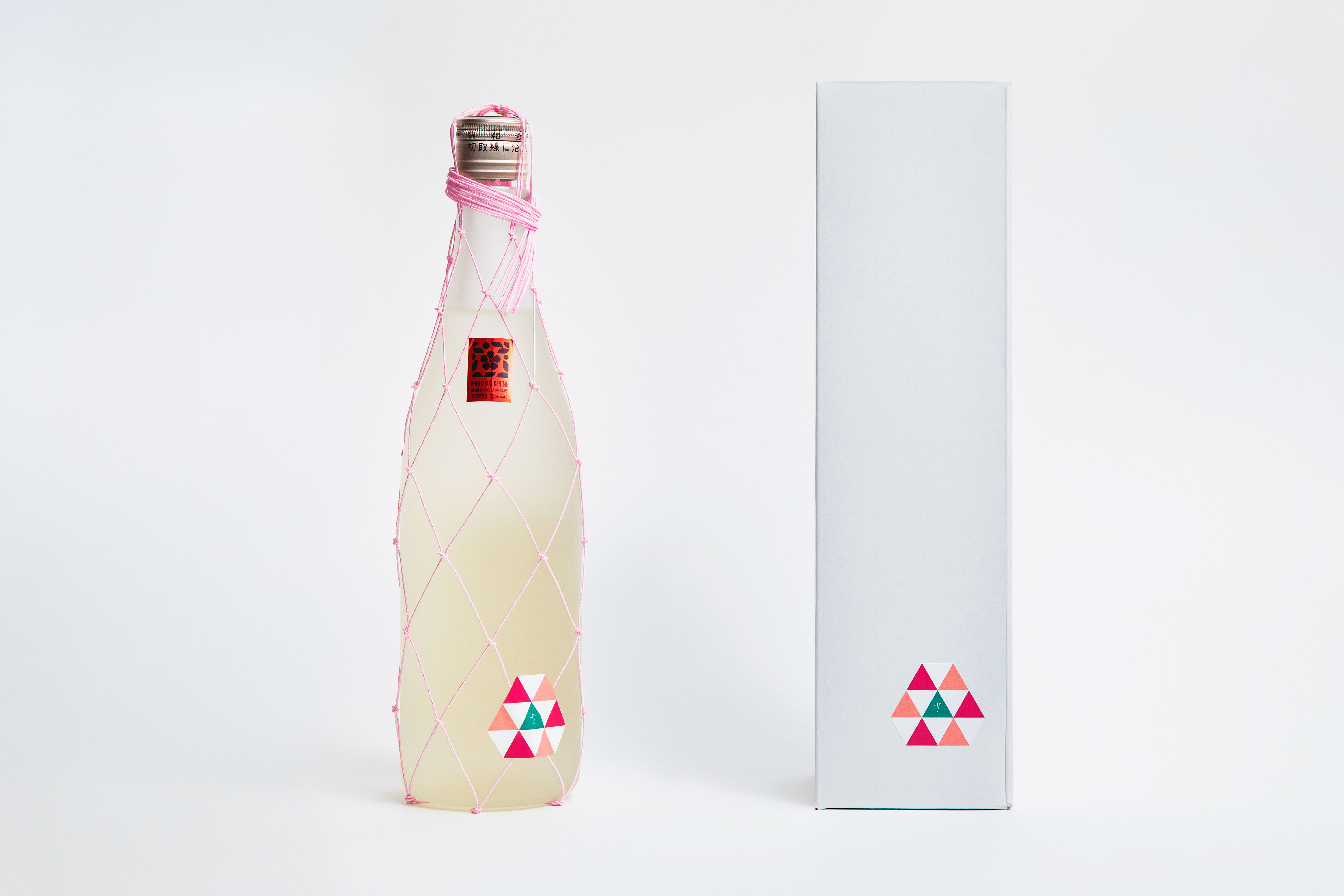 Package
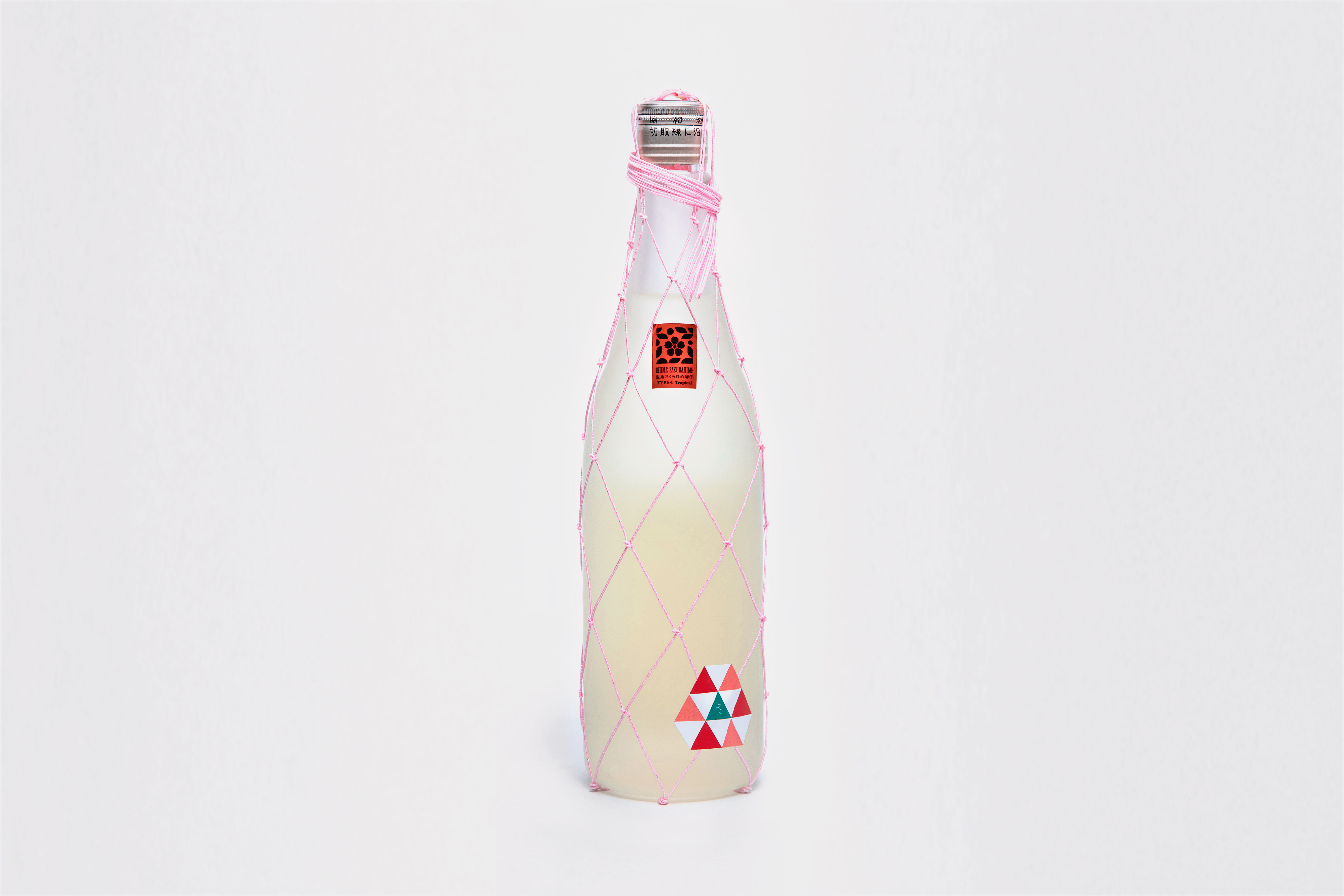
愛媛 砥部町で、創業130年を迎える、水・米にこだわった実直な酒造りを続ける酒蔵「協和酒造」。この度、愛媛地酒のブランドの確⽴や認知度向上を目的に支援された「えひめ⾹る地酒プロジェクト」への参加に伴い、愛媛県独⾃品種である「さくらひめ」の清酒⽤花酵⺟から製造された日本酒用のボトルデザインを行なった。
可憐で淑やかな花をつけるさくらひめの姿から、県の伝統工芸品である“伊予水引“を用いたボトルデザインを念頭に構想を膨らませていった。編み方については工芸士を交えながら、作り込みすぎない自然な様相を残した佇まいとした。水引の色はさくらひめの淡いピンクの花色から抽出し、その繊細な佇まいを表現するため、極力細手のものを選定した。ボトル正面のボディラベルには商品名の「さ」を配しながら、全体として花びらをモチーフとした柄とすることで手工芸に偏りすぎないバランスに気を配った。手仕事ならではのぬくもりや繊細さの中に、現代的な顔つきを持たせたボトルデザインに仕上がった。
‘Kyowa Shuzo’, who celebrate their 130 anniversary this year, has been committed to honest sake brewing in Tobe-cho, Ehime, paying special attention to the water and rice. As a part of the ‘Ehime Kaoru Local Sake Project’, the sake brewer has developed a new product called ‘Sakura Sarasara’ for which we have designed bottle. The purpose of the project is the establishment of ‘Ehime Brand’ and to raise awareness of Ehime’s local sake, using a unique flower yeast ‘Sakurahime’ made of the flower of the same name which was specially developed in Ehime.
Inspired by the pretty and delicate appearance of Sakurahime, we developed a design using ‘Iyo Mizuhiki’, a traditional craft of Ehime Prefecture. Regarding the knotting of the Mizuhiki code, we worked with craftsmen to create a natural appearance that is not overly made. Also, we chose the pale pink code, the colour of Sakurahime. Furthermore, we selected the thinnest possible Mizuhiki code in order to achieve the delicate appearance. Arranging the letter ‘さ (sa)’ a part of the product name on the petal like pattern of the label on the front of the bottle, a special attention was paid not to give the bottle too much handcrafted look. The bottle design has both a modern look and the warmth and delicacy that are unique to handwork.