KUFUFU
- Client :
- Term :
- 2023
- Works :
- BrandingCi/Vi/BiPackage/ProductsGraphics
 Ci/Vi/Bi
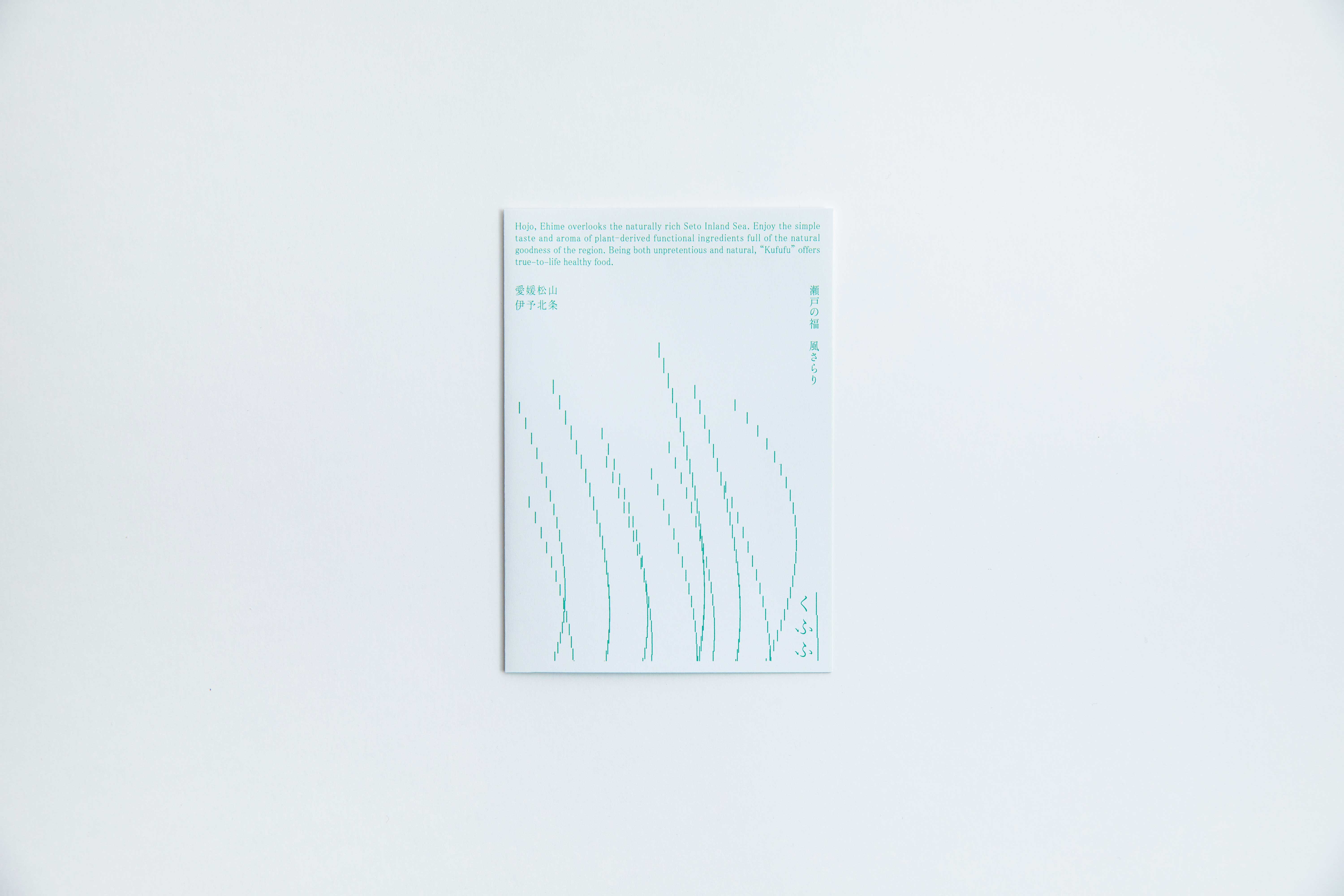 Leaflet
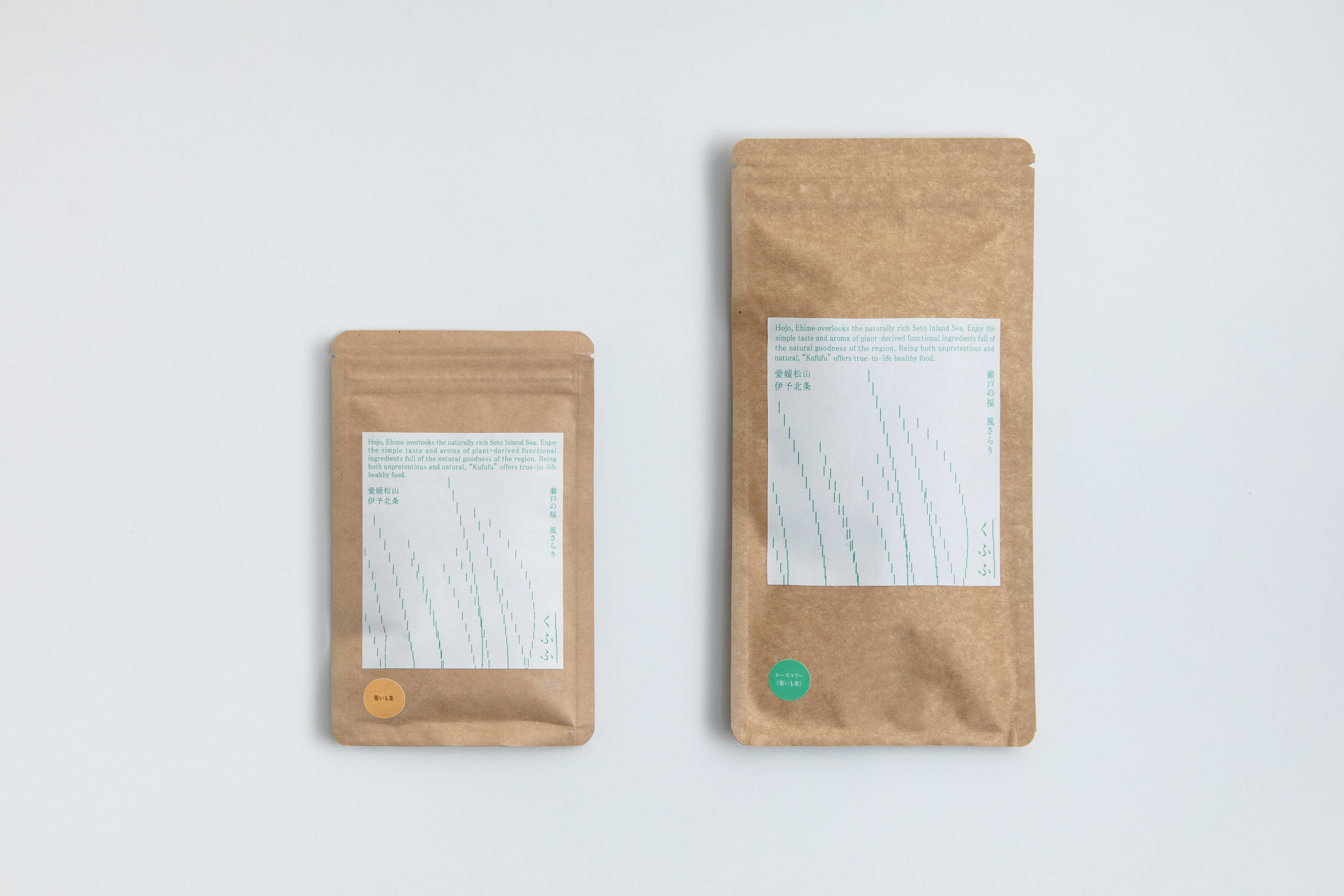 Package
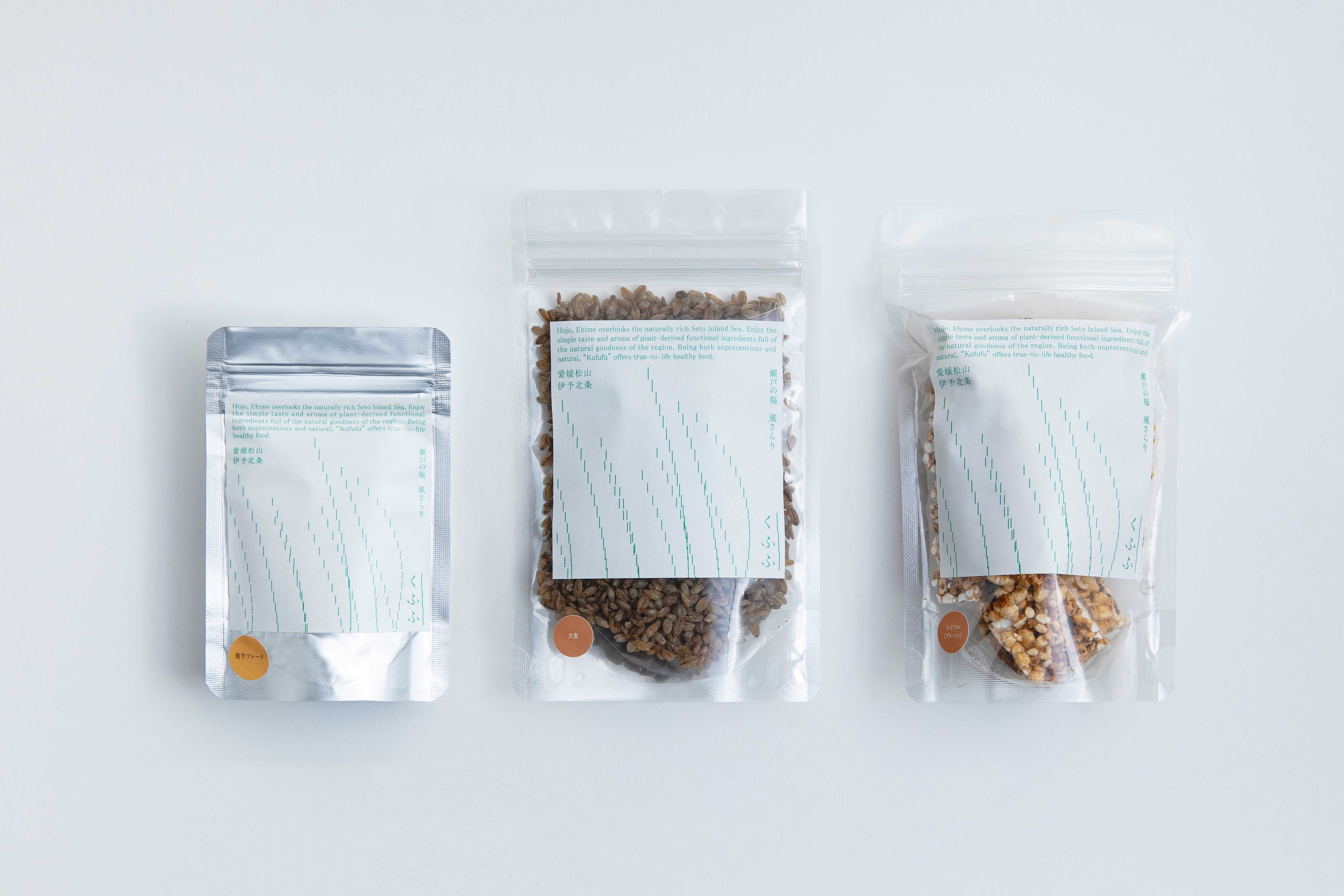 Package
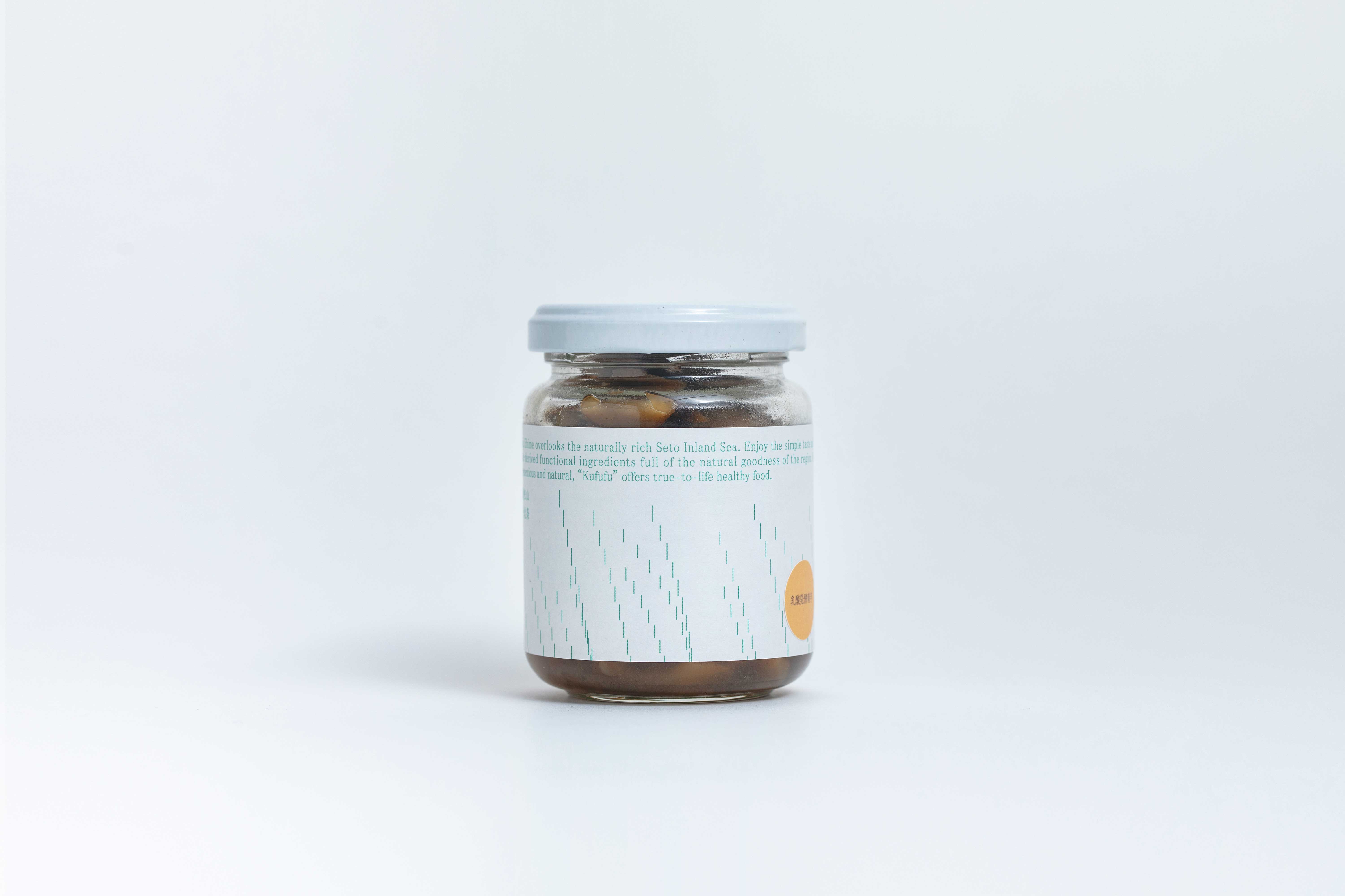 Package
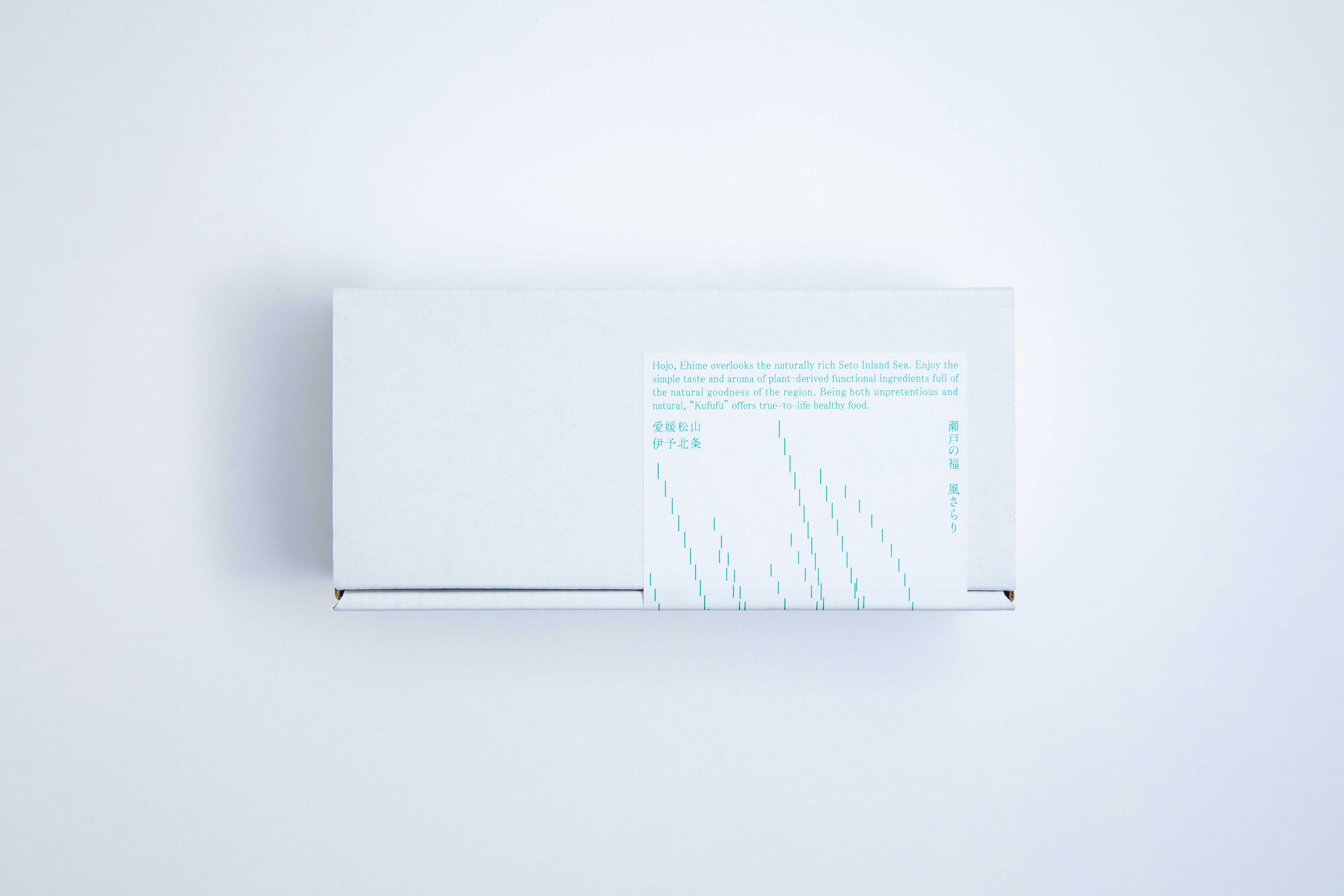 Package
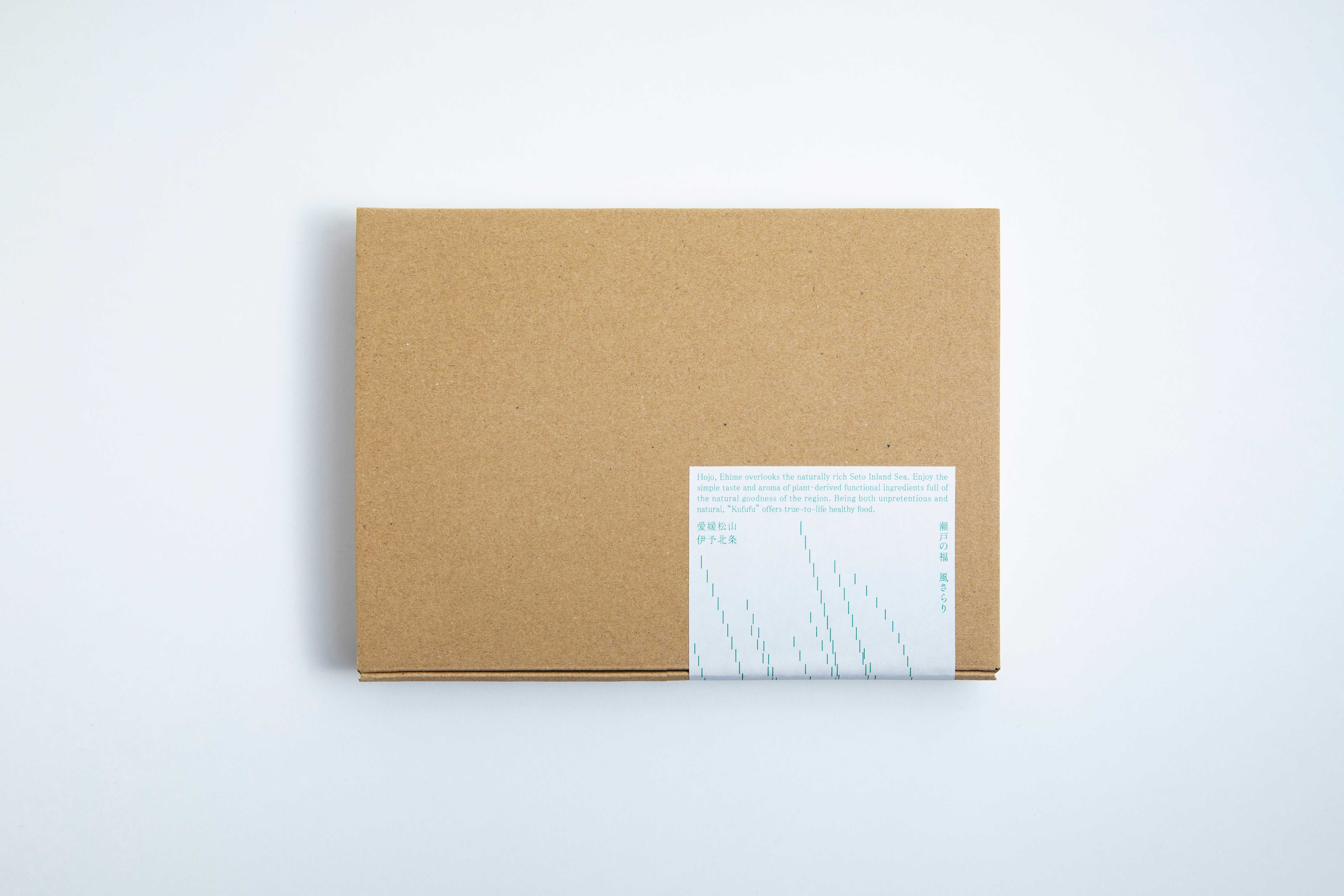 Package
愛媛 松山の北側に隣接し、瀬戸内海に面した北条。「くふふ」はこうした自然豊かな場所で、各種菊いもを中心とした商品を栽培・加工・販売している。この度、ロゴマークのデザインから各種パッケージやラベル、リーフレット等ブランド一式のデザイン制作に携わった。
植物がもつ風味や香り、身体への嬉しい要素を日常の暮らしに取り入れ、心と身体の巡りを良くしたいという思いが込められた各商品。そうした飾らない等身大の姿勢にデザインで寄り添った。
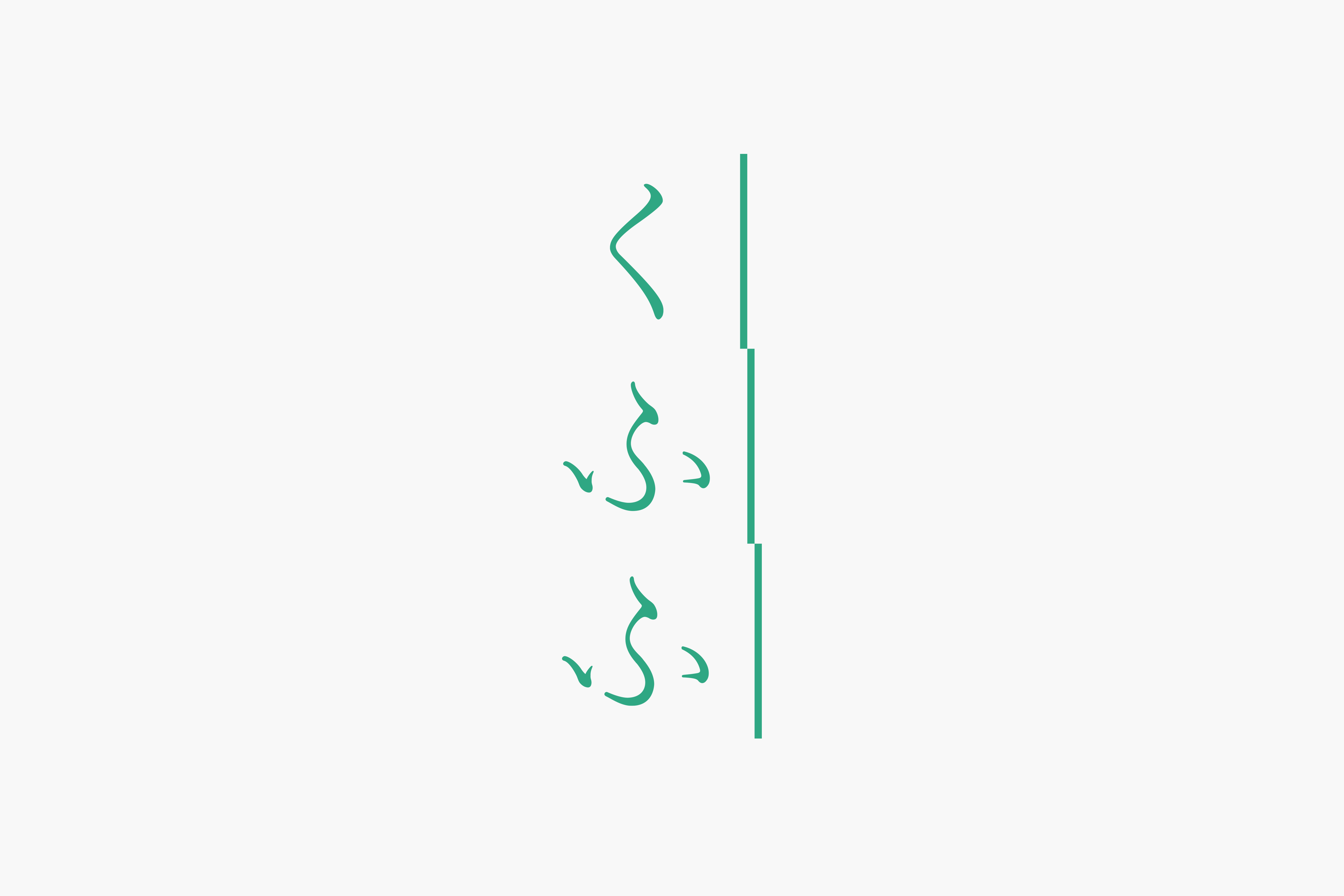
歴史や文化、豊かな自然に恵まれ、“風早”とも呼ばれている当地区。そうしたことから、風に揺れる草々を共通のモチーフとし、ローカルならではの風通しの良さや飾らない自然さを表現しながら、繊細さを残すことで感度の高さを感じられるよう配慮。ロゴマークもそれと呼応するように風になびく草のモチーフと、柔らかさを内包した活版風の書体で構成している。ボディラベルについては単色印刷とし、運用面を考慮し共通サイズとしている。
地域らしく親しみやすい顔つきとしながらも、より広い市場性やターゲットを意識したグローカルなデザインに仕上げた。
Hojo, on the north side of Matsuyama, Ehime, overlooks the naturally rich Seto Inland Sea. ‘Kufufu’ has cultivated various types of Jerusalem artichoke and processed and sold products made from them in the area. We were involved in the various designs for the entire brand, from its logo to the packages, labels, leaflets, and so on.
In the hope to help improve the circulation of the mind and body, each product incorporates the natural flavour and aroma of plants and the elements with health benefits into our daily life. The designs harmonise with the client’s unpretentious attitude.
Blessed with history, culture, and rich nature, this area in Ehime is also known as ‘Kazahaya’. This is the inspiration for the design based on the image of the grass swaying with the winds. While expressing the openness and unadorned naturalness of the region, much consideration was given to conveying a high sensitivity by maintaining the subtleness. The logo is also composed of the motif of the swaying grass, and a font with a letterpress-like texture that adds softness to it. The labels are printed in monotone and in the same size, in consideration of the efficiency of the operation of business. Allowing the design to have a friendly look of the local region, we also had wider marketability and consumers in mind and finished the design with a ‘glocal’ standard