Nippon No Dougu Irodori
 Logo
Logo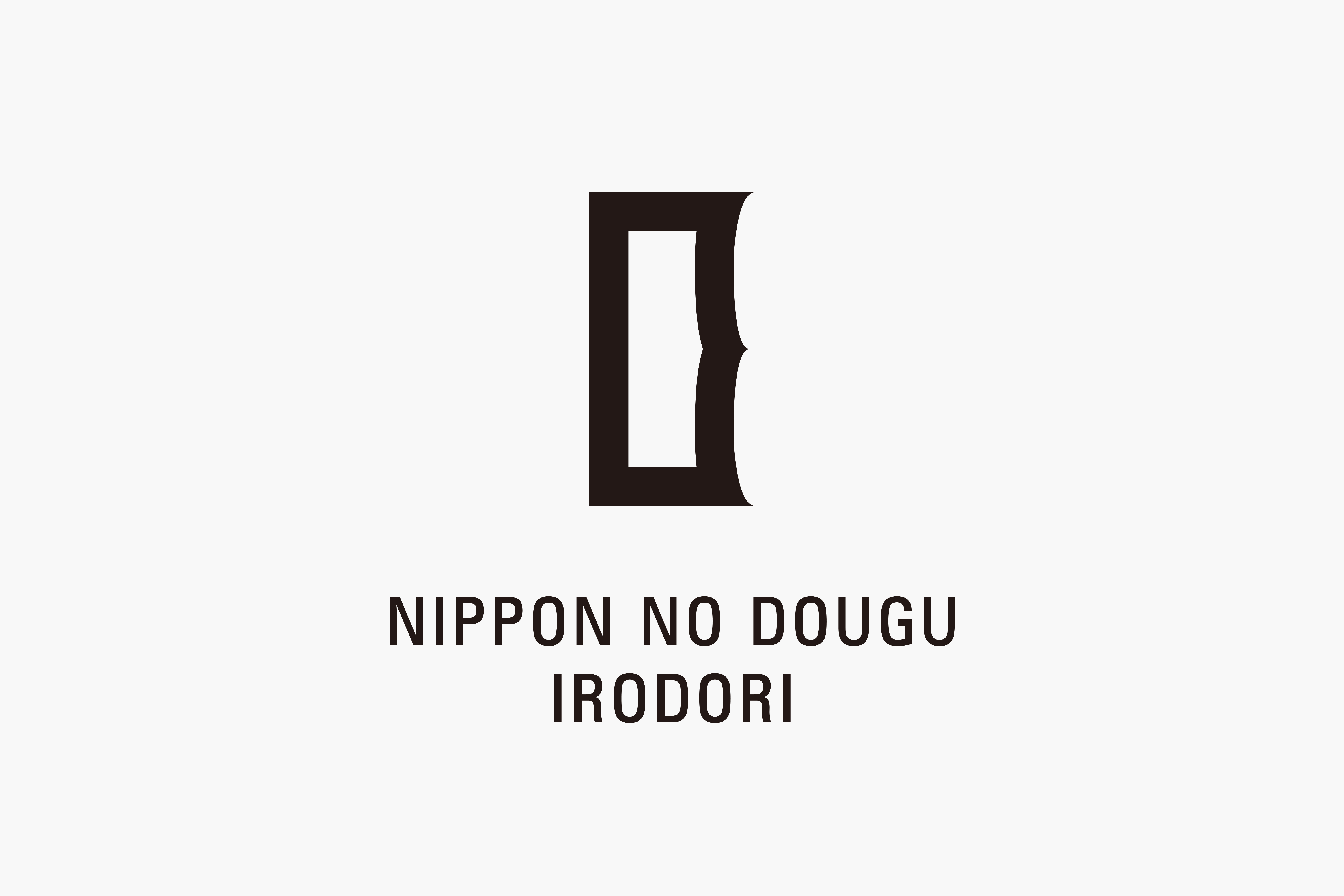 Logo
Logo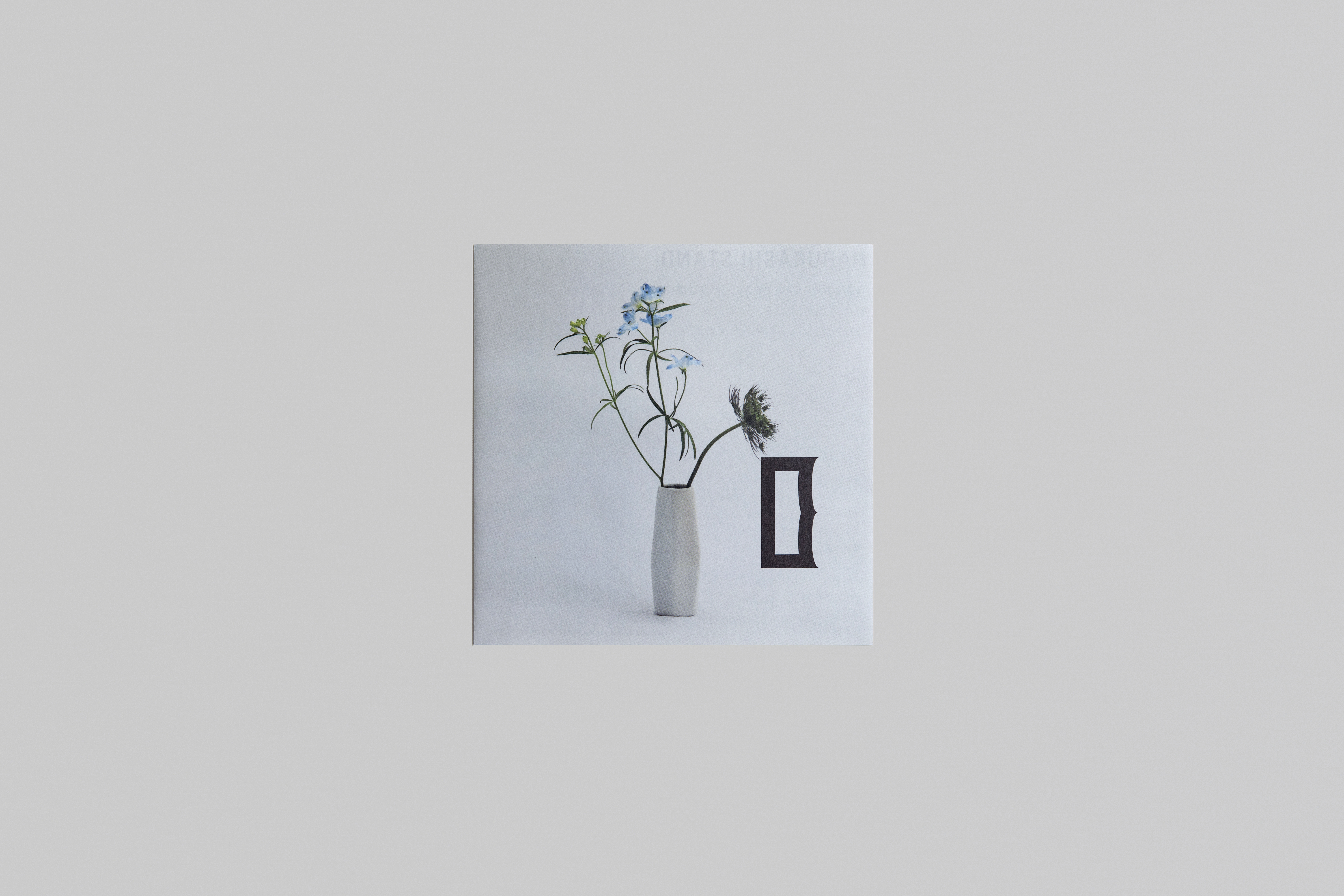 Leaflet
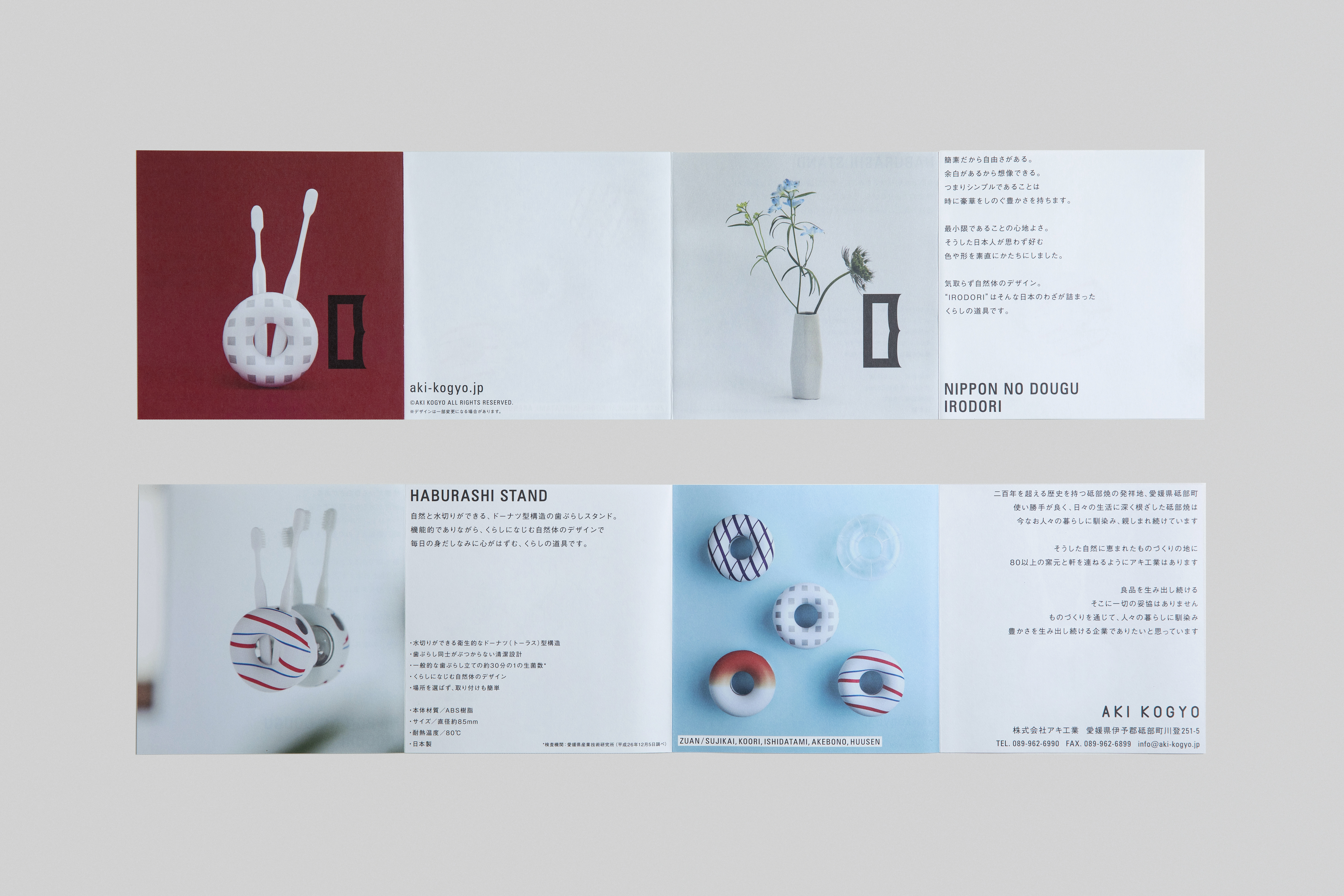 Leaflet
200年を超える歴史を持つ砥部焼の発祥地、愛媛県砥部町。この地で半世紀近くに渡り工業用プラスチックの製造・加工を行なってきたアキ工業。80以上の窯元が軒を連ねるものづくりの地において、気取らず自然体な暮らしの道具「NIPPON NO DOUGU IRODORI(ニッポンノドウグ イロドリ)」は生まれた。
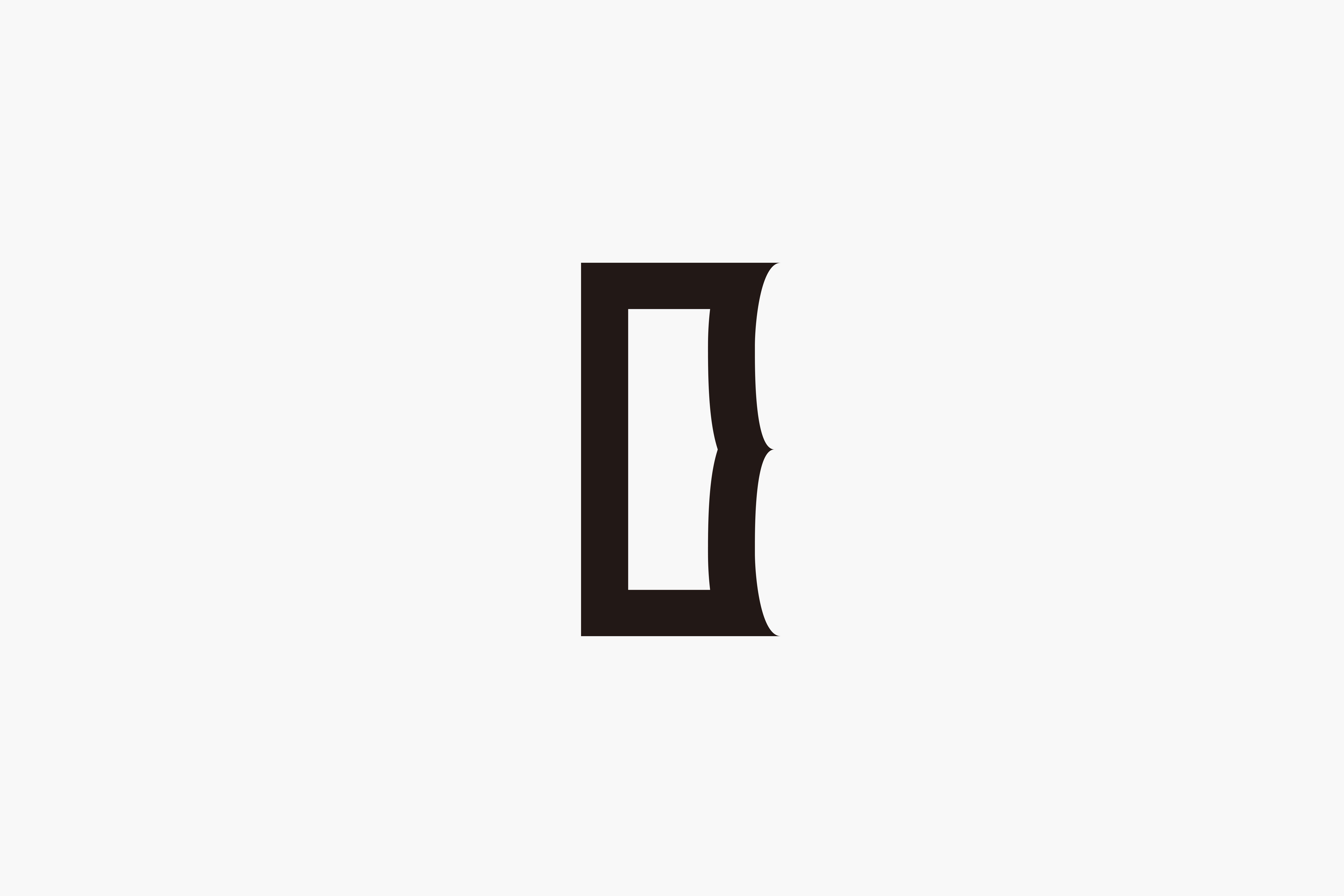
シンプルであることは時に豪華さをも凌ぎ、最小限であることは心地良さを生み出す———日本人が思わず好む色や形を当プロダクトの理念に掲げた。ロゴマークには、竹の節を感じさせる抑揚と、ブランド名の頭文字「I」、またブランド名を構成するアルファベット「I,R,O,D」を内包したデザインとした。
第一弾となる「HABURASHI STAND」では、日本人が思わず惹かれる図案デザインを模索。機能的でありながら、暮らしに馴染む道具を目指し、日本の技や感性が詰まった“NIPPON NO DOUGU“への模索がスタートした。
Tobe Town in Ehime is the birth place of Tobeyaki porcelain which has over a 200-year history. The town is also a home to Aki Factory, an industrial plastic manufacturer, who has been in business here for nearly half a century. In the manufacturers’ town, home to more than 80 pottery producers, gave birth to NIPPON NO DOUGU IRODORI, natural and unostentatious tools for everyday life.
Being simple sometimes overcome being luxurious and being minimum brings comfort — the colours and shapes the Japanese instinctively like are employed as the philosophy of the series of products. The logo, with the bamboo tree like accent and the initial ‘I’, entails the letters ‘I, R, O, D’, an abbreviation of NIPPON NO DOUGU IRODORI.
As the first step, a product HABURASHI STAND (toothbrush stand) has been launched. We searched for a logo design which the Japanese minds cannot resist. Aiming to create tools that are functional and harmonious with life at the same time, our journey to establish the NIPPON NO DOUGU (Japanese tools) packed with skills and sensitivities of the Japanese.